一个系列广告想要保持内在统一感,靠的是重复同一条渲染规则,而不是重复同一个场景。
分享链接 · https://openimages.ajiang.me/p/2103767295889916204/
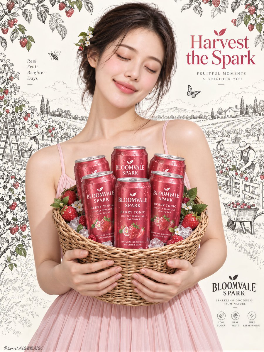
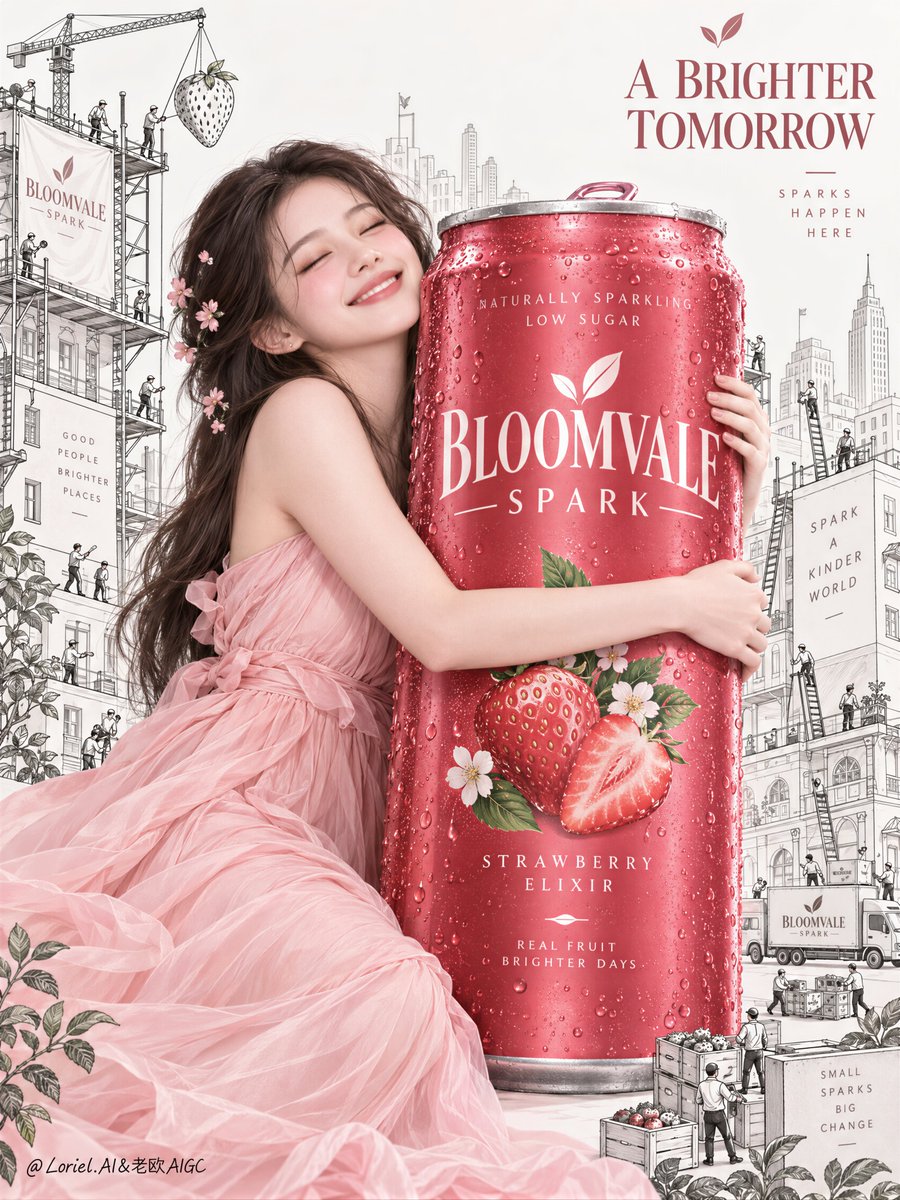
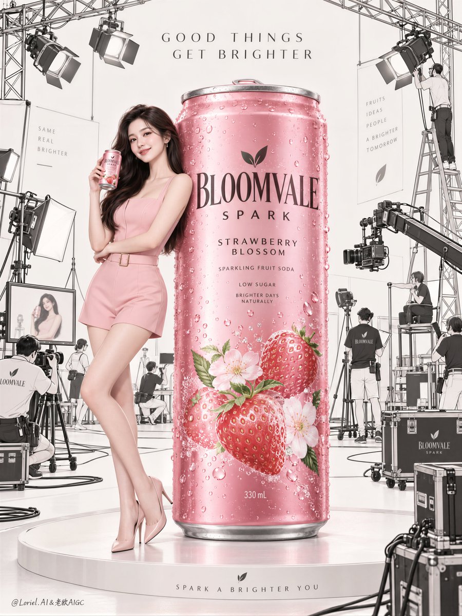
composition · centeredhuman_attributes · long-hairquality_flags · embedded-textsubject_type · fashion-personsubject_type · productusage · ad-campaign
提示词(原文,逐字保留)
A campaign feels coherent when it repeats a rendering rule, not a location.
🍊 Keep the muse and can fully photographic in berry pink; render the surrounding world as charcoal line art on warm off-white.
The hero stays tactile and immediate, while the illustrated setting can expand without stealing attention.
🪽 Change the world from orchard to city, but retain the same empty field, restrained palette, and monumental central product.
The setting evolves, yet viewers still recognize the same campaign within a single glance.
GPT- image 2.5 prompt👇
Create the definitive Orbit + Transit + Port final poster for the second image in the exact same campaign universe as the first poster for the fictional international sparkling fruit soda brand BLOOMVALE SPARK. This is not a new campaign and not a new aesthetic direction. It must read instantly as the official second hero product poster from the same premium series, with absolute IP continuity across muse identity, styling, palette logic, typography restraint, product family, emotional temperature, and monochrome illustrated-world grammar. The image must feel like a Cannes-level commercial sequel: more product-forward, more graphically exact, more collectible, and more brand-legible than the first poster.
The core structure is locked: one monumental hero soda can dominates the vertical composition at center, while the exact same campaign muse from the first poster embraces it with visible affection and delight. She must be unmistakably the same young woman from image one, not merely similar: same face identity, same soft youthful elegance, same dark smooth hair with tiny floral accents, same blush-pink styling language, same clean premium beauty treatment, same optimistic emotional universe. Her expression is brighter and more celebratory than in the first image, as if the brand world has shifted from gentle discovery into joyful product devotion.
The can is the absolute commercial hero and must read first from across the room. Make it oversized, vertical, crisp, chilled, retail-perfect, and visually irresistible. Render it as a berry-rose to strawberry-crimson aluminum sparkling soda can with newly invented English-only branding that feels native to the BLOOMVALE SPARK world. The label system must be highly refined and consistent with the first poster: same premium typographic family, same fruit-icon logic, same upscale low-sugar sparkling-fruit identity, same polished finish, same tasteful hierarchy, same restrained elegance. The can surface must show believable printed aluminum, clean seam structure, sharp rim, realistic pull tab, cold condensation droplets, subtle micro-reflections, and luxurious controlled highlights. No distortion, no warped cylinder, no messy logo behavior. The can is the message.
The muse stands behind and slightly around the can, wrapping both arms around it in a natural, affectionate embrace that reinforces its scale and emotional desirability. Her pose must feel soft, celebratory, and sincere rather than seductive. One cheek may incline gently toward the can. Her body line should curve elegantly around the product, creating a unified silhouette where human warmth amplifies product monumentality. Her blush-pink dress remains light, airy, and premium, consistent with the first poster, with graceful folds and a soft feminine outline. Anatomy must be realistic and mature, with correct head-neck-shoulder proportion, natural torso and pelvis structure, believable chest gravity, smooth hip-to-thigh transition, subtle skin elasticity, faint natural dimpling, realistic hands with five clean fingers, correct joints, elegant grip behavior, and zero mannequin stiffness.
The background must preserve the exact same brand-universe mechanism as the first poster, but evolve it forward. Replace the orchard-harvest line-art world with a monochrome illustrated city-building universe that feels like the same brand world expanding into a new chapter. Use clean black or charcoal line drawing on a pale off-white field: simplified city blocks, refined cranes, ladders, tiny workers, miniature delivery gestures, scaffold details, subtle storefront rhythms, elegant utility lines, tiny moving carts or micro-transport accents if useful. Everything must remain flat, graphic, secondary, and highly controlled, like premium printed illustration surrounding a real photographic commercial centerpiece. The city should feel as if the world of BLOOMVALE SPARK is being built around the can, but it must never compete with the woman or the product. No doodle chaos, no dense clutter, no comic noise.
Composition must feel more vertical, more iconic, and more product-promotional than the first poster. The giant can forms the main central axis. The muse functions as emotional proof of love and scale. The illustrated city expands behind them as the branded universe under construction. The reading order must be immediate and non-negotiable: hero can first, same muse second, world continuity third, typography last. The poster should feel clean enough to be collectible, but commercial enough to sell the product instantly.
Typography must be extremely restrained, entirely newly invented, and English only. Do not copy any wording from the source image. Use typography as graphic architecture, not information overload. At most include one refined headline in the upper area, something short, gentle, and brand-forward such as an invented phrase in the spirit of "Build the Spark" without repeating that exact wording unless it truly serves the composition, plus one tiny brand lockup near a lower edge. Text must stay secondary, elegant, sparse, and fully integrated into the visual rhythm. No loud ad copy, no clutter, no bulky blocks of text, no generic fonts, no random letters.
Lighting must maintain the premium beauty-commercial softness of the first image while becoming slightly crisper on the can for stronger product advertising impact. Use a clean frontal key with subtle directional shaping, feather-light shadows, soft facial glow, airy dress rendering, and precise reflective control on the chilled aluminum surface. The atmosphere is fresh, affectionate, polished, and luminous. Avoid harsh darkness, muddy shadows, or overdramatic contrast. Preserve a refined high-key softness with enough tonal separation to give the can true volume and desirability.
Use a disciplined palette with strict campaign continuity: 60% pale off-white and soft skin-lit atmosphere, 30% berry-pink to strawberry-crimson product color with blush harmony in the dress, 10% charcoal line-art detail and tiny green leaf accents only if they strengthen fruit memory. The palette must feel like the same family as poster one, just pushed toward a cleaner and more exact single-product hero statement.
Material semantics are critical: the can must feel cold, metallic, printed, and shelf-real; the muse must feel alive, touchable, and premium; the dress must feel light and elegant; the illustrated city must feel like luxurious monochrome print graphics. Every element must support the idea that this is the official second chapter of one coherent BLOOMVALE SPARK campaign system.
Target feeling: premium beverage launch poster, emotional product devotion, campaign-world continuity, collectible editorial advertising, same muse same universe same brand DNA, but with sharper hero-product focus and cleaner graphic scarcity.
Quality target and exclusions: photoreal central woman and can, exact anatomy integrity, realistic hands with five fingers, no extra fingers, no missing fingers, no fused fingers, no broken wrists, no distorted face, no warped can geometry, no fake-liquid label melting, no unreadable typography, no random letters, no style drift, no childish cartoon overload, no cluttered city drawing, no muddy pink palette, no AI artifacts, no watermark, no real brand names, no real person names, no dead eyes, no plastic skin, no dirty shadows, no visual noise.
中文译文
一个系列广告想要保持内在统一感,靠的是重复同一条渲染规则,而不是重复同一个场景。
🍊 让缪斯与易拉罐保留莓粉色调、完整的写实质感;周围世界则用炭黑线稿渲染在暖色米白底上。
主角始终保持可触碰的即时感,而插画式场景可以延展,但不能夺走注意力。
🪽 把世界从果园切换成城市,但要保留同一种空旷版式、克制的配色,以及居中、纪念碑式的产品。
场景在演变,但观众一眼就能认出属于同一个系列。
GPT- image 2.5 提示词👇
为虚构的国际气泡果味汽水品牌 BLOOMVALE SPARK(布鲁姆维尔气泡)打造第二张图像的最终 Orbit + Transit + Port 主海报,与首张海报处于完全相同的系列世界观。这不是新系列,也不是新的美学方向。它必须在第一眼就能读出"这是同一高端系列的官方第二张主推产品海报",在缪斯身份、造型、配色逻辑、字体克制、产品系列、情绪温度、黑白插画世界语法上保持绝对的 IP 连续性。整张图必须有戛纳级商业续作的感觉:比首张海报更以产品为先、更图形精准、更具收藏感、更具品牌可读性。
核心结构是锁定的:一只纪念碑式的主推汽水罐垂直居中、占据画面,而与首张海报完全相同的系列缪斯以可见的亲昵与欢欣拥抱着它。她必须一眼就是图一中那位年轻女性,不是仅仅"相似":同一张脸、同一份柔和的青春优雅、同样的深色顺滑头发点缀着细碎花饰、同一套蜜桃粉造型语言、同样的干净高端美妆处理、同一个乐观的情绪宇宙。比起第一张,她的表情更亮、更喜庆,仿佛品牌世界已从温柔的初遇转向欢悦的产品崇拜。
易拉罐是绝对的商业主角,在房间的另一端也要最先被看见。把它做得大、垂直、清脆、冰爽、上架完美、视觉上让人无法抗拒。用全新的、自创的、纯英文品牌文案来表现,让它像 BLOOMVALE SPARK 世界中原生长出的内容。整个标签系统必须和首张海报高度精致且一致:同一族高端字体、同样的水果图标逻辑、同样的高端低糖气泡果汁身份、同样的精致工艺、同样有品味的层级、同样克制的优雅。罐身必须呈现可信的印刷铝感、干净接缝结构、锋利的罐口、真实的拉环、冷凝水珠、细腻的微反射、华丽而有控制的高光。不要变形、不要歪罐、不要乱标的 LOGO。罐本身即是讯息。
缪斯站在罐子后方并稍稍绕过罐子,用双手自然、亲昵地环抱它,以此强化它的尺度与情绪渴望。她的姿态必须柔和、欢庆、真诚,而不是性感。脸颊可以轻靠罐身。她的身体线条应优雅地绕过产品,形成人与产品合一的剪影,让人的温度放大产品的纪念碑感。她的蜜桃粉连衣裙保持轻盈、通透、高端,与首张海报一致,带有优雅褶皱与柔和的女性轮廓。人体解剖必须是写实且成熟的:正确的头颈肩比例、自然的躯干与骨盆结构、合理的胸部重力感、顺滑的胯到大腿过渡、细腻的皮肤弹性、若有若无的自然凹陷、五指干净且真实的手、正确的关节、优雅的抓握动作、零假人感。
背景必须保留与首张海报完全相同的品牌世界机制,但向前演化。把果园采摘线稿世界替换为单色插画式的城市建筑宇宙,感觉像是同一品牌世界进入了新章节。在淡米白底上使用干净的黑或炭色线稿:简化的城市方块、精炼的起重机、梯子、迷你工人、小型送货动作、脚手架细节、若有若无的店面节奏、优雅的管线、迷你手推车或微型运输点缀。一切保持扁平、图形化、次要且高度可控,像高端印刷插画环绕在真实的摄影级商业中心件外面。城市应当感觉像 BLOOMVALE SPARK 的世界正在罐子周围被建造起来,但绝不能与女子或产品抢戏。不要涂鸦式混乱、不要密集堆砌、不要漫画噪点。
构图必须比首张海报更垂直、更标志化、更具产品宣传感。巨大的罐子构成主中轴。缪斯充当情感与尺度的注脚。插画式城市在他们身后延展为正在建造的品牌宇宙。阅读顺序必须立刻成立且不容商量:主角罐第一、同一位缪斯第二、世界延续性第三、字体最末。海报应该干净得足以被收藏,同时又商业得足以立刻卖出产品。
字体必须极度克制、全新自创、纯英文。不要照抄原图中的任何字句。把字体当作图形架构使用,而不是信息堆叠。顶多在上方加一条精致的标题——简短、温柔、面向品牌——例如"Build the Spark"那种精神下的自造短语(不要直接复用这个原文,除非它真的有助于构图),再在画面下沿加一处小巧的品牌组合标记。文字必须保持次要、优雅、稀少,并完全融入视觉节奏。不要喧闹的广告文案、不要杂乱、不要厚重字块、不要通用字体、不要随便几个字母。
光线必须在保留首张图像高端美妆商业柔软感的同时,在罐身上略微变得更清脆,用以强化产品广告效果。使用干净正面主光配合细腻的方向塑形、羽毛般的浅影、柔和的面部辉光、通透的裙摆描绘,以及冰爽铝面上的精准反光控制。氛围是新鲜、亲昵、精致、透亮的。避免硬黑、避免脏影、避免过度戏剧的对比。在保持柔和高端高调感的同时,提供足够的明度分离,让罐子拥有真正的体积感与渴望感。
使用受约束的配色并严格保持系列延续性:60% 淡米白与柔和肤光氛围,30% 莓粉到草莓深红的产品色与裙身的蜜桃呼应,10% 炭色线稿细节与极少的绿色叶饰(仅在能强化水果记忆时使用)。整体配色应与第一张海报属于同一家族,只是被推向更干净、更精准的单一产品主推表达。
材质语义至关重要:罐子必须给人冰、金属、印刷、上架真实的感觉;缪斯必须活着、可触碰、高端;裙身必须轻盈优雅;插画式城市必须像奢华的单色印刷图形。所有元素都必须支撑这一信念——这是同一个 BLOOMVALE SPARK 品牌系统正式的第二章。
目标感受:高端饮品发布海报、情绪化的产品崇拜、系列世界延续性、收藏级编辑风广告、同一位缪斯同一个宇宙同一种品牌 DNA,但更锐利的主角产品聚焦与更干净的图形稀缺感。
质量目标与排除项:中心女性与罐子具备照片级真实感、解剖结构正确无误、双手五指真实、无多指、无缺指、无并指、无断腕、无扭曲面部、无变形罐体、无假液体的标签融化、无不可读的字体、无随机字母、无风格漂移、无幼稚卡通过载、无杂乱城市图样、无浑浊粉色、无 AI 瑕疵、无水印、无真实品牌名、无真实人名、无死鱼眼、无塑料皮肤、无脏影、无视觉噪点。
来源与署名
原文由 @ou_zhen599 发布在 X:查看原推文。 本页逐字保留原文并提供机器翻译的中文解读;版权归原作者所有。
同工具的更多提示词
- 未来主义之所以显得昂贵,是因为机器懂得在哪里停下。 🪽 保留一块清晰的面部区域,呈现真实的毛孔、雀斑、柔软的唇部与闭合的眼睑细节;让外壳去框定它,而不是取代它…@ou_zhen599
- 为 [国家 / 城市 / 地点 / 主题] 创作一张高级感的 4:5 竖版复古旅行海报。 仅文字生成图像 —— 全部画面仅凭 [国家 / 城市 / 地点 /…@Goodmanprotocol
- 创作一张高端电影感汽车编辑海报,以一辆经典的1980年代 BMW E30 赛车作为主体。视觉风格融合地下街头赛车文化、做旧复古赛车图形、粗野主义都市设计以及实…@Shorelyn_
- 四格广告系列只有在你预期内的变化更少时,才会显得奢华。 🌿 在每一格中锁定相同的缪斯、天空色调、柔和粉彩色系以及云朵头饰的造型构造。 整个网格之所以能读作一个…@ou_zhen599
- 【主体】 × 展会现场喷涂 × 1:1真人等身PVC手办 × 竖版9:16随手拍照片 https://t.co/nurJIXxC4e@DeepBlueX0
- { "prompt_type": "photorealistic_reference_edit", "goal": "以非常高的构图还原度重新制作参考肖像,仅…@GreenlandMa1