{
分享链接 · https://openimages.ajiang.me/p/2103121581837013461/
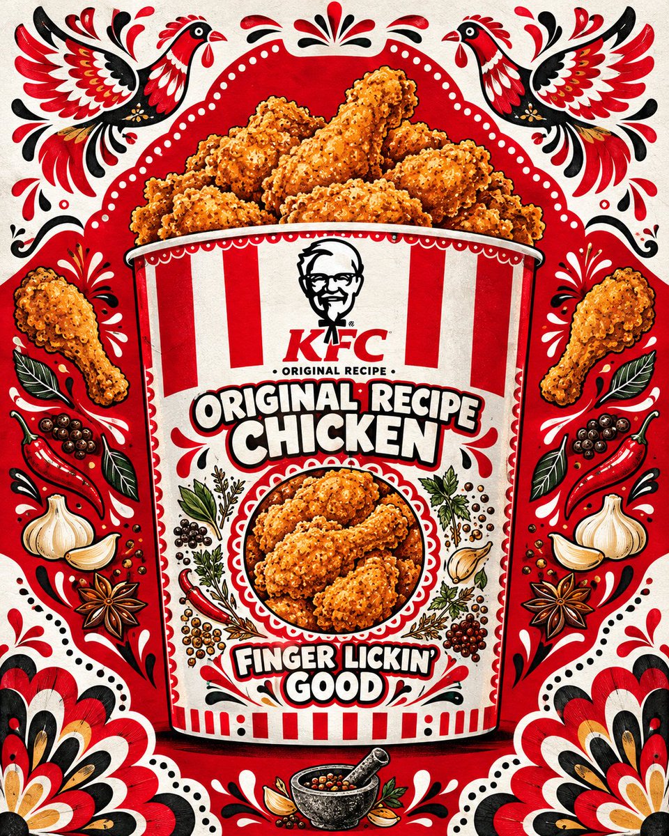
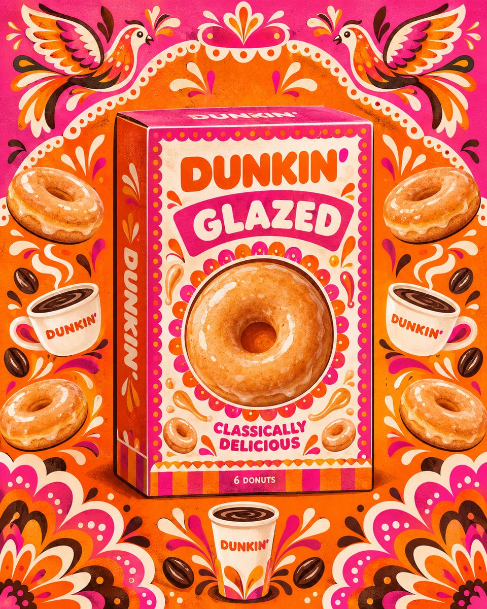
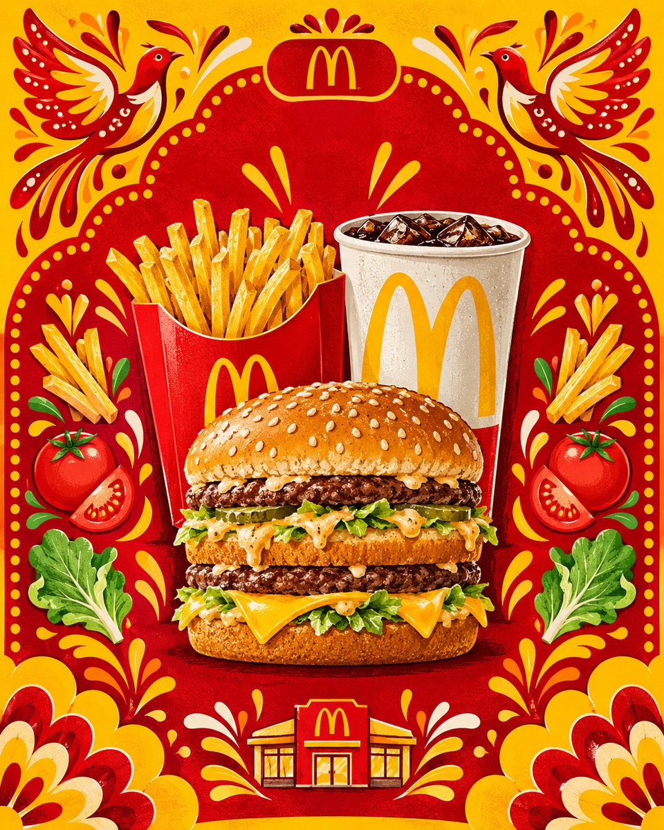
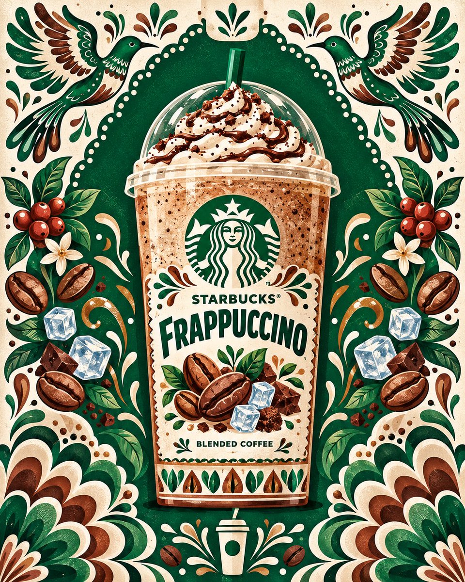
color_palette · high-contrastcolor_palette · vibrantcomposition · symmetrymood · playfulquality_flags · embedded-textsubject_type · food-drink
提示词(原文,逐字保留)
{
"prompt_template_name": "Folk_Art_Hero_Product_Poster_BrandColor_Adaptive",
"instructions_for_generator": "User will provide only {BRAND_NAME}. Steps to follow: (1) Identify that brand's flagship/hero product. (2) Identify that brand's official brand color palette (primary logo color, secondary accent colors, and packaging colors as used in real-world branding). (3) Apply this exact folk-art poster illustration style and layout, but recolor every background shape, ornamental element, and packaging surface using ONLY colors derived from that brand's real identity — do not default to magenta/yellow/green unless those happen to be the brand's actual colors. (4) Select all decorative ingredient/thematic illustrations to be contextually relevant to that hero product's flavor, category, and use-case.",
"image_type": "Vertical poster-style product advertisement illustration",
"aspect_ratio": "4:5 portrait",
"art_style": {
"primary_style": "Mexican folk art / papel picado inspired flat illustration",
"rendering": "Textured flat vector illustration with visible grainy/paper texture overlay on all shapes",
"line_work": "Bold, thick, rounded outlines on every illustrated element, cartoon-poster style",
"shading": "Minimal cel-shading, soft highlight streaks, no realistic gradients",
"mood": "Vibrant, festive, celebratory, appetizing, culturally rich"
},
"brand_color_resolution": {
"step_1_primary_background_color": "Use the brand's dominant/primary logo color as the main background field color (the large arch/blob shape)",
"step_2_secondary_background_color": "Use the brand's secondary or complementary identity color for the surrounding corner fields",
"step_3_accent_colors": "Derive 2-3 accent colors for ornamental birds, florals, and flourishes by pulling from the brand's full identity system (packaging colors, secondary logo tones, or established brand gradient colors) — never invent unrelated colors",
"step_4_box_color": "Packaging box body color must match the brand's actual hero product packaging color scheme as closely as possible",
"step_5_contrast_check": "Ensure chosen palette maintains high contrast and poster vibrancy even if brand colors are naturally muted — deepen/saturate for illustration purposes only, do not shift hue",
"fallback_rule": "If brand has only one strong identity color, generate a harmonious festive palette using tints/shades/complements of that single color rather than introducing an unrelated color scheme"
},
"background": {
"base_layout": "Two-tone split background using brand primary and secondary colors as resolved above",
"top_and_side_corners_color": "Brand secondary identity color",
"main_field_shape": "Large arch or ornamental blob shape in brand primary identity color, emerging from bottom center, filling majority of frame",
"border_treatment": "Scalloped/dotted lace-like border along inner edge of the main shape, using brand secondary color dots against the primary color field, forming a perforated papel picado trim"
},
"framing_ornamental_elements": {
"top_center": "Small rounded badge/plaque shape at very top center in brand secondary color, reserved for a short promotional word or brand mark",
"top_center_motif": "Small stylized leaf/floral icon using brand accent colors above or inside the badge",
"upper_flanking_elements": "Two large symmetrical stylized folk-art birds (one left, one right), wings spread ornately, rendered using a gradient built from brand accent colors, facing inward toward the center product",
"mid_flanking_elements_left_right": "Symmetrical pairs of large decorative illustrations of ingredients/objects directly tied to the hero product's flavor or use, colored using brand accent palette where naturalistic color isn't essential to recognizability, positioned stacked vertically along both left and right sides",
"small_accent_squiggles": "Thin ribbon-like paint-splash or flourish squiggles in brand accent colors scattered near each flanking element for movement",
"lower_corner_bursts": "Two large layered floral/cloud-burst shapes in bottom left and right corners, made of overlapping petal forms using the full resolved brand accent palette",
"bottom_center_icon": "A small centered illustrated object symbolizing how the hero product is prepared or used traditionally, colored in brand primary/secondary tones, flanked by two small floral flourish splashes in accent colors"
},
"central_hero_element": {
"object": "Front-facing product packaging box of the brand's flagship/hero product, centered vertically and horizontally, slightly larger in height than width, standing upright",
"packaging_style": "Matches brand's real-world hero product packaging conventions and colorway, reinterpreted in this illustration's texture and line style",
"box_body_color": "Brand's actual hero product packaging base color, with darker shade of same hue for 3D box edge/side effect",
"box_border_decoration": "Thin ornamental scalloped ribbon trim in brand accent color running around the inner border of the front face, same style as outer background border",
"top_left_badge_on_box": "Small circular/rounded badge in contrasting brand accent color indicating quantity or unit count relevant to hero product",
"brand_logo_placement": "Bold brand wordmark logo centered in upper-middle of box front, rendered in the brand's actual logo colors and authentic typography style, on a ribbon/banner shape",
"tagline_under_logo": "Establishment date or brand heritage line in small caps directly under or above logo if authentic to brand",
"product_flavor_name": "Large bold rounded sans-serif headline text stating the specific hero product's flavor/variant name, white or brand-light text with brand-dark outline, arched or two-line stacked layout",
"central_circular_product_photo_window": "Large circular illustrated 'window' in the middle of the box showing a stylized top-down illustration of the actual hero product/food/result in use, with decorative petal/scalloped ring border in brand accent colors around the circle",
"surrounding_box_illustrations": "Small painterly illustrations of the product's real ingredients or components scattered around the circular window on the box face itself, colored naturalistically but harmonized with brand palette saturation level",
"lower_tagline": "Secondary marketing phrase in bold rounded text, two-line stacked, white/light with brand-dark outline, positioned below the circular window",
"bottom_box_footer_band": "Decorative striped or geometric pattern band near bottom of box using brand accent colors",
"bottom_box_fine_print": "Small white or light text at very bottom of box stating pack contents/specs, in a simple sans-serif"
},
"color_palette": {
"resolution_method": "100% derived from {BRAND_NAME}'s real identity system — primary logo color, secondary logo/packaging color, and 2-3 supporting accent colors pulled from official brand assets",
"overall_saturation": "high saturation, high contrast, poster-vibrant — brand colors may be deepened/intensified for illustration impact but hue must stay true to brand",
"no_generic_defaults": "Do not default to magenta/yellow/green unless independently verified as the resolved brand's actual colors"
},
"lighting_and_texture": {
"texture_overlay": "Subtle grain/noise texture across all flat color fields to mimic screen-printed or hand-painted poster look",
"lighting_style": "Flat frontal illustrated lighting, no realistic shadows except small drop shadow beneath central box for depth",
"highlight_style": "Painterly white/light streak highlights on rounded surfaces (fruits, birds, box edges)"
},
"composition_rules": {
"symmetry": "Strict vertical mirror symmetry on all background and flanking ornamental elements",
"focal_hierarchy": "Central product box is the clear largest, sharpest, most detailed focal point; background elements are supporting and slightly softer in detail",
"negative_space": "Background shapes fill nearly entire frame with minimal flat empty space, dense festive composition"
},
"exclusions": [
"no readable brand-external promotional badges or 'new product' callout text anywhere in the image",
"no extra text labels beyond the packaging's own brand name, flavor name, taglines, and contents line",
"no realistic photography, entire image must remain flat illustrated folk-art style",
"no unrelated ingredients that do not connect to the resolved hero product",
"no off-brand colors anywhere in background, ornamental elements, or packaging"
],
"user_input_field": {
"BRAND_NAME": "{{user_provided_brand_name}}"
}
}
中文译文
{
"prompt_template_name": "Folk_Art_Hero_Product_Poster_BrandColor_Adaptive",
"instructions_for_generator": "用户将仅提供 {BRAND_NAME}。请按以下步骤执行:(1) 识别该品牌的旗舰/主打产品。(2) 识别该品牌的官方品牌配色方案(主标志色、次要强调色,以及在实际品牌中使用的包装色)。(3) 应用这一完全相同的民间艺术海报插画风格与版式,但仅使用源自该品牌真实视觉体系的颜色,重新为每一个背景形状、装饰元素和包装表面着色——除非恰好是该品牌的真实颜色,否则不要默认使用洋红/黄/绿。(4) 所有装饰性的食材/主题插画必须与该主打产品的口味、品类和使用场景在语境上相关。",
"image_type": "竖版海报式产品宣传插画",
"aspect_ratio": "4:5 竖版",
"art_style": {
"primary_style": "墨西哥民间艺术 / 镂剪纸(papel picado)启发的扁平插画",
"rendering": "带纹理的扁平矢量插画,所有形状上都有可见的颗粒/纸张纹理叠加",
"line_work": "每个插画元素都使用粗而圆润的描边,卡通海报风格",
"shading": "极简赛璐珞明暗、柔和的高光条纹,无写实渐变",
"mood": "鲜艳、节日感、庆祝氛围、诱人、富含文化气息"
},
"brand_color_resolution": {
"step_1_primary_background_color": "使用品牌的主导/主标志色作为主背景色块(大型拱形/团块形状)",
"step_2_secondary_background_color": "使用品牌的次要或互补识别色作为四周角落区域色",
"step_3_accent_colors": "从品牌完整的视觉识别体系中(包装色、次级标志色调或已确立的品牌渐变色)提取 2–3 种强调色,用于装饰鸟类、花卉与花纹——绝不可杜撰无关颜色",
"step_4_box_color": "包装盒主体色必须尽可能贴合品牌真实主打产品的包装配色",
"step_5_contrast_check": "即使品牌色本身较为柔和,也须确保所选配色保持高对比度与海报般鲜艳感——仅可加深/提饱和度以服务插画表现,不得偏移色相",
"fallback_rule": "若品牌仅有单一强势识别色,则以该单色的明度变化/深浅/互补生成一套和谐节庆配色,而非引入无关色系"
},
"background": {
"base_layout": "使用上述解析得出的品牌主色与次色,构成双色分割背景",
"top_and_side_corners_color": "品牌次级识别色",
"main_field_shape": "以品牌主识别色构成的大型拱形或装饰性团块形状,从底部中央升起,占据画面大部分",
"border_treatment": "沿主形状内缘的扇贝形/点状蕾丝状边框,在主色色块上以品牌次色绘制圆点,形成镂剪纸式的花边装饰"
},
"framing_ornamental_elements": {
"top_center": "顶部正中央的小型圆形徽章/铭牌形状,使用品牌次级识别色,用于放置简短的推广词或品牌标识",
"top_center_motif": "使用品牌强调色的小型程式化叶片/花卉图标,位于徽章上方或内部",
"upper_flanking_elements": "两个大型对称的程式化民间艺术鸟类(左右各一),翅膀华丽展开,由品牌强调色构成的渐变上色,朝向中心产品",
"mid_flanking_elements_left_right": "成对对称的大型装饰性插画,直接表现与主打产品口味或用途相关的食材/物品,在不依赖自然色辨识度时使用品牌强调色,沿左右两侧上下堆叠排列",
"small_accent_squiggles": "以品牌强调色绘制的细丝带状泼墨/花纹曲线,散布在各侧边元素附近以增加动感",
"lower_corner_bursts": "左下与右下角各一个大型分层花/云朵爆发形,由重叠的花瓣构成,使用解析得出的全套品牌强调色",
"bottom_center_icon": "中央位置的小型程式化插画对象,象征该主打产品传统的制备或使用方法,以品牌主/次色调上色,两侧以强调色绘制小型花卉飞溅装饰"
},
"central_hero_element": {
"object": "品牌旗舰/主打产品的正面包装盒,垂直与水平居中,高度略大于宽度,直立放置",
"packaging_style": "符合品牌实际主打产品的包装惯例与配色,并以本插画的纹理与线条风格重新诠释",
"box_body_color": "品牌实际主打产品的包装底色,同色相的更深一档用于 3D 盒体边缘/侧面效果",
"box_border_decoration": "在正面内边框周围,以品牌强调色绘制的细窄扇贝形丝带装饰,风格与外背景边框一致",
"top_left_badge_on_box": "盒体左上方的小型圆形/圆角徽章,使用对比品牌强调色,标注与主打产品相关的数量或单位",
"brand_logo_placement": "粗体品牌字标 logo 居中放置于盒体正面中上部,以品牌真实 logo 颜色与正本字形风格呈现,置于丝带/横幅造型上",
"tagline_under_logo": "若与品牌相符,在 logo 正下方或上方以小型大写字母排印创立年份或品牌传承说明",
"product_flavor_name": "粗体大号圆角无衬线标题文字,标明该主打产品的具体口味/规格名称,使用白色或品牌浅色文字配品牌深色描边,呈拱形或两行堆叠排版",
"central_circular_product_photo_window": "盒体中央的大型圆形程式化「窗口」,展示主打产品/食品/使用效果的俯视程式化插画,圆形外缘以品牌强调色绘制花瓣/扇贝形环状装饰",
"surrounding_box_illustrations": "在盒体正面的圆形窗口周围,散布小型绘画风格的真实食材或产品组件插画,色彩自然但与品牌配色饱和度相协调",
"lower_tagline": "次级营销短语,粗体圆角文字,两行堆叠,白色/浅色配品牌深色描边,置于圆形窗口下方",
"bottom_box_footer_band": "盒体底部的装饰性条纹或几何图案带,使用品牌强调色",
"bottom_box_fine_print": "盒体最底部的小号白色或浅色文字,使用简洁无衬线字体,注明包装内容/规格"
},
"color_palette": {
"resolution_method": "100% 源自 {BRAND_NAME} 的真实视觉识别体系——主标志色、次级标志/包装色,以及从官方品牌资产中提取的 2–3 种辅助强调色",
"overall_saturation": "高饱和度、高对比度、海报级鲜艳——可为插画表现加深/强化品牌色,但色相必须忠于品牌",
"no_generic_defaults": "除非独立核实为解析品牌的真实颜色,否则不得默认使用洋红/黄/绿"
},
"lighting_and_texture": {
"texture_overlay": "所有平面色块上叠加细微颗粒/噪点纹理,以模拟丝网印刷或手绘海报质感",
"lighting_style": "平面正面程式化打光,除中心盒体下方的小投影外无写实阴影",
"highlight_style": "在曲面(水果、鸟、盒体边缘)上添加绘画风格的白色/浅色条状高光"
},
"composition_rules": {
"symmetry": "所有背景与侧边装饰元素严格垂直镜像对称",
"focal_hierarchy": "中心产品盒为最清晰、最大、细节最丰富的视觉焦点;背景元素起衬托作用,细节略柔",
"negative_space": "背景形状几乎填满整个画面,极少留白,构成密集而节庆感的构图"
},
"exclusions": [
"画面任何位置均不得出现可读的外部品牌推广徽章或「新上市」类提示文字",
"除包装自身的品牌名、口味名、标语与内容说明外,不得有其他文字标签",
"不得使用写实摄影,整张图像须保持平面程式化民间艺术风格",
"不得出现与解析得出的主打产品无关的食材",
"背景、装饰元素或包装上不得出现与品牌不符的颜色"
],
"user_input_field": {
"BRAND_NAME": "{{user_provided_brand_name}}"
}
}
来源与署名
原文由 @SaasJunctionHQ 发布在 X:查看原推文。 本页逐字保留原文并提供机器翻译的中文解读;版权归原作者所有。
同工具的更多提示词
- 创建一个高级的 4:5 竖版 Instagram 旅行艺术插画,主题为 [LOCATION],完全由文字生成,不使用任何参考图片。 风格:精致的水彩 + 细腻…@Goodmanprotocol
- 以参考照片中的女孩作为确切的外观参考。保留她的面部特征、发型、比例、妆容以及整体身份,不要改变她的外貌。 一张自然的前置摄像头 iPhone 自拍照,从略微侧…@mehvishs25
- 微缩工人让超大护肤品显得精心打造——但前提是他们的动作必须能解释产品本身。 🪜 给每位工匠一个清晰的任务:爬上瓶盖、擦拭瓶身、采摘花瓣、搬运乳霜、或照料石质底…@ou_zhen599
- ChatGPT / GPT Image 2.5 照片级写实源重建,原生竖版 736:981。保留身份、比例、抬臂姿势、混合盘发/散发、服饰、暖色日光与柔和感…@RougeHalo_AI
- 超写实 IMAX 级 Netflix 风格电影感人像,9:16 竖构图。以上传的图片作为主要视觉参考,精确保留面部身份、比例与标志性特征。一位女性斜坐在一张深…@imGopalTiwari
- 超写实 IMAX 级 Netflix 风格电影感人像肖像,9:16 竖版。以上传的图片作为主要视觉参考,保留完全一致的面部特征、比例和标志性细节。一名男子与一…@imGopalTiwari