一场充满活力的广告战役,一旦包装只出现一次,就会失去传播力。
分享链接 · https://openimages.ajiang.me/p/2102048808784085102/
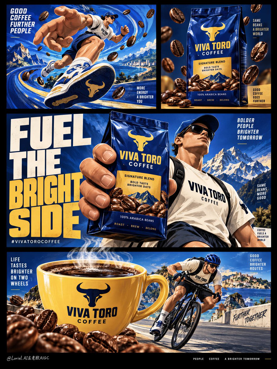
color_palette · high-contrastcolor_palette · warm-tonescomposition · multi-panelmood · energeticquality_flags · embedded-textquality_flags · multi-panel-layout
提示词(原文,逐字保留)
An energetic campaign stops selling when the pack appears only once.
☕ repeat the same cobalt-blue coffee bag at three scales: clean shelf view, giant hand-held hero, and cup-side brand cue
The action can change from running to cycling, but the product stays instantly recognizable.
⚡ give each panel one job: motion, pack clarity, campaign statement, or coffee ritual
The board feels modular enough for a full campaign, without turning into a collage of unrelated sports scenes.
GPT- image 2.5 prompt👇
Create a premium illustrated coffee campaign board for a fictional international brand named VIVA TORO COFFEE, designed as a single vertically composed multi-panel poster on a deep black background, where bold editorial layout, oversized graphic limbs, and product-led storytelling merge into one collectible advertising image. The final image must integrate Orbit, Transit, and Port at the same time: immediate commercial impact, systemized brand versatility, and curatorially reduced visual sophistication. Preserve the structural logic of the reference as pure composition language only: multiple clean rectangular panels floating inside a black field, one dominant middle statement panel, one product-focused upper-right panel, one energetic upper-left action panel, and one wide lower panel built around a giant branded coffee cup and an athletic character.
The commercial product is the coffee brand itself, expressed through a hero coffee bag, a large steaming cup, scattered roasted beans, and a recurring athletic mascot system. The pack must remain shelf-ready and clearly legible inside the illustration world: upright premium flexible bag, rich cobalt-blue body, warm golden label zone, bold brand mark, believable gusset folds, glossy laminate reflections, sharp edges, and appetizing coffee imagery. The cup must be equally iconic: oversized yellow ceramic cup with printed brand identity, dark coffee surface, visible steam plume, smooth glazed reflections, and strong graphic silhouette. The product assets must remain visually dominant across the board, even while the human figures and giant hands create motion and personality.
The illustration style is premium commercial graphic art, not childish cartooning. Use bold shape language, vector-clean contour logic, controlled shadow blocks, subtle grain or print texture, expressive but disciplined brush energy, and highly curated panel composition. The visual world should feel modern, playful, and international, like a Cannes-winning FMCG campaign or an award-winning beverage poster series. The human figures are stylized yet believable, with clear anatomy and controlled exaggeration: athletic adult bodies, clean limb articulation, readable hands, correct finger count when visible, oversized hands and shoes used intentionally as part of the brand language, not as anatomical errors. Their movement should feel active and rhythmic: running, striding, cycling, or carrying the force of caffeine through the composition.
Upper-left panel: a dynamic blue motion field with swirling abstract coffee-energy patterns, a giant illustrated hand integrated into the scene, and a sporty mascot character in motion, as if the brand is physically propelling the body forward. The hand and character relationship must feel witty and graphic rather than random. Upper-right panel: a more reduced product-first composition centered on the coffee bag, with roasted beans suspended or falling around it in clean spatial rhythm, highlighting pack clarity and shelf impact. Middle main panel: the strongest commercial statement, with one giant hand gripping the hero coffee bag beside a large athletic character standing or stepping forward, supported by massive bold typography that acts as both message and graphic block. Bottom wide panel: a large steaming coffee cup dominates the scene while a cyclist or active consumer character interacts with it, using the cup as a scale-distorting object of desire and energy.
The color system must be highly controlled and brand-strong: 55% saturated cobalt blue and deep roast-blue, 20% warm golden yellow and toasted bean amber, 15% cream white and pale highlight accents, 10% black field and deep coffee-brown anchors. The black outer background must feel like a gallery wall framing the bright commercial worlds within. Let the internal panels contain most of the color, while the outer black field provides sophistication, breathing room, and a premium editorial finish. The movement textures inside the blue fields should feel like liquid caffeine currents or energetic roast waves, not generic decoration.
Typography is a major graphic force and must be elegant within its boldness. Use only English visible text. In the central panel, create one large campaign line with huge condensed uppercase lettering, such as "FUEL THE BRIGHT SIDE" or "WAKE THE MOTION", integrated into the scene as a structural block. Add the brand name "VIVA TORO COFFEE" on the pack and cup, and one short bottom-line hashtag or call phrase only if needed. Avoid information clutter, small promotional paragraphs, or supermarket-flyer noise. The type must feel like part of the poster architecture, tightly locked to the panel grid and giant-hand composition.
Material semantics must remain explicit even inside the illustration language: glossy coffee-bag laminate, roasted bean oil sheen, ceramic cup glaze, coffee liquid depth, steam softness, bicycle frame gloss, sporty fabric folds, sneaker rubber edge, and crisp panel borders. The image should function both as a powerful single poster and as a scalable brand system whose scenes could be extracted into separate ads. That Transit quality must be present in the design logic: every panel feels modular, but the whole remains one unified premium campaign object. The Port quality must also be present: remove low-value clutter, reduce unnecessary mini-elements, widen negative space where possible, and let the strongest gestures, products, and type do the work.
Rendering target: premium graphic-illustration FMCG campaign, product-dominant hierarchy, international editorial grid, clean brand modularity, reduced but powerful storytelling, bold collectible print finish, and world-class commercial poster clarity.
Structured exclusion constraints: no real coffee brand names, no copied source text, no cheap clip-art feel, no childish cartoon simplification, no muddy colors, no cluttered panel noise, no unreadable typography, no random letters, no extra fingers, no fused fingers, no broken limb logic, no low-end retail flyer look, no style drift, no AI slop.
中文译文
一场充满活力的广告战役,一旦包装只出现一次,就会失去传播力。
☕ 在三个尺度上重复同一只钴蓝色咖啡袋:干净的货架视角、巨型手持主视觉、以及杯旁的品牌提示
动作可以从跑步切换到骑行,但产品必须始终一眼可辨。
⚡ 让每个画格只承担一个任务:动感、包装清晰度、广告主张、或咖啡仪式
整块版面要足够模块化以支撑完整战役,又不至于沦为毫不相干的运动场景拼贴。
GPT- image 2.5 prompt👇
为虚构国际品牌 VIVA TORO COFFEE 创作一幅高级感插画风格的咖啡广告版面,呈现为在深黑底色上纵向构图的多画格海报,将大胆的编辑式版面、夸张的图形化肢体、以及以产品为核心的故事表达融合为一件可收藏的广告图像。最终图像必须同时整合 Orbit、Transit 与 Port 三种特质:直接的商业冲击力、系统化的品牌延展性,以及策展式精简的视觉精致度。仅以纯粹构图语言保留参考稿的结构逻辑:在黑色画布中漂浮的多个干净矩形画格、一个居中的主导主张画格、一个聚焦产品的右上画格、一个充满能量的左上动作画格,以及一个以巨型品牌咖啡杯和运动角色构建的宽幅下方画格。
商业产品即咖啡品牌本身,通过一只主视觉咖啡袋、一只冒着热气的大杯、散落的烘焙咖啡豆,以及一套反复出现的运动吉祥物系统来表达。包装必须在插画世界中保持货架就绪感与清晰可读:直立的高端软包袋、浓郁的钴蓝色袋身、温暖的烫金标签区、醒目的品牌标志、可信的底部折角、光泽覆膜反光、利落的袋身边缘,以及诱人的咖啡图像。杯子同样必须具备标志性:超大号黄色陶瓷杯身,印有品牌标识、深色咖啡液面、可见的升腾蒸汽、平滑的釉面反光,以及强烈的图形化轮廓。即使人物与巨手带来动感与个性,产品资产也必须在整个版面上保持视觉主导地位。
插画风格为高端商业图形艺术,而非低龄卡通化。使用大胆的造型语言、矢量级干净的轮廓逻辑、受控的阴影块面、细腻的颗粒或印刷质感、富于表现力却克制的笔触能量,以及高度策展化的画格构图。视觉世界应感觉现代、俏皮且国际化,如同戛纳获奖的快消品广告战役,或获奖的饮料海报系列。人物造型风格化却又可信,具备清晰解剖与受控夸张:成年运动体型、干净的肢体关节、可辨识的手部、可见时手指数量正确,巨手与巨鞋作为品牌语言的刻意设计,而非解剖错误。其动作应感觉活跃且有节奏:奔跑、大步迈进、骑行,或将咖啡因的力量贯穿整幅构图。
左上画格:充满动感的蓝色动态场,旋绕着抽象的咖啡能量花纹,一只巨大的插画化手部融入场景,一位运动型吉祥物角色处于运动之中,仿佛品牌在物理层面将身体向前推进。手部与角色的关系必须感觉机智且图形化,而非随意拼贴。右上画格:更精简、以产品为先的构图,以咖啡袋为中心,烘焙咖啡豆以干净的空间节奏悬停或洒落于四周,突出包装清晰度与货架冲击力。中间主画格:最强的商业主张,一只巨手握持主视觉咖啡袋,旁边站着或向前迈步的大型运动角色,并由巨型粗体字作为信息与图形块双重支撑的标题。底部宽幅画格:一杯巨大的冒着热气的咖啡杯主导场景,一位骑行或活跃的消费者角色与之互动,将杯子作为尺度被扭曲的欲望与能量对象。
色彩系统必须高度受控且具备强烈品牌感:55% 饱和钴蓝与深烘焙蓝、20% 暖金色与烘焙豆琥珀色、15% 奶油白与浅色高光点缀、10% 黑色画布与深咖啡棕作为锚点。外部黑色背景必须感觉如画廊墙面,框定内部明亮的商业世界。让内部画格承载大部分色彩,而外部黑色画布提供精致感、呼吸空间,以及高级的编辑式收束。蓝色场域内的动态肌理应感觉像液态咖啡因流体或充满能量的烘焙波纹,而非通用装饰。
字体是重要的图形力量,必须在大胆之中保持优雅。仅使用英文可见文字。在中央画格中,以超大号紧凑大写字母创作一条大型广告语,例如 "FUEL THE BRIGHT SIDE" 或 "WAKE THE MOTION",作为结构块融入场景。在包装与杯身添加品牌名 "VIVA TORO COFFEE",并在必要时仅添加一条简短的底部标签或号召短语。避免信息杂乱、短小的促销段落,或超市传单式的噪声。字体必须感觉是海报建筑的一部分,紧扣画格网格与巨手构图。
即使在插画语言内部,材质语义也必须保持清晰:咖啡袋的光泽覆膜、烘焙豆的油润光泽、陶瓷杯的釉面、咖啡液体的深度、蒸汽的柔软、自行车车架的光泽、运动面料的褶皱、运动鞋橡胶边缘,以及锐利的画格边框。该图像既要作为一张有力的独立海报运作,也要作为一套可被拆分为独立广告的可延展品牌系统。这种 Transit 品质必须存在于设计逻辑中:每个画格感觉模块化,但整体仍是统一的高级广告对象。Port 品质也必须在场:去除低价值杂乱、减少不必要的小元素、尽可能扩大负空间,让最有力的姿态、产品与字体承担表现力。
渲染目标:高级图形插画快消品广告、产品主导的层级关系、国际化的编辑式网格、干净的品牌模块化、精简却有力的叙事、大胆的可收藏印刷质感,以及世界级的商业海报清晰度。
结构化排除约束:不得出现真实咖啡品牌名称、不得复制源文本、不得有廉价剪贴画感、不得低龄卡通化简化、不得有浑浊色彩、不得有画格噪声杂乱、不得有不可辨识的字体、不得有随机字母、不得有多余手指、不得有粘连手指、不得有断裂的肢体逻辑、不得有低端零售传单观感、不得有风格漂移、不得有 AI 废稿感。
来源与署名
原文由 @ou_zhen599 发布在 X:查看原推文。 本页逐字保留原文并提供机器翻译的中文解读;版权归原作者所有。
同工具的更多提示词
- 超写实 IMAX 级 Netflix 风格电影感肖像,9:16 竖版。使用上传的图片作为主要视觉参考,并保留两位主体的精确面部身份、比例和标志性特征。创作一位…@imGopalTiwari
- 1. 打开 ChatGPT image 2.5 2. 上传你的图片 3. 提示词 4. 生成 "一张4:5画幅的照片级电影感人像,呈现浪漫的街景。画面左侧,一…@WanderingC76
- 为 FRANK 创作一份高端电影级角色圣经图集。严格以上传的角色设定图作为视觉参考。不得更改其外观。 布局:单一角色独版格式。角色居中,深红与黑色水彩泼溅在其…@TechieBySA
- 一年之中最美的时候是秋天,那时美丽本身就是一种奢侈。 Created in @ImagineArt_X model: GPT Image 2.5 Flare…@churvikv
- 为 [COUNTRY / LOCATION / SUBJECT](国家 / 地点 / 主题)创作一幅高端的 4:5 竖版松散蜡笔与干粉彩编辑插画。 视觉生成…@Goodmanprotocol
- 超现实 IMAX 级电影感编辑人像拼贴画,9:16 竖版。以上传的图片作为主要视觉参考,在三幅人像中保持该女性完全一致的面部特征、比例和标志性特点。打造一幅时…@imGopalTiwari