使用上传的照片,制作一张竖向 3:4 的“前后对比”海报。如果上传了多张照片,请为每张照片分别制作一张独立的海报;不要在同一页面中混合…
分享链接 · https://openimages.ajiang.me/p/2101888385627598947/
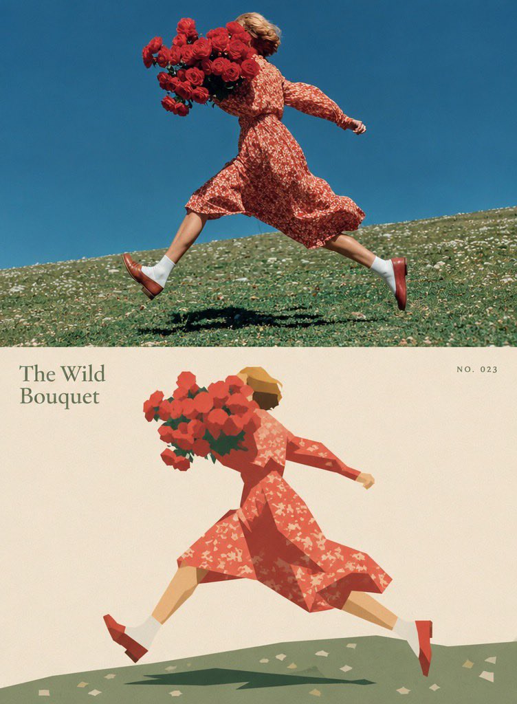
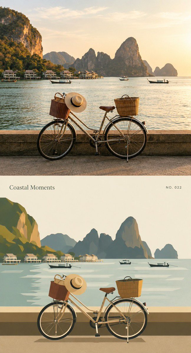
color_palette · warm-tonescomposition · multi-panelmood · nostalgicquality_flags · embedded-textsubject_type · fashion-personusage · poster
提示词(原文,逐字保留)
Using the uploaded photo, create a vertical 3:4 “before-and-after” comparison poster. If multiple photos are uploaded, create one separate poster for each photo; do not mix different photos on the same page. The upper and lower sections should each occupy exactly half of the total height, with a seamless transition between them. Do not add borders, arrows, or “Before” / “After” labels.
【TOP SECTION: ORIGINAL PHOTO】
The top section should use the uploaded original photo, filling the full width of the canvas. Preserve the original subject, pose/action, scene, natural lighting, and dominant color palette. Only allow subtle overall color adjustments; do not change the atmosphere or add any filter effects. Maintain the photo’s original aspect ratio and do not stretch the subject. To fit the top section, you may crop unimportant edges; if cropping would remove the main subject, prioritize adding a small amount of background instead, but never invent or alter the subject or key elements of the scene.
【BOTTOM SECTION: GEOMETRIC ABSTRACT】
Using the same photo from the top section as the only reference, recreate the core subject and a few key environmental elements as a hard-edged, geometric, flat-style illustration. Do not add any people, animals, objects, or actions that were not present in the original photo. Preserve the core subject’s left/right position, pose, direction, interactions, and major occlusion relationships from the photo so that the top and bottom sections appear visually aligned at first glance; however, there is no need to reproduce the image pixel-for-pixel.
Remove secondary background elements and insignificant details. The subject may be scaled down slightly to create generous negative space around it. Construct objects using a limited number of polygons of varying sizes, simplified curves, and solid color blocks. Preserve enough of the subject’s silhouette, movement, and defining characteristics so that it remains recognizable as the specific subject from the original photo; do not reduce it to a generic icon.
Use adjacent color blocks of different shapes and brightness levels to define structure. Do not use gradients, outlines, 3D shadows, or realistic textures. Extract approximately 5–6 representative colors from the original photo and organize them into a cohesive palette with slightly reduced saturation. Use a warm off-white/beige tone as the background color for the lower section. Reserve the darkest tones for a few visual focal points, and retain one accent color that echoes the original photograph. Do not arbitrarily change the most recognizable colors of the core subject.
Keep all geometric edges crisp and sharp. Add only an extremely subtle printed grain texture within the color blocks, with slight registration misalignment allowed on a few edges. Do not render the entire image with a rough paper texture or glitch-art effect.
【TEXT】
Add a small amount of archival-style typography to the lower section: automatically generate a short English title based on the content of the photo, accompanied by the small number “NO. 023”. Place the title in an area of negative space where it does not obstruct the subject, and position the number diagonally opposite the title to create visual balance.
Do not fabricate real locations, dates, identities, or events, and do not add overly dense explanatory text. The overall composition should resemble a page from a contemporary art book: a rich, realistic photograph on top paired with a bold, highly simplified, orderly geometric interpretation beneath it.
Keep the overall work restrained, gentle, and distinctive. Avoid cartoon-like faces, 3D effects, plastic-like materials, clashing neon colors, or random doodles.
中文译文
使用上传的照片,制作一张竖向 3:4 的“前后对比”海报。如果上传了多张照片,请为每张照片分别制作一张独立的海报;不要在同一页面中混合不同的照片。上半部分和下半部分各占整张画面总高度的恰好一半,两部分之间无缝衔接。不要添加边框、箭头,也不要添加“Before”/“After”之类的标签。
【上半部分:原始照片】
上半部分使用上传的原始照片,铺满画面的完整宽度。保留原始的主体、姿势/动作、场景、自然光线以及主要色调。只允许进行轻微的整体色彩调整;不要改变氛围,也不要添加任何滤镜效果。保持照片原始的宽高比例,不要拉伸主体。为了适配上半部分,可以裁切不重要的边缘;如果裁切会移除主体,则优先加入少量背景,但绝对不能凭空捏造或改动主体及场景中的关键元素。
【下半部分:几何抽象】
仅以上半部分同一张照片作为唯一参考,将核心主体及若干关键环境元素以硬边、几何、扁平风格的插画方式重新呈现。不要添加原照片中不存在的人物、动物、物体或动作。保留核心主体在照片中的左右位置、姿势、朝向、互动关系以及主要的遮挡关系,使上下两部分在第一眼看上去是视觉对齐的;但无需做到逐像素还原。
去除次要的背景元素和不重要的细节。可以将主体稍微缩小,在其周围留出充足的负空间。使用数量有限、尺寸各异的多边形、简化的曲线以及纯色色块来构建物体。保留足够的主体轮廓、动态以及关键特征,使其仍能被识别为原始照片中的特定主体,而不是沦为通用图标。
使用形状与明度不同的相邻色块来塑造结构。不要使用渐变、描边、3D 阴影或写实纹理。从原始照片中提取大约 5–6 种具有代表性的颜色,组织成一套饱和度略有降低的协调配色。下半部分的背景色采用一种偏暖的米白/米色调。最深的色调保留给少数几个视觉焦点,并保留一种呼应原照片的强调色。不要随意改变核心主体最具辨识度的颜色。
保持所有几何边缘清晰锐利。仅在色块内部添加极其细微的印刷颗粒质感,允许在少数边缘处出现轻微的套印错位。不要让整张图像呈现粗糙的纸张纹理或故障艺术效果。
【文字】
在下半部分添加少量档案风格的排版:根据照片内容自动生成一个简短的英文标题,并搭配小号编号“NO. 023”。将标题放置在不会遮挡主体的负空间区域,编号置于与标题对角的位置,以形成视觉平衡。
不要编造真实的地点、日期、身份或事件,也不要添加过于密集的解释性文字。整体构图应类似一本当代艺术书的一页:上方是一张丰富、写实的照片,下方配以大胆、高度简化、秩序井然的几何诠释。
整体作品保持克制、柔和且有辨识度。避免卡通化的面孔、3D 效果、塑料感的材质、冲突的霓虹色,以及随意的涂鸦。
来源与署名
原文由 @Sairah_0 发布在 X:查看原推文。 本页逐字保留原文并提供机器翻译的中文解读;版权归原作者所有。
同工具的更多提示词
- Gpt image 2 提示 👇 超写实电影感特写肖像:一位英俊的年轻男子,身着精致的黑色定制西装与挺括的白色衬衫,浓密的深棕色波浪卷发向后梳理、自然蓬松,五…@iamsofiaijaz
- 一张超现实、精致优雅的年轻南亚女性室内坐姿肖像。她有着一头浓密的深棕色长发,中分,自然地披落在双肩之上。她的五官精致,皮肤质感自然,妆容柔和,眉形清晰,眼线细…@ZarnishNael
- 保持附件中人物的特征不变。参考图片:已发送的照片。 面部:与参考图片保持完全一致的人物。格式: 图像提示 一位英俊的 17 岁男性的写实肖像,留着浓密蓬松的深…@DilshadAI1
- 创作一张完全原创的 9:16 竖版生活方式旅行摄影照片,灵感来源于两位年轻朋友在蜿蜒的乡间道路上俏皮摆姿、周围环绕着开阔的绿色田野和远山的整体概念。 场景…@hey_am_cherry
- 对上传的古老复古照片进行超写实修复与重现。保留完全相同的人物与原始面部特征,相似度达 99% —— 相同的脸部结构、眼睛、眉毛、鼻子、嘴唇、下颌线、发型、表情…@Arminn_Ai
- { "subject": "一位惊艳的年轻女性,二十五六岁,白皙肌肤,肤质无瑕,妆容自然淡雅。她拥有迷人的蓝色眼睛和纤长睫毛,饱满的双唇涂着光泽的红色口红,神…@punkhuri1