当一个动作打破版式时,美食海报会显得更具实体感。
分享链接 · https://openimages.ajiang.me/p/2100922048164077671/
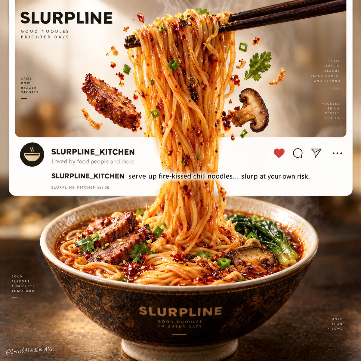
color_palette · high-contrastcolor_palette · warm-tonescomposition · centeredcomposition · close-uplighting · studio-lightmood · luxurious
提示词(原文,逐字保留)
A food poster feels more physical when one action breaks the layout.
🍊 one continuous bundle of glossy noodles lifted from the top window, passing through the interface band, and landing in the bowl below
The strands turn three separate zones into one uninterrupted movement.
✨ align chopsticks, suspended noodles, and bowl on one central vertical axis
Your eye travels straight through the graphic card into the food, making the “screen-to-table” idea instantly visible.
GPT- image 2.5 prompt👇
A hyper-real premium food poster advertisement for a fictional noodle brand called SLURPLINE, refined into an Orbit-plus-Transit-plus-Port direction where the original social-post skeleton remains intact, the lifted noodle action becomes more iconic, the flavor system becomes series-ready, and the interface language is reduced into a cleaner curated structure. The composition is a tall vertical social-feed-inspired poster with three zones: an upper food-image window, a middle minimalist interaction-caption band, and a lower real-world bowl zone. The food remains the absolute hero. A pair of dark wooden chopsticks enters from the upper right and lifts a dramatic bundle of glossy fire-kissed chili noodles upward, the strands hanging long, springy, and heavy with believable tension. The noodles pass through the clean interface band and visually connect to the bowl below, making the food feel as if it is escaping the screen into physical space.
Framing and composition: vertical hero poster, strong central axis, clean white social-card borders, top image window occupying the upper third, a reduced minimalist social band in the middle, and a large ceramic bowl anchored in the lower third. Keep the noodle lift as the main visual force line. The chopsticks, suspended noodle bundle, and bowl must align into one clear top-to-bottom movement. Floating garnish elements are fewer but more intentional than before: a few crisp ingredient fragments, herb leaves, and droplets placed in balanced suspension around the lifted strands. Preserve the recognizable social-post architecture, but make it feel more premium, restrained, and design-forward.
Subject design: the noodles are thin, elastic, richly coated, vivid chili-gold, and highly appetizing, with a glossy light oil sheen and subtle steam warmth. Make the flavor direction stronger and more adaptable: the bowl reads as a luxe spicy chili noodle base that can flex toward chili-garlic, sesame tantan, or black garlic heat while keeping the same visual structure. Around the lifted strands, place a few carefully chosen floating cues: one or two caramelized protein slices, one mushroom piece, tiny chopped herbs, and a few crisp fried garnish fragments. The bowl below is a restaurant-grade ceramic bowl with a warm dark glaze, subtle ornamental pattern, white rim and foot, filled with rich amber-red broth, coiled noodles, green vegetables, and restrained toppings. The bowl must feel authentic, premium, and grounded.
Interface and typography: the middle band clearly suggests a social-feed post but is cleaner and more minimal than a literal app screenshot. Use exact visible copy as follows: handle name "SLURPLINE\_KITCHEN", social line "Loved by food people and more", caption text "SLURPLINE\_KITCHEN serve up fire-kissed chili noodles... slurp at your own risk.", and a secondary brand line near the lower-left of the band reading exactly: "SLURPLINE\_KITCHEN est 26". Keep the icon set sparse and elegant, with only essential interaction cues. Typography must be crisp, premium, modern sans-serif, and never compete with the noodles.
Lighting and color: warm commercial food lighting with a soft key from upper left, subtle frontal fill, stronger highlights on the suspended strands, and richer warmth in the broth and bowl. Build clear depth between the bright top image panel, the clean white middle band, and the warm darker lower bowl zone. Palette balance: 60% ivory white, noodle gold, and warm neutral highlights; 30% chili orange, broth amber, and dark ceramic brown; 10% herb green and small red spice accents. Increase contrast so the noodle lift feels more sculptural and the bowl more luxurious, without muddy broth or dirty whites.
Materials and finish: hyper-real food advertising photography fused with polished graphic poster design. Show glossy noodle coating, subtle steam softness, ceramic glaze detail, broth shine, crisp garnish textures, and precise card/interface clarity. The whole finish should feel like a Cannes-level restaurant campaign: craveable, contemporary, smart, and easy to extend into a series.
Output and constraints: premium food poster, product-first hierarchy, no copied source text, no real platform names, no people, no extra props, no chaotic clutter. Keep noodle geometry natural, chopstick grip believable, bowl perspective correct, floating ingredients physically consistent, and typography crisp. Avoid broken strands, malformed noodles, greasy muddy broth, warped bowl perspective, unreadable text, excessive garnish, random utensils, AI gibberish text, dead shadows, or drift away from high-end commercial food realism.
中文译文
当一个动作打破版式时,美食海报会显得更具实体感。
🍊 一束连续的、光泽油亮的面条从顶部窗口被夹起,穿过中间的界面带,落入下方的碗中
面条的丝缕将三个独立区域连成一次不间断的动作。
✨ 让筷子、悬空的面条与碗对齐在同一条中央垂直轴上
视线可以顺着图形卡片直接穿过食物进入画面,让“屏幕到餐桌”的概念一眼可见。
GPT- image 2.5 prompt👇
为虚构的面条品牌 SLURPLINE 打造的一张超写实高端美食海报广告,凝练为 Orbit-plus-Transit-plus-Port 方向:保留原有的社交帖骨架,让“夹起面条”的动作更具标志性,让风味系统具备系列化延展性,让界面语言收敛为更干净、更策展化的结构。整体构图是一张高挑的竖版社交信息流风格海报,分为三个区域:上方的食物图片窗口、中间的极简互动文案带、下方的真实碗具区域。食物仍是绝对主角。一双深色木筷从右上方入场,将一束极具戏剧感的、光泽诱人的“火吻辣面”高高夹起,面条垂坠、修长、富有弹性,并带着可信的张力感。面条穿过干净的界面带,与下方的碗在视觉上相连,让食物仿佛正从屏幕中逃逸到现实空间里。
构图与取景:竖版主角海报,强中央轴线,干净的白色社交卡片边框,顶部图片窗口占据上三分之一,中间是收敛的极简社交带,下三分之一锚定一只大型陶瓷碗。将“面条被夹起”作为主要的视觉力线。筷子、悬空的面条束与碗必须对齐为一条清晰的由上至下的动线。漂浮的点缀元素比之前更少但更具意图性:在悬空面条周围以平衡的悬浮状态布置少量酥脆的食材碎片、香草叶与油滴。保留可辨识的社交帖结构,但让整体感觉更高端、更克制、更具设计感。
主体设计:面条纤细、有弹性、裹汁饱满、呈现鲜明的辣椒金色,且极具食欲,表面有一层光泽的薄油光泽与柔和的热气暖意。让风味方向更鲜明、更有延展性:碗底呈现为豪华辣味基底,可灵活切换为蒜辣、芝麻担担或黑蒜风味,同时保持同一套视觉结构。在悬空面条周围布置少量精心挑选的漂浮提示:一两片焦糖化的蛋白片、一块蘑菇、少许切碎香草,以及少量酥脆炸物碎屑。下方的碗是一只餐饮级陶瓷碗,釉面呈温暖深色,带有低调的装饰纹样,白色碗沿与碗足,盛着浓郁的琥珀红色汤汁、盘绕的面条、绿色蔬菜与克制的配料。碗必须显得真实、高级、沉稳。
界面与排版:中间带要明确暗示社交信息流的帖子感,但比真实的 App 截图更干净、更极简。使用以下精确可见文案:账号名 "SLURPLINE\_KITCHEN",社交行 "Loved by food people and more",文案正文 "SLURPLINE\_KITCHEN serve up fire-kissed chili noodles... slurp at your own risk.",以及一条位于中间带左下方的辅助品牌行,文案必须完全一致地写为:"SLURPLINE\_KITCHEN est 26"。图标组保持稀少而优雅,只保留必要的互动提示。字体必须清晰、高级、现代无衬线,绝不能与面条抢戏。
光影与色彩:温暖的商业美食灯光,主光从左上方柔和打入,轻微正面补光,对悬空面条施加强高光,汤汁与碗中带更浓郁的温度感。在明亮的上图面板、干净的白色中间带与温暖的下方深色碗区之间建立清晰层次。配色比例:60% 象牙白、面条金与暖中性高光;30% 辣椒橙、汤汁琥珀与深陶瓷棕;10% 香草绿与少量红色香料点缀。提升对比度,让“夹起的面条”更具雕塑感,让碗更具奢华感,避免汤汁浑浊或白色发灰。
材质与质感:超写实美食广告摄影融合精致的图形海报设计。表现光泽的面条挂汁、柔和的热气、陶瓷釉面细节、汤汁光泽、酥脆的配料质感,以及精确的卡片/界面清晰度。整体成品应像戛纳级别的餐厅广告战役:诱人、现代、聪明,并且易于延展为系列作品。
输出与约束:高端美食海报,产品优先层级,不得抄写源文本中的内容,不出现真实平台名称,不出现人物,不出现多余道具,不出现混乱堆砌。保持面条形态自然、筷子的握法可信、碗的透视正确、漂浮食材物理一致、字体清晰锐利。避免出现断裂的面条、畸形的面条、油腻浑浊的汤汁、变形的碗体透视、无法辨识的文字、过度的配料、随意的餐具、AI 胡编的乱文、呆滞的阴影,或偏离高端商业美食写实感的飘移。
来源与署名
原文由 @ou_zhen599 发布在 X:查看原推文。 本页逐字保留原文并提供机器翻译的中文解读;版权归原作者所有。
同工具的更多提示词
- GPT Image 2.5 在 CHATGPT 上 每一座纪念碑都有一份无人见过的测绘图。 比萨斜塔,在纸面上重新测量。 四块图版,一座塔,一位测绘员。 完整…@sebatheepan
- 想让早餐感觉像安慰,而不只是食物?在加更多配料之前,先改变比例尺度。 🧸 在下方中央放置一座巨大的煎饼堆,顶部煎饼上躺着一位娇小的成年人物 食物变成柔软的风景…@ou_zhen599
- 👇 👇 创作一幅可收藏的复古汽车工程海报,展示四款传奇经典超级跑车:法拉利 F40(1989)、兰博基尼 Countach 5000 QV(1985)、保时捷…@iamrealsnow
- 竖幅 2:3 的高级科幻艺术摄影,一片无边界的冷白盐霜荒原,大片空白天空占画面上半部。左侧近景站立一名无身份特征的未来巡守者,穿象牙白长款结构风衣与哑光复合材…@listudio
- 超写实复古 Y2K 夏季时尚人像,竖向 2:3 比例,采用怀旧的 2000 年代傻瓜胶片机摄影美学拍摄。 她拥有一头浓密、自然蓬松的深巧克力棕色长发,带有细腻…@AIwithSarah_
- 单一超高垂直体量对抗广阔雪原;建筑略偏左,天空和右侧山坡形成负空间;红色实体与黑色缝隙产生强烈图底关系;人物极小用于尺度参照;雾遮山脊;红光沿地面延展;长曝光…@listudio