为高级薯条制作一整张高端广告海报,竖版 3:4 比例。
分享链接 · https://openimages.ajiang.me/p/2096603668095086797/
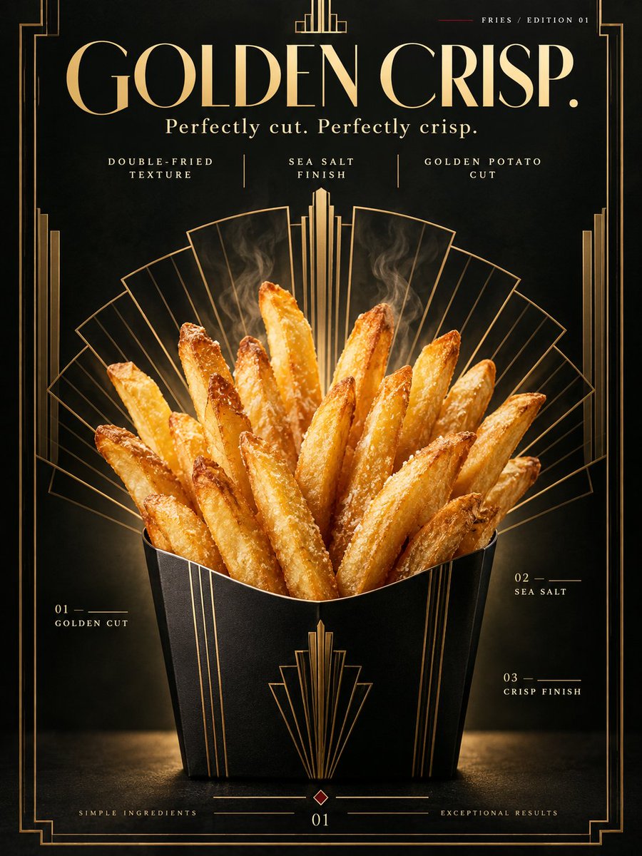
color_palette · dark-moodycomposition · symmetrymood · elegantmood · luxuriousquality_flags · embedded-textsubject_type · food-drink
提示词(原文,逐字保留)
Create one complete high-end advertising poster for premium French fries, vertical 3:4 aspect ratio.
SELECTED STYLE:
Art Deco × Quiet Luxury Food Advertising — geometric elegance, luxurious symmetry, sculptural food styling, restrained glamour, premium editorial typography.
The poster should feel like:
a luxury food campaign,
a boutique restaurant brand poster,
a high-end hospitality advertisement,
a contemporary reinterpretation of 1920s Art Deco design.
NOT a cheap fast-food flyer.
NOT a delivery-app promotion.
NOT a menu board.
────────────────────
CORE CREATIVE CONCEPT:
“GOLDEN CRISP.”
Transform French fries into a sculptural golden centerpiece.
The fries should rise upward like an elegant fan-shaped architectural formation,
almost like a radiant Art Deco skyline made of food.
The visual impression should communicate:
crispness,
warmth,
precision,
luxury,
desire.
The fries must feel simple,
but elevated to an iconic premium object.
────────────────────
PRODUCT:
Show one serving of premium French fries as the absolute hero.
The fries should look:
freshly cooked,
golden,
crisp,
thick-cut but refined,
slightly irregular and natural,
lightly salted,
hot and irresistible.
Use fries with realistic variation in shape and browning.
Some fries are straighter,
some slightly curved,
some darker at the edges.
Avoid identical factory-uniform fries.
The fries should have:
golden-yellow surface,
slightly blistered crisp exterior,
fine salt crystals,
tiny surface texture,
subtle matte oil sheen,
soft steam hint.
Container:
Use a refined matte-black or deep dark green serving vessel,
such as a minimal paper carton, ceramic cup, or small structured serving box.
The container should feel premium and graphic,
not cheap fast-food packaging.
────────────────────
MAIN COMPOSITION:
Single complete 3:4 vertical poster.
Place the fries slightly below center.
The fries and container occupy approximately 50–55% of the canvas height.
Arrange the fries in a controlled upward fan shape.
The composition should feel symmetrical or near-symmetrical,
with strong verticality.
The fries should resemble:
a crown,
a sunburst,
or an Art Deco tower cluster.
Keep the product fully visible.
Do not crop away the serving vessel.
────────────────────
BACKGROUND:
Use a deep luxurious background.
Primary tone:
black lacquer,
deep charcoal,
or very dark emerald green.
The background should feel rich and smooth.
No restaurant environment.
No kitchen.
No table setting.
No human presence.
This is a graphic poster space,
not a real room.
Add subtle Art Deco geometry in the background:
radiating lines,
stepped fan motifs,
fine gold linework,
layered arches,
streamlined symmetrical framing.
These elements must remain elegant and restrained.
They should support the fries,
not overpower them.
────────────────────
PRIMARY DESIGN DEVICE:
Behind the fries,
create a large Art Deco sunburst or fan-shaped geometric halo.
Use thin metallic-gold lines spreading upward and outward.
The sunburst should align with the shape of the fries,
making the fries feel like the radiant center of the composition.
The geometry should be very refined:
thin gold rules,
stepped arches,
symmetrical vertical accents,
subtle ornamental framing.
Do not make it gaudy.
Do not overdecorate.
────────────────────
COLOR SYSTEM:
Primary:
deep black,
charcoal,
or dark emerald.
Secondary:
metallic gold,
aged brass,
warm ivory.
Food colors:
golden yellow,
toasted amber,
slight warm brown.
Accent:
one tiny area of deep vermilion or burgundy.
Use the accent sparingly,
only for one small line,
one small dot,
or one tiny typographic detail.
No neon colors.
No cheap red-and-yellow fast-food palette.
────────────────────
LIGHTING:
Use premium commercial food photography lighting.
Main light:
a warm diffused spotlight from upper front.
Add controlled side highlights to reveal:
crisp edges,
salt crystals,
surface texture,
slight oil sheen.
Use a subtle rim light from behind
to separate the fries from the dark background.
The fries should glow warmly against the darker environment.
The lighting must make the fries feel:
fresh,
hot,
premium,
architectural.
No harsh flash.
No flat lighting.
No greasy overexposure.
────────────────────
STEAM:
Add only a very subtle amount of heat haze or soft steam rising from the fries.
It should be delicate and believable.
The steam should catch the light slightly,
but must not become a smoke effect.
────────────────────
MAIN TYPOGRAPHY:
Headline:
“GOLDEN
CRISP.”
Use large uppercase typography.
Place in the upper-left area or centered above the fries.
Typography should feel:
elegant,
architectural,
precise,
luxurious.
Use an Art Deco-inspired typeface or a refined high-contrast modern display font.
Color:
warm ivory or metallic pale gold.
Do not use playful diner fonts.
────────────────────
SECONDARY TYPOGRAPHY:
Small eyebrow text:
“FRIES / EDITION 01”
Place near the top-right margin.
Tiny uppercase letters with wide tracking.
Supporting copy:
“Perfectly cut.
Perfectly crisp.”
Place beneath the main headline.
Add three restrained feature lines:
“DOUBLE-FRIED TEXTURE”
“SEA SALT FINISH”
“GOLDEN POTATO CUT”
Use small, clean editorial text.
────────────────────
EDITORIAL DETAILS:
Add a few minimal decorative information elements:
01 — GOLDEN CUT
02 — SEA SALT
03 — CRISP FINISH
Use thin guide rules or short lines.
These should feel like luxury catalogue annotations,
not technical diagrams.
Add one small geometric page-number detail:
“01”
Somewhere near the bottom margin.
────────────────────
GRAPHIC ELEMENTS:
Only use:
thin metallic-gold lines,
one small decorative dot or square,
a stepped Art Deco frame,
one small burgundy accent line,
subtle symmetrical line motifs.
Do not clutter the poster.
Every decorative element must feel intentional.
────────────────────
VISUAL HIERARCHY:
LEVEL 01:
French fries.
LEVEL 02:
Art Deco golden geometry.
LEVEL 03:
GOLDEN CRISP.
LEVEL 04:
supporting copy.
LEVEL 05:
small editorial annotations.
The fries must remain the emotional center of the image.
────────────────────
DESIGN ATTITUDE:
Think:
luxury hotel restaurant campaign,
Vogue food editorial,
Art Deco poster revival,
premium hospitality branding,
museum-quality commercial design,
award-winning food advertising.
The image should feel expensive because of:
restraint,
symmetry,
material contrast,
typographic elegance,
and lighting precision.
────────────────────
DO NOT USE:
cheap fast-food styling,
bright ketchup-red background,
yellow-and-red combo branding,
cartoon fries,
smiley faces,
flying fries explosion,
sauce splashes,
restaurant tray,
plastic table,
paper napkin clutter,
burger combo meal,
cola,
price text,
discount badge,
QR code,
logo,
watermark,
people,
hands,
kitchen background,
wood table,
retro diner clichés.
────────────────────
AI QUALITY CONTROL:
one serving of fries only,
no duplicate or deformed fries,
no strange potato shapes,
no plastic texture,
no soggy appearance,
no burnt-black fries,
no fake text gibberish,
clean premium typography,
elegant Art Deco geometry,
strong visual symmetry,
high-end food realism,
single complete poster.
────────────────────
FINAL VISUAL IMPRESSION:
golden,
luxurious,
crisp,
graphic,
symmetrical,
editorial,
premium,
refined,
appetizing,
iconic,
high-design,
award-worthy.
Keywords:
3:4 vertical fries poster,
premium French fries,
Art Deco food advertising,
luxury hospitality poster,
golden fries,
high-end food photography,
black and gold palette,
editorial typography,
symmetrical composition,
quiet luxury food campaign,
premium restaurant branding,
Behance-level art direction
中文译文
为高级薯条制作一整张高端广告海报,竖版 3:4 比例。
选定风格:
Art Deco × 静奢美食广告 —— 几何优雅、奢华对称、雕塑般的食物造型、克制的魅力、高端编辑级字体设计。
海报应让人感觉像:
一场奢华美食广告大片,
一家精品餐厅的品牌海报,
一则高端酒店餐饮广告,
一场对 1920 年代 Art Deco 设计的当代重释。
不是廉价的快餐传单。
不是外卖 App 的促销图。
不是菜单牌。
────────────────────
核心创意概念:
“GOLDEN CRISP.”(金酥。)
将薯条转化为一座雕塑般的金色主角。
薯条应如优雅的扇形建筑结构般向上升起,
几乎像由食物构成的、放射状的 Art Deco 天际线。
视觉印象应传达:
酥脆,
温暖,
精准,
奢华,
渴望。
薯条必须保持简洁,
却被提升为标志性的高级物件。
────────────────────
产品:
仅展示一份高级薯条,作为绝对主角。
薯条应呈现:
新鲜现炸,
金黄,
酥脆,
粗切但精致,
略带自然不规则感,
轻洒盐,
滚烫诱人。
使用形状与上色具有真实变化的薯条。
有的较直,
有的略弯,
有的边缘色泽更深。
避免完全一致的工厂标准化薯条。
薯条应具有:
金黄色表面,
略带起泡的酥脆外皮,
细小的盐晶,
细微的表面纹理,
克制的哑光油光,
柔和的蒸汽暗示。
容器:
使用精致的哑光黑或深墨绿色盛器,
例如极简的纸盒、陶瓷杯或小巧结构化的外卖盒。
容器应显得高级且图形化,
而非廉价快餐包装。
────────────────────
主构图:
单张完整的 3:4 竖版海报。
将薯条置于略低于画面中心的位置。
薯条与容器约占画面高度的 50–55%。
将薯条排列为受控的向上扇形。
构图应保持对称或近对称,
具有强烈的竖向感。
薯条应让人联想到:
皇冠,
太阳光芒,
或 Art Deco 塔群。
保持产品完整可见。
不要裁切掉盛器。
────────────────────
背景:
使用深沉奢华的背景。
主色调:
黑漆色,
深炭灰,
或极深的翡翠绿。
背景应显得丰盈而平滑。
不要餐厅环境。
不要厨房。
不要桌面陈设。
不要人物。
这是平面海报空间,
而非真实的房间。
在背景中加入微妙的 Art Deco 几何元素:
放射状线条,
阶梯式扇形图案,
纤细的金色线稿,
层层叠叠的拱形,
流线型对称框架。
这些元素必须保持优雅与克制。
它们应衬托薯条,
而非喧宾夺主。
────────────────────
主要设计装置:
在薯条后方,
构建一个大型 Art Deco 太阳光芒或扇形的几何光环。
使用纤细的金属金线条向上、向外扩散。
太阳光芒应与薯条形状对齐,
让薯条成为构图的放射状中心。
几何应非常精致:
纤细的金色规线,
阶梯式拱门,
对称的纵向装饰,
细腻的装饰性框架。
不可流于俗艳。
不可过度装饰。
────────────────────
色彩体系:
主色:
深黑,
炭灰,
或深翠绿。
次色:
金属金,
古铜黄,
暖象牙白。
食物色:
金黄,
烤琥珀色,
略暖的棕色。
点缀色:
一小块深朱红或酒红色。
点缀色应极其节制,
仅用于一处细线、
一个圆点,
或一处微小的字体细节。
不要霓虹色。
不要廉价红黄快餐配色。
────────────────────
光线:
使用高端商业美食摄影光线。
主光:
来自正上方的暖色柔光聚光。
加入受控的侧面高光以呈现:
酥脆边缘,
盐晶,
表面纹理,
微妙油光。
从背后加入一束柔和的轮廓光,
将薯条从深色背景中分离出来。
薯条应在较暗环境中散发出温暖光泽。
光线必须让薯条感觉:
新鲜,
滚烫,
高级,
建筑感。
不要刺眼的闪光。
不要平淡的光线。
不要油腻的过曝。
────────────────────
蒸汽:
仅添加极其微弱的上升热气或柔和蒸汽。
应当纤细而真实。
蒸汽应略微捕捉光线,
但绝不能变成烟雾效果。
────────────────────
主字体:
主标题:
“GOLDEN
CRISP.”
使用大号大写字体。
置于左上方或薯条正上方居中。
字体应显得:
优雅,
建筑感,
精准,
奢华。
使用 Art Deco 风格的字体或精致高对比度的现代展示字体。
颜色:
暖象牙白或金属浅金色。
不要使用俏皮的 diner 字体。
────────────────────
次要字体:
小号眉题文字:
“FRIES / EDITION 01”
置于右上边距附近。
微小的大写字母,字距宽松。
辅助文案:
“Perfectly cut.
Perfectly crisp.”
置于主标题下方。
加入三行克制的特性文案:
“DOUBLE-FRIED TEXTURE”
“SEA SALT FINISH”
“GOLDEN POTATO CUT”
使用小巧、干净的编辑级文字。
────────────────────
编辑级细节:
添加少量极简的装饰信息元素:
01 — GOLDEN CUT
02 — SEA SALT
03 — CRISP FINISH
使用纤细的引导规线或短线。
这些应感觉像奢华产品目录的注释,
而非技术示意图。
加入一个小型几何页码细节:
“01”
置于底部边距附近某处。
────────────────────
图形元素:
仅使用:
纤细的金属金线条,
一个小型装饰圆点或方块,
阶梯式 Art Deco 边框,
一条小型酒红色点缀线,
克制的对称线纹。
不要让海报显得杂乱。
每一个装饰元素都应有意为之。
────────────────────
视觉层级:
第一层级:
薯条。
第二层级:
Art Deco 金色几何。
第三层级:
GOLDEN CRISP.
第四层级:
辅助文案。
第五层级:
小型编辑注释。
薯条必须始终是图像的情感中心。
────────────────────
设计态度:
请想象:
奢华酒店餐厅广告大片,
《Vogue》美食编辑大片,
Art Deco 海报复兴风,
高端酒店品牌,
博物馆级商业设计,
获奖美食广告。
图像之所以应显得昂贵,是因为:
克制,
对称,
材质对比,
字体优雅,
以及布光的精准。
────────────────────
不得使用:
廉价快餐造型,
刺眼的番茄红背景,
红黄组合的品牌配色,
卡通薯条,
笑脸,
薯条飞舞爆炸效果,
酱汁飞溅,
餐厅托盘,
塑料餐桌,
纸巾杂乱堆放,
汉堡套餐,
可乐,
价格文字,
折扣徽章,
QR code(二维码),
logo(标志),
watermark(水印),
人物,
手部,
厨房背景,
木桌,
复古 diner 老套元素。
────────────────────
AI 质量控制:
仅一份薯条,
无重复或畸形的薯条,
无怪异的土豆形状,
无塑料质感,
无疲软外观,
无烧焦发黑的薯条,
无虚假乱码文字,
干净高级的字体,
优雅的 Art Deco 几何,
强烈的视觉对称,
高端美食真实感,
单张完整海报。
────────────────────
最终视觉印象:
金色,
奢华,
酥脆,
图形化,
对称,
编辑级,
高级,
精致,
诱人,
标志性,
高设计感,
获奖水准。
关键词:
3:4 竖版薯条海报,
高级薯条,
Art Deco 美食广告,
奢华酒店海报,
金黄薯条,
高端美食摄影,
黑金配色,
编辑级字体,
对称构图,
静奢美食广告,
高端餐厅品牌,
Behance 级艺术指导
来源与署名
原文由 @hellsing00fl 发布在 X:查看原推文。 本页逐字保留原文并提供机器翻译的中文解读;版权归原作者所有。
同工具的更多提示词
- 极简暖米色影棚中的超写实奢华时尚大片。一位迷人的成年金发女模特,长而柔软的波浪卷发优雅地摆姿势,身旁是一匹雄伟的全尺寸纯白马,马佩戴着带有细腻金色五金件的逼真…@sha_zdiii
- 这些设定图是怎么做出来的。共 3 步,中间那一步是故意会失败的。 1. 先在 Midjourney 里把角色捏出来。先把脸调到满意,再考虑设定图的事。 2.…@Iancu_ai
- 【角色池】 不知火舞、蒂法、2B、艾达·王、吉尔·瓦伦丁、春丽、阿狸、雷电将军、八重神子、卡芙卡、娜美、女帝、纲手、明日香、约尔。 【随机场景池】 漫展会场、…@DeepBlueX0
- 一张照片写实风格的室内人像照,画面中一位年轻女子站在一间温馨复古卧室里,旁边是一面带大型复古木框的镜子。她留着深棕色中分长直发,妆容柔和自然,戴着精致的耳饰…@Aqsahere_
- 为 [LOCATION](地点)创作一张高级纵向 4:5 旅行海报,灵感来自一套优雅的复古邮票收藏。使用温暖的象牙白纸张背景,搭配细腻的纸张纹理、柔和的阴影与…@Goodmanprotocol
- 一张写实风格的印刷海报,铺满整个画面边缘到边缘,正面平铺拍摄,方形构图,没有房间、没有墙壁、没有图钉。厚奶油色纸张上的科学图版:五件个人声音的器物,于2150…@TraffAlex