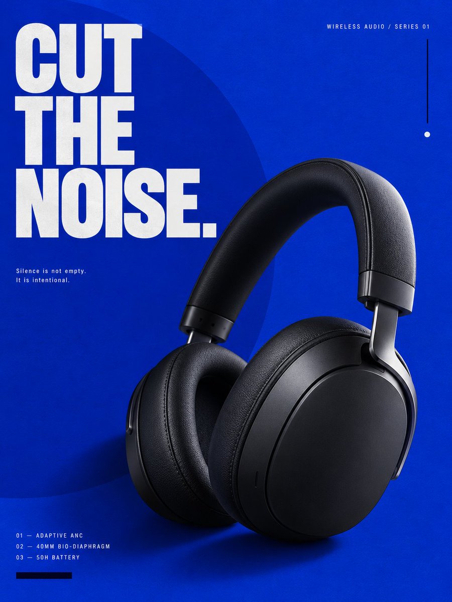
为一款高端蓝牙无线头戴式耳机制作一张完整的高端广告海报,垂直 3:4 比例。 选定风格:Klein Blue(克莱因蓝)——极致单色视…
分享链接 · https://openimages.ajiang.me/p/2096543815238902057/
composition · negative-spacelighting · studio-lightquality_flags · embedded-textquality_flags · typography-heavyscene · studiosubject_type · graphic-design
提示词(原文,逐字保留)
Create one complete high-end advertising poster for a premium Bluetooth wireless over-ear headphone, vertical 3:4 aspect ratio. SELECTED STYLE: Klein Blue — extreme monochromatic visual language, intense saturated ultramarine blue, radical simplicity, sculptural product photography, conceptual editorial layout, gallery-poster aesthetics. The poster should feel like a crossover between: high-end industrial design, contemporary art exhibition graphics, luxury fashion campaign, experimental editorial design, premium consumer electronics branding. Do NOT make it look like a conventional technology advertisement. ──────────────────── CORE CONCEPT: “CUT THE NOISE.” The entire poster is built around one strong visual contradiction: an extremely saturated Klein-blue field versus a matte-black sculptural wireless headphone. The headphone should feel like a precise dark object suspended inside a field of pure color. The visual language should communicate: silence, focus, control, clarity, premium sound. ──────────────────── PRODUCT: Show one complete pair of premium unbranded Bluetooth over-ear headphones. Wireless only. No visible audio cable. Industrial design: large oval circumaural earcups, deep ergonomic ear cushions, matte graphite-black shell, soft-touch headband, precision-machined aluminum yokes, dark titanium joints, minimal buttons, hidden microphones, subtle tactile controls, clean seamless geometry. The product must feel: premium, real, manufacturable, minimal, architectural. Not gaming. Not DJ. Not cheap plastic. Not futuristic fantasy hardware. ──────────────────── PRODUCT SELLING POINTS: Use only three: ADAPTIVE ANC 40MM BIO-DIAPHRAGM DRIVER 50H BATTERY LIFE Do not display more than three major specifications. ──────────────────── MAIN COMPOSITION: Single complete 3:4 vertical poster. Use a radical asymmetric editorial composition. Place the headphone in the lower-right central region, occupying approximately 48–55% of the canvas. The headphone should be shown in a strong three-quarter perspective. Rotate approximately 10 degrees. The headband rises diagonally toward the upper-right area. One earcup faces the viewer, while the second remains partially visible behind it. The product should feel sculptural, almost like a museum object. Do NOT center the product. ──────────────────── BACKGROUND: Use one continuous, extremely saturated deep Klein-blue background. Color impression: International Klein Blue, deep ultramarine, very high chroma, rich pigment density. No gradient. No atmospheric environment. No room. No landscape. No digital sci-fi background. No particles. No waveforms. No neon glow. The blue itself is the visual environment. Add an extremely subtle matte pigment texture, similar to painted art paper or screen-printed ink. The texture should only become visible at close inspection. ──────────────────── PRIMARY GRAPHIC ELEMENT: Introduce one enormous geometric circle. The circle should occupy approximately 45–50% of the poster. Position it slightly outside the left edge, so only around 65% of the circle remains visible. Color: slightly lighter or darker Klein blue, only 5–8% tonal difference from the background. The circle must be subtle. It should not become a bright decorative shape. Its purpose is to create invisible visual gravity. The headphone may overlap the circle slightly. ──────────────────── SECONDARY GRAPHIC SYSTEM: Use only three additional graphic elements: one thin vertical black line, one tiny white circular index mark, one narrow horizontal black rectangle. Nothing else. Avoid decorative clutter. Every element must align to an invisible editorial grid. ──────────────────── MAIN TYPOGRAPHY: Headline: “CUT THE NOISE.” Use extremely large uppercase modern grotesk typography. Place the headline in the upper-left area. Three stacked lines. Typography should occupy approximately 30–35% of the poster width. Use: bold, condensed, precise, architectural, modern sans-serif typography. Color: pure off-white. Not bright glowing white. The typography should have strong contrast against the Klein-blue background. ──────────────────── TYPOGRAPHIC TENSION: Do not place the headline perfectly inside safe margins. Allow: the “C” of CUT to approach the left edge, the word “NOISE.” to partially overlap an invisible grid line, one word may sit behind a small part of the headphone headband. The layout should feel intentionally designed, not automatically centered. ──────────────────── SECONDARY TYPOGRAPHY: Small top eyebrow: “WIRELESS AUDIO / SERIES 01” Place near the top-right margin. Use tiny uppercase typography with wide tracking. Additional micro-copy: “ADAPTIVE ANC” “40MM BIO-DIAPHRAGM” “50H BATTERY” Place the three specifications vertically along the lower-left edge. Use small off-white typography. Add small numerical labels: 01 02 03 before each specification. Example: 01 — ADAPTIVE ANC 02 — 40MM BIO-DIAPHRAGM 03 — 50H BATTERY The typography should feel closer to editorial catalogue information than marketing copy. ──────────────────── MICRO TYPOGRAPHY: Add one tiny sentence: “Silence is not empty. It is intentional.” Place this near the middle-left area. Very small text. Two lines maximum. Large amount of negative space around it. ──────────────────── PRODUCT LIGHTING: Use premium product-photography lighting. One large diffused softbox from upper-left. A narrow white edge highlight along the right side of the headband. Very subtle reflected blue light from the background. Metal yokes should show controlled cold highlights. Ear cushions should reveal: fine leather grain, micro wrinkles, soft compression, precision stitching. Matte surfaces should remain matte. Do not make everything glossy. ──────────────────── SHADOW: Create one strong but soft sculptural shadow behind the headphone. The shadow should fall slightly toward the lower-left. Do not use a realistic floor. The shadow floats directly onto the blue background, similar to high-end studio still-life photography. The shadow must add physical depth without creating an environment. ──────────────────── COLOR SYSTEM: Approximately: 82% Klein blue 12% matte black / graphite product 5% off-white typography 1% secondary black graphic details No other colors. No red. No cyan. No purple. No rainbow. No metallic gold. No gradient. ──────────────────── DESIGN PRINCIPLE: Use reduction instead of decoration. The premium feeling must come from: scale, spacing, color confidence, precise typography, product texture, visual hierarchy, negative space. Not from effects. ──────────────────── VISUAL HIERARCHY: LEVEL 01: Klein-blue field + black headphone silhouette. LEVEL 02: CUT THE NOISE. LEVEL 03: Product details and sculptural lighting. LEVEL 04: Technical micro-copy. LEVEL 05: Tiny editorial symbols. The poster should remain powerful even when viewed as a small thumbnail. ──────────────────── OPTIONAL CROPPING DEVICE: Allow one small portion of the headphone headband to move close to the poster edge, but the complete headphone must still remain visually understandable. Do not crop away an entire earcup. Do not hide critical product structure. ──────────────────── DESIGN ATTITUDE: Think: international art-direction studio, European design museum poster, experimental audio brand identity, luxury fragrance campaign translated into technology, Japanese editorial restraint, Swiss typographic discipline, high-fashion campaign photography, premium industrial-design catalogue. The poster should feel expensive because it refuses to over-explain. ──────────────────── IMPORTANT NEGATIVE CONSTRAINTS: No cyberpunk. No futuristic city. No RGB. No glowing waveforms. No particle explosions. No holographic interface. No glass cards. No Bento UI. No black gradient technology background. No abstract sound-wave tunnel. No floating technical components. No generic blue energy. No gaming aesthetic. No Amazon product listing. No e-commerce feature boxes. No discount text. No price. No QR code. No fake logo. No people. No hands. No smartphone. No laptop. No audio cable. No watermark. ──────────────────── PRODUCT ACCURACY: one complete wireless headphone, two correctly constructed earcups, one continuous headband, correct left-right geometry, realistic hinges, realistic ear cushion depth, no duplicated components, no deformed headband, no impossible joints, no floating buttons, no broken industrial geometry. ──────────────────── TYPOGRAPHY ACCURACY: Render the main headline exactly: “CUT THE NOISE.” Supporting text must remain minimal and correctly spelled. Avoid meaningless pseudo-English. Avoid random filler paragraphs. ──────────────────── FINAL VISUAL IMPRESSION: bold, cultured, minimal, graphic, luxurious, confident, art-directed, iconic, contemporary, editorial, museum-grade, high-fashion technology. Keywords: 3:4 vertical poster, premium Bluetooth headphones, Klein blue poster, International Klein Blue, luxury audio advertising, minimal editorial design, Swiss typography, experimental product campaign, modern grotesk typography, negative space, sculptural product photography, high-end industrial design, fashion campaign aesthetics, gallery poster, contemporary graphic design, Behance-level art direction
中文译文
为一款高端蓝牙无线头戴式耳机制作一张完整的高端广告海报,垂直 3:4 比例。 选定风格:Klein Blue(克莱因蓝)——极致单色视觉语言,浓郁饱和的群青蓝,激进极简,雕塑感产品摄影,概念性编辑排版,画廊海报美学。 海报应呈现出以下交叉融合感:高端工业设计、当代艺术展览视觉、奢华时尚大片、实验性编辑设计、高端消费电子品牌。 不要让它看起来像常规的科技广告。 ──────────────────── 核心概念: “CUT THE NOISE.”(切断噪音。) 整张海报围绕一个强烈的视觉矛盾构建:极致饱和的克莱因蓝色块 vs 一只哑光黑色的雕塑感无线耳机。 耳机应如同一件精密的深色物体悬浮于纯色场域之中。 视觉语言应传达:静默、专注、控制、清晰、高端音质。 ──────────────────── 产品:展示一副完整的、无品牌的、优质的蓝牙头戴式耳机。 仅无线款。 不出现可见的音频线材。 工业设计:大型椭圆形包耳式耳罩,深度人体工学耳垫,哑光石墨黑外壳,触感柔软的头梁,精密加工铝制支架,深色钛合金关节,极简按键,隐藏式麦克风,细腻触感控制,干净无缝的几何形态。 产品必须感觉:高端、真实、可制造、极简、建筑感。 不要游戏风。不要 DJ 风。不要廉价塑料感。不要未来幻想硬件。 ──────────────────── 产品卖点(仅使用三项): ADAPTIVE ANC(自适应主动降噪) 40MM BIO-DIAPHRAGM DRIVER(40mm 生物振膜单元) 50H BATTERY LIFE(50 小时续航) 不得展示超过三项主要规格。 ──────────────────── 主体构图:一张完整的 3:4 垂直海报。 使用激进的非对称编辑式构图。 将耳机放置于右下中央区域,占画布约 48–55%。 耳机应以强烈的 3/4 透视呈现。 旋转约 10 度。 头梁斜向右上区域上扬。 一只耳罩朝向观者,第二只耳罩在其后部分可见。 产品应呈现雕塑感,近乎博物馆藏品。 不要把产品居中。 ──────────────────── 背景:使用一整片连续、极度饱和的深克莱因蓝背景。 色彩印象:International Klein Blue(国际克莱因蓝),深群青,极高色度,浓郁颜料密度。 不要渐变。 不要大气环境。 不要房间。 不要风景。 不要数字科幻背景。 不要粒子。 不要波形。 不要霓虹光晕。 蓝色本身就是视觉环境。 添加极其微妙的哑光颜料纹理,类似绘图纸或丝网印刷油墨。 该纹理仅在近距离观察时才可见。 ──────────────────── 主要图形元素:引入一个巨大的几何圆形。 圆形约占海报 45–50%。 将其稍微置于左边缘之外,使仅约 65% 的圆形可见。 颜色:略浅或略深的克莱因蓝,与背景仅有 5–8% 的色调差异。 圆形必须保持克制。 不应成为明亮的装饰形状。 其目的在于制造无形的视觉引力。 耳机可与圆形轻微重叠。 ──────────────────── 次要图形系统:仅使用三个额外图形元素: 一根细的垂直黑线、 一个微小的白色圆形索引标记、 一条窄的水平黑色矩形。 仅此而已。 避免装饰性堆砌。 每个元素必须对齐一条隐形的编辑网格。 ──────────────────── 主字体:主标题: “CUT THE NOISE.” 使用超大型大写现代 grotesk(无衬线)字体。 将主标题置于左上方区域。 三行堆叠排版。 字体宽度约占海报 30–35%。 使用:粗体、压缩、精密、建筑感、现代无衬线字体。 颜色:纯米白。 非明亮发光的纯白。 字体需与克莱因蓝背景形成强烈对比。 ──────────────────── 字体张力:不要把主标题完美置于安全边距内。 允许: CUT 的 “C” 接近左边缘, “NOISE.” 一词与隐形网格线部分重叠, 某个单词可位于头梁的一小部分之后。 排版应感觉是被刻意设计的,而非自动居中。 ──────────────────── 次要字体:顶部小眉头文字: “WIRELESS AUDIO / SERIES 01” 置于接近右上边缘处。 使用细长大写字体,宽字距。 附加微文案: “ADAPTIVE ANC” “40MM BIO-DIAPHRAGM” “50H BATTERY” 将三项规格沿左下边缘竖向排列。 使用小号米白字体。 在每条规格前加上小号数字编号: 01 02 03 示例: 01 — ADAPTIVE ANC 02 — 40MM BIO-DIAPHRAGM 03 — 50H BATTERY 字体感觉应更接近编辑式目录信息,而非营销文案。 ──────────────────── 微字体:加入一句极小的句子: “Silence is not empty. It is intentional.”(寂静并非空洞,而是刻意为之。) 置于中部偏左区域。 极小字号。 最多两行。 周围留有大量负空间。 ──────────────────── 产品打光:使用高端产品摄影布光。 左上方一只大尺寸漫射柔光箱。 头梁右侧一条窄白色边缘高光。 来自背景的极淡蓝色反射光。 金属支架应呈现克制的冷调高光。 耳垫应展现:细腻皮革纹理、微细褶皱、柔软压痕、精密缝线。 哑光表面应保持哑光。 不要让一切变得高光锃亮。 ──────────────────── 阴影:在耳机后方制造一道强烈但柔和的雕塑感阴影。 阴影应略微朝向左下方向。 不要使用写实的地面。 阴影直接悬浮在蓝色背景之上,类似高端静物摄影。 阴影必须增加物理深度,但不营造环境。 ──────────────────── 色彩体系:大致比例: 82% 克莱因蓝 12% 哑光黑 / 石墨产品 5% 米白字体 1% 次要黑色图形细节 不使用其他颜色。 不要红色。 不要青色。 不要紫色。 不要彩虹。 不要金属金。 不要渐变。 ──────────────────── 设计原则:以“减法”代替“装饰”。 高端感必须来自:尺度、间距、色彩自信、精准字体、产品质感、视觉层级、负空间。 而非来自特效。 ──────────────────── 视觉层级: LEVEL 01:克莱因蓝色块 + 黑色耳机剪影。 LEVEL 02:CUT THE NOISE. LEVEL 03:产品细节与雕塑感打光。 LEVEL 04:技术微文案。 LEVEL 05:极小的编辑符号。 海报即使缩略为小图也应保持强大冲击力。 ──────────────────── 可选裁切手法:允许耳机头梁的一小部分靠近海报边缘,但完整的耳机仍必须在视觉上可被理解。 不要裁掉整个耳罩。 不要遮蔽关键产品结构。 ──────────────────── 设计态度:设想:国际艺术指导工作室, 欧洲设计博物馆海报, 实验性音频品牌识别, 将奢华香水大片翻译为科技产品, 日式编辑式克制, 瑞士字体排版纪律, 高级时尚大片摄影, 高端工业设计目录。 海报之所以“贵”,在于它拒绝过度解释。 ──────────────────── 重要的反向约束:不要赛博朋克。 不要未来都市。 不要 RGB。 不要发光波形。 不要粒子爆炸。 不要全息界面。 不要玻璃卡片。 不要 Bento UI。 不要黑色渐变科技背景。 不要抽象声波隧道。 不要漂浮的零部件。 不要泛化的蓝色能量。 不要游戏美学。 不要亚马逊商品列表。 不要电商功能框。 不要折扣文字。 不要价格。 不要二维码。 不要假 logo。 不要人物。 不要手部。 不要手机。 不要笔记本电脑。 不要音频线材。 不要水印。 ──────────────────── 产品准确性:一只完整无线耳机, 两只正确构造的耳罩, 一根连续头梁, 正确左右几何关系, 真实铰链, 真实耳垫深度, 不出现重复部件, 不出现变形头梁, 不出现不可能的关节, 不出现漂浮按键, 不出现破损的工业几何结构。 ──────────────────── 字体准确性:主标题需精准渲染: “CUT THE NOISE.” 辅助文字须保持极简并拼写正确。 避免无意义的伪英语。 避免随机填充段落。 ──────────────────── 最终视觉印象:大胆、有文化感、极简、图形化、奢华、自信、艺术指导感、标志性、当代性、编辑感、博物馆级、高时尚科技感。 关键词:3:4 垂直海报、高端蓝牙耳机、克莱因蓝海报、International Klein Blue(国际克莱因蓝)、奢华音频广告、极简编辑设计、瑞士字体排版、实验性产品大片、现代 grotesk 字体、负空间、雕塑感产品摄影、高端工业设计、时尚大片美学、画廊海报、当代平面设计、Behance 级艺术指导
来源与署名
原文由 @hellsing00fl 发布在 X:查看原推文。 本页逐字保留原文并提供机器翻译的中文解读;版权归原作者所有。
同工具的更多提示词
- 创作一张完整的高端广告海报,用于一款高端蓝牙无线头戴式耳机,纵向 3:4 比例。 随机选定风格:Bento Grid(便当格)——精致的模块化构图、精确的网格…@hellsing00fl
- 创建一张超写实、高端编辑风格的成年女性特写肖像照,以与上传的参考图像中完全相同的女性为对象。将该参考图像作为她身份的唯一真实依据。保留她的面部结构、比例、自然…@mehvishs25
- 创作一张高端电影级汽车工作室海报,主体为一辆粉色 Mazda RX-7 FD,采用低位前 3/4 视角。车身采用纯净光亮的柔和粉彩色,姿态激进低趴,配备黑色前…@harboriis
- Gptimage2 提示词分享: 为一款高端牛肉汉堡创建一张完整的高端广告海报,竖版 3:4 比例。 选定风格: Geological Layers(地质分层…@hellsing00fl
- 极端低角度鱼眼镜头拍摄的年轻女性照片,她有一头深色长发,做出摇滚手势。她身穿Y2K街头风格服装:白色上衣外搭短款牛仔背心,宽松橄榄绿色工装裤,铆钉腰带,厚底金…@chatgptpaglu
- Gptimage2 提示词分享: 为一款限定版动漫联名头戴式蓝牙耳机,创作一张完整的、高品质的 2:3 竖版广告海报。 活动标题: “FRAME SHIFT”…@hellsing00fl