Gptimage2 提示词分享:
分享链接 · https://openimages.ajiang.me/p/2096268292122173937/
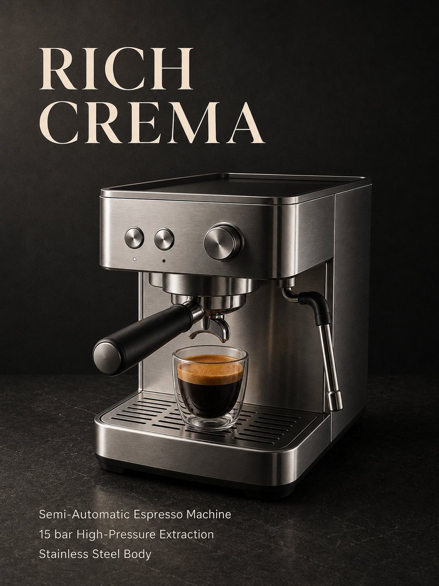
color_palette · dark-moodycomposition · negative-spacelighting · low-keylighting · rim-lightlighting · soft-lightmood · elegant
提示词(原文,逐字保留)
Gptimage2 prompt share:
Create one standalone vertical product advertising poster for a professional semi-automatic espresso machine aimed at coffee enthusiasts. Target a 3:4 canvas, 4k, composed for mobile social feeds. Deliver a full poster, not a mockup or multi-panel layout.
PRODUCT
Design a plausible, unbranded concept espresso machine with a brushed stainless-steel body, one brew group, one correctly attached portafilter with a matte black handle, one side-mounted steam wand, and a coherent metal drip tray. Use restrained, unlabelled physical controls. Preserve realistic proportions and mechanically credible connections. Do not reproduce a recognizable branded model or invent logos.
CORE CONCEPT AND STYLE
Make rich espresso crema the central sensory attraction, with the machine remaining the dominant product subject. Use Quiet Luxury as the single dominant style, expressed through three concrete features: generous uncluttered negative space, restrained charcoal and silver tones, and carefully controlled lighting that reveals fine material texture. Use warm amber crema as the only saturated accent.
COMPOSITION
Place the machine in the middle and lower portion of the poster, centered slightly right. Its bounding box should occupy approximately 55% of the canvas height and 80% of its width. Show a front three-quarter view from slightly above drip-tray level so the front panel, side depth, portafilter connection, steam wand, and cup surface remain visible.
Place one small clear espresso glass on the drip tray directly beneath the portafilter. Show freshly extracted dark espresso with a clearly visible, naturally proportioned layer of golden-brown crema and delicate surface mottling. The cup must be large enough to read on a phone while remaining physically proportional to the machine. Keep the product and cup sharp. No separate macro inset.
Reserve the upper 25% for the headline. Set it left-aligned on two lines, breaking after “RICH”. Use large, medium-weight contemporary serif lettering with open counters and clearly readable forms. Keep all letters unobstructed and separate from the machine.
Place three supporting lines in the lower text zone beneath the product, aligned to the headline’s left edge. Use a clean sans-serif with comfortable spacing, approximately 25% of the headline letter height. Maintain at least 6% horizontal and 5% vertical safe margins. Ensure all supporting copy remains legible at a 360 px-wide preview.
BACKGROUND, COLOR AND LIGHT
Use a seamless matte charcoal background and a dark, subtly textured countertop. Stainless steel provides the secondary silver tone; warm ivory typography provides clear contrast. Avoid decorative props.
Light the scene with a large soft key from the upper left, creating long controlled highlights along the brushed steel. Add a narrow, restrained right-side rim light to separate the machine from the background. Give the crema a gentle warm highlight without making it glow. Preserve realistic contact shadows, visible steel grain, natural glass reflections, and detail in the dark areas. Keep reflections away from text zones.
EXACT TEXT WHITELIST
Headline: “RICH CREMA”
Supporting line 1: “Semi-Automatic Espresso Machine”
Supporting line 2: “15 bar High-Pressure Extraction”
Supporting line 3: “Stainless Steel Body”
Render only the text inside the quotation marks, with the exact spelling and capitalization. Do not render quotation marks or field labels. Use only these two typography systems.
EXCLUSIONS
No invented performance claims, prices, certifications, awards, numerical gauges, or technical diagrams. Do not imply that higher pressure guarantees better flavor. No milk foam, latte art, overflowing crema, coffee splashes, floating beans, excessive steam, distorted components, duplicate accessories, cutaway structures, extra lettering, logos, QR codes, URLs, signatures, or watermarks.
中文译文
Gptimage2 提示词分享:
为面向咖啡爱好者的专业半自动浓缩咖啡机制作一张独立的竖版产品广告海报。画布比例为 3:4,分辨率 4k,针对移动端社交信息流进行构图。交付一张完整的海报,而非样机或多面板布局。
产品(PRODUCT)
设计一台可信且无品牌的概念浓缩咖啡机:拉丝不锈钢机身、一个冲煮头、一个正确安装的带哑光黑色手柄的粉碗手柄(portafilter)、一支侧装蒸汽棒,以及一个结构统一的金属滴水盘。使用克制、无文字标注的物理控制旋钮/按键。保持真实比例和机械上可信的连接关系。不要复刻任何可识别的品牌型号,也不要编造标志。
核心概念与风格(CORE CONCEPT AND STYLE)
以浓郁的浓缩咖啡油脂(crema)作为核心感官亮点,同时让咖啡机本身保持主导的产品主体地位。使用“静奢”(Quiet Luxury)作为唯一的主导风格,并通过三个具体特征来体现:充裕而不杂乱的负空间、克制的炭灰与银色调,以及能展现细腻材质质感的精细布光。使用暖琥珀色的油脂作为唯一的饱和点缀色。
构图(COMPOSITION)
将咖啡机置于海报中部偏下的位置,中心略偏右。其包围盒大约占画布高度的 55% 和宽度的 80%。展示略高于滴水盘平面的前 3/4 视角,使前面板、侧面纵深、粉碗手柄连接处、蒸汽棒以及杯体表面都清晰可见。
在滴水盘上、粉碗手柄正下方放置一只小巧的透明浓缩咖啡杯。展示刚刚萃取出的深色浓缩咖啡,其上具有清晰可见、自然成比例的金棕色油脂层和细腻的表面斑驳。杯子在手机上需足够清晰可读,同时与咖啡机保持物理比例上的合理。产品与杯子需保持锐利。不使用单独的微距插入画面。
将海报上部 25% 留给标题。标题左对齐,分为两行,在 “RICH” 之后换行。使用大号、中等字重的现代衬线字体,字怀开放且形态清晰可读。所有字母需保持完整不被遮挡,并独立于咖啡机之外。
在产品下方的下部文字区域放置三行辅助说明文字,与标题左边缘对齐。使用干净的无衬线字体,间距舒适,字号约为标题字高的 25%。至少保持 6% 的水平安全边距和 5% 的垂直安全边距。确保所有辅助文案在 360 像素宽的预览尺寸下依然清晰可读。
背景、色彩与光线(BACKGROUND, COLOR AND LIGHT)
使用无缝的哑光炭灰色背景,以及深色、带有微妙纹理的台面。不锈钢提供次要的银色调;暖象牙色字体提供清晰对比。避免任何装饰性道具。
主光使用来自左上方的柔和大光源,沿拉丝不锈钢表面形成长而受控的高光。再加一道狭窄而克制的右侧轮廓光(rim light),将咖啡机从背景中分离出来。为油脂提供柔和的暖色高光,但不要让其发光。保留真实的接触阴影、可见的钢纹、自然的玻璃反光以及暗部细节。避免反光出现在文字区域内。
精确文字白名单(EXACT TEXT WHITELIST)
标题(Headline):“RICH CREMA”
辅助行 1(Supporting line 1):“Semi-Automatic Espresso Machine”
辅助行 2(Supporting line 2):“15 bar High-Pressure Extraction”
辅助行 3(Supporting line 3):“Stainless Steel Body”
仅渲染引号内的文字,保持精确拼写与大小写。不要渲染引号或字段标签。仅使用这两种字体系统。
排除项(EXCLUSIONS)
不得出现任何杜撰的性能宣称、价格、认证、奖项、数值仪表或技术图表。不得暗示更高的压力就保证更好的风味。不得出现奶泡、拉花、溢出油脂、咖啡飞溅、漂浮的咖啡豆、过量蒸汽、变形部件、重复配件、剖视结构、额外文字、标志、二维码、URL、签名或水印。
来源与署名
原文由 @hellsing00fl 发布在 X:查看原推文。 本页逐字保留原文并提供机器翻译的中文解读;版权归原作者所有。
同工具的更多提示词
- 廉价外卖传单,卡通火箭,布局杂乱,文字难以辨认,玉米饼细节粗糙,馅料虚假,塑料感肉块,火焰效果微弱,图标过多,烟雾浑浊,光线平淡,背景图案噪点多,低端快餐品牌@ou_zhen599
- GPT Image 2 on ChatGPT Prompt; Create an ultra-photorealistic, cinematic close-…@mehvishs25
- 廉价传单设计,画面杂乱拥挤,包装文字难以辨认,幼稚卡通吉祥物,四肢扭曲变形,手部姿态别扭,扁平打光,浑浊的黄色背景,过多漂浮的切片,文字信息过多,低端便利店广…@ou_zhen599
- 我从零开始打造了一套完整的品牌识别系统——不仅仅是一个标志。 认识 NIVARO。 一套围绕几何“N”字图形徽标、钴蓝色、温暖象牙白、定制图案、包装、服饰和生…@abs_uiux
- 以我的照片作为主要身份参考。以我将要附加的目标图像作为姿势、构图、取景、灯光、场景、色彩搭配和视觉风格的参考。将目标图像中的角色替换为照片中的我,保持我的身份…@codewithhajra
- 使用主体照片作为面部身份参考 以参考图像的姿态、构图、光线、造型及整体摄影氛围为基础,创作一幅超写实的专业影棚人像,描绘一位身着优雅正装的时尚成年男性。 主体…@abs_uiux