TRIDENT。担任社交媒体艺术总监与数字拼贴艺术家,专长于高端快消品广告、高端糖果营销活动、商业产品摄影、大胆的编辑构图、超现实视觉…
分享链接 · https://openimages.ajiang.me/p/2095834603944833173/
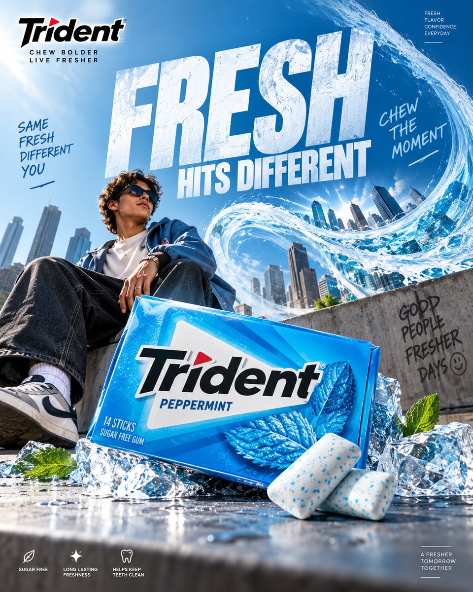
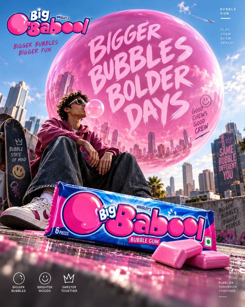
composition · dynamic-diagonalcomposition · low-anglehuman_attributes · short-hairhuman_attributes · sunglasseslighting · natural-daylightscene · cityscape
提示词(原文,逐字保留)
TRIDENT. Act as a Social Media Art Director and Digital Collage Artist specializing in high-end FMCG advertising, premium confectionery campaigns, commercial product photography, bold editorial compositions, surreal visual storytelling, and culturally relevant Instagram content.
PHASE 1: CONCEPTUAL FRAMEWORK
Create a premium Trident chewing gum advertising poster built around one instantly understandable visual idea.
The advertisement should transform the simple act of chewing gum into a visually exciting experience. Think beyond conventional food advertising. Use a strong visual metaphor where freshness, flavor, confidence, connection, or an unexpected burst of sensation becomes a physical part of the environment.
The creative idea must be:
* Original
* Visually surprising
* Instantly understandable
* Social-media optimized
* Premium
* Playful but sophisticated
* Commercially believable
* Strong enough to work without excessive copy
Do not create a generic chewing-gum advertisement. Avoid random fruit explosions, generic mint leaves, floating products, excessive splashes, meaningless CGI, or stereotypical AI surrealism.
PHASE 2: PRODUCT & PACKAGING
Use the supplied Trident product packaging as the exact product reference.
Preserve:
* Exact package shape
* Brand logo
* Typography
* Colors
* Flavor name
* Product proportions
* Packaging graphics
* Wrapper details
* Material finish
* Product quantity where visible
The packaging must remain physically accurate and immediately recognizable.
Make the Trident pack the hero object of the composition.
If individual gum pieces are shown, maintain realistic proportions, wrapper construction, texture, folds, and material behavior.
Never redesign the packaging or invent product claims.
PHASE 3: CREATIVE VISUAL WORLD
Build an imaginative physical environment around the Trident product.
The environment should visually communicate the product benefit or flavor through a clever advertising metaphor.
Examples of creative territory:
* A wave of cool freshness physically transforming a city
* A mint-powered breeze bending an entire environment
* A giant flavor landscape emerging from one tiny piece of gum
* A frozen world breaking apart around the product
* A mundane social environment suddenly becoming vibrant
* Architectural forms shaped by the movement of fresh air
* An impossible miniature world contained inside the gum pack
The visual world should feel intentionally art-directed, not randomly surreal.
PHASE 4: BRAND COLOR & VISUAL IDENTITY
Use Trident’s established visual identity as the foundation.
Prioritize the actual product packaging as the primary color reference.
Where appropriate, incorporate Trident’s recognizable cool cyan/blue visual territory with white and dark neutral contrast, while adapting the palette to the specific flavor SKU.
Color should create:
* Freshness
* Energy
* Cleanliness
* Flavor recognition
* Strong product separation
Do not overload the artwork with unrelated colors.
PHASE 5: PRODUCT COMPOSITION
Create a sophisticated commercial product composition.
The Trident pack should occupy a strong hero position with realistic scale, perspective, and contact with the environment.
Use:
* Dramatic perspective
* Layered depth
* Foreground elements
* Midground product interaction
* Atmospheric background
* Intentional negative space
* Strong visual diagonals
* Controlled cropping
The product must feel physically present inside the scene.
Use realistic contact shadows, reflections, surface interaction, and material behavior.
PHASE 6: GRAPHIC DESIGN & COLLAGE
Combine premium FMCG photography with contemporary editorial graphic design.
Introduce graphic elements only when they strengthen the concept:
* Oversized typography
* Flavor labels
* Small technical information
* Editorial numbering
* Graphic lines
* Cropped shapes
* Repeated product details
* Subtle geometric elements
* Microcopy
Create visual tension between photographic realism and graphic design.
Avoid turning the poster into a template or a cluttered collage.
PHASE 7: TYPOGRAPHY
Create one short, memorable campaign headline connected directly to the visual idea.
Possible direction:
“CHEW THE MOMENT.”
“FRESH HITS DIFFERENT.”
“UNWRAP THE FRESH.”
“FRESHNESS, UNLEASHED.”
“FEEL THE FLAVOR.”
“MAKE ROOM FOR FRESH.”
Use bold, contemporary uppercase typography with strong editorial presence.
Typography should become part of the visual composition.
Allow oversized type to interact with the environment, overlap atmospheric elements, disappear behind objects, or extend beyond the frame where appropriate.
Maintain perfect spelling, clean letterforms, strong hierarchy, and commercial readability.
PHASE 8: BRAND INTELLIGENCE
Maintain Trident’s core communication territory:
* Freshness
* Flavor
* Everyday confidence
* Social connection
* Energy
* Approachability
* Contemporary culture
* Playful sophistication
Use the Trident logo correctly and prominently enough for immediate brand recognition without making the artwork feel like a packaging mockup.
Do not imitate a specific existing Trident campaign.
Create a completely original visual concept using the brand’s established identity.
PHASE 9: SOCIAL MEDIA ART DIRECTION
Format: 4:5 vertical Instagram poster.
Design specifically for mobile viewing.
The composition must:
* Stop the scroll immediately
* Communicate the idea within one second
* Make the product recognizable at thumbnail size
* Have one dominant focal point
* Maintain strong contrast
* Use clear visual hierarchy
* Feel premium when viewed full-screen
* Remain readable without zooming
The artwork should look equally strong as an Instagram post, paid social advertisement, and campaign carousel cover.
PHASE 10: COMMERCIAL FINISH
Create the finish of a world-class FMCG advertising campaign.
Use:
* Photorealistic product rendering
* Premium commercial lighting
* Realistic packaging materials
* High-detail textures
* Controlled reflections
* Accurate shadows
* Natural depth of field
* Sophisticated retouching
* Subtle atmospheric detail
* Sharp product edges
* Print-quality detail
Avoid:
* Generic AI aesthetics
* Plastic-looking packaging
* Warped logos
* Incorrect text
* Fake product geometry
* Duplicate products
* Random objects
* Excessive glow
* Excessive particles
* Cheap CGI
* Over-saturated colors
* Unnecessary visual clutter
* Stock-photo appearance
FINAL OUTPUT:
Create a world-class Trident chewing gum social advertisement where the product, advertising idea, environment, typography, color system, photography, and graphic design feel conceived as one unified campaign.
The final image should feel playful enough for social media, sophisticated enough for a global FMCG brand, and visually distinctive enough to be immediately recognizable in a crowded Instagram feed.
Premium FMCG advertising. Bold visual metaphor. Photorealistic product. Editorial graphic design. Fresh, energetic, culturally relevant, scroll-stopping.
中文译文
TRIDENT。担任社交媒体艺术总监与数字拼贴艺术家,专长于高端快消品广告、高端糖果营销活动、商业产品摄影、大胆的编辑构图、超现实视觉叙事以及具有文化相关性的 Instagram 内容。
阶段 1:概念框架
创建一个高端 Trident 口香糖广告海报,围绕一个瞬间即可理解的视觉创意构建。
该广告应将简单的嚼口香糖动作转变为视觉上令人兴奋的体验。超越传统食品广告的思维。使用一个强有力的视觉隐喻,让清新、口味、自信、连接或意外的爆发感成为环境中物理存在的一部分。
创意必须:
* 原创
* 视觉上令人惊喜
* 瞬间即可理解
* 针对社交媒体优化
* 高端
* 俏皮但精致
* 商业上可信
* 强到无需大量文案即可成立
不要制作一个普通的口香糖广告。避免随机的水果爆炸、普通的薄荷叶、漂浮的产品、过度的飞溅、无意义的 CGI 或刻板的 AI 超现实主义。
阶段 2:产品与包装
使用所提供的 Trident 产品包装作为确切的产品参考。
保留:
* 确切的包装形状
* 品牌标志
* 字体
* 颜色
* 口味名称
* 产品比例
* 包装图形
* 包装纸细节
* 材质工艺
* 可见时的产品数量
包装必须在物理上准确且立即可识别。
让 Trident 包装成为构图的主角。
如果展示单颗口香糖,保持真实比例、糖纸结构、纹理、褶皱和材质表现。
切勿重新设计包装或编造产品宣称。
阶段 3:创意视觉世界
围绕 Trident 产品构建一个富有想象力的物理环境。
该环境应通过巧妙的广告隐喻来视觉化地传达产品益处或口味。
创意领域示例:
* 一股凉爽的清新浪潮物理性地改变一座城市
* 一股薄荷驱动的小风吹弯整个环境
* 一片巨大的口味景观从一颗小口香糖中浮现
* 产品周围一个冻结的世界正在碎裂
* 一个平凡的社交环境突然变得充满活力
* 由清新空气流动塑造的建筑形态
* 一个不可能的微缩世界被包含在口香糖包装内
视觉世界应感觉是被有意艺术指导的,而不是随机超现实的。
阶段 4:品牌色彩与视觉识别
以 Trident 已确立的视觉识别为基础。
以实际产品包装作为主要色彩参考。
在适当的情况下,融入 Trident 标志性的冷青色/蓝色视觉领域,配以白色和深色中性对比,同时根据特定口味 SKU 调整色板。
色彩应创造:
* 清新
* 能量
* 洁净
* 口味识别
* 强烈的产品区隔
不要用不相关的颜色过度堆砌画面。
阶段 5:产品构图
创建一个精致的商业产品构图。
Trident 包装应占据强势的主角位置,与环境之间具有真实的尺度、透视和接触。
使用:
* 戏剧性透视
* 层次景深
* 前景元素
* 中景产品互动
* 氛围背景
* 有意的负空间
* 强烈的视觉对角线
* 受控的裁切
产品必须在场景中感觉真实存在。
使用真实的接触阴影、反射、表面互动和材质表现。
阶段 6:平面设计与拼贴
将高端快消品摄影与当代编辑平面设计相结合。
仅在强化概念时引入平面元素:
* 超大字体
* 口味标签
* 小型技术信息
* 编辑编号
* 图形线条
* 裁切形状
* 重复的产品细节
* 微妙的几何元素
* 微文案
在摄影写实主义与平面设计之间创造视觉张力。
避免将海报变成模板或杂乱的拼贴。
阶段 7:字体设计
创作一句简短、令人难忘、与视觉创意直接相关的广告标题。
可能的方向:
"CHEW THE MOMENT."
"FRESH HITS DIFFERENT."
"UNWRAP THE FRESH."
"FRESHNESS, UNLEASHED."
"FEEL THE FLAVOR."
"MAKE ROOM FOR FRESH."
使用大胆、当代的大写字体,具有强烈的编辑存在感。
字体应成为视觉构图的一部分。
在适当情况下,允许超大字体与环境互动、与氛围元素重叠、在物体后方消失,或延伸出画面之外。
保持完美的拼写、干净的字形、强烈的层级和商业可读性。
阶段 8:品牌智慧
保持 Trident 的核心传播领域:
* 清新
* 口味
* 日常自信
* 社交连接
* 能量
* 平易近人
* 当代文化
* 俏皮的精致
正确且足够醒目地使用 Trident 标志,以实现即时品牌识别,同时不让画面感觉像是包装模型。
不要模仿某个特定的现有 Trident 广告战役。
使用品牌已确立的识别,创建一个完全原创的视觉概念。
阶段 9:社交媒体艺术指导
格式:4:5 竖版 Instagram 海报。
专为移动端观看而设计。
构图必须:
* 立刻打断浏览
* 一秒内传达创意
* 使产品在缩略图大小下可识别
* 拥有一个主导焦点
* 保持强烈对比
* 使用清晰的视觉层级
* 全屏查看时感觉高端
* 无需放大即可阅读
该作品作为 Instagram 帖子、付费社交广告和广告活动轮播封面看起来同样出色。
阶段 10:商业收尾
打造世界级快消品广告活动的成品质量。
使用:
* 照片级真实感的产品渲染
* 高端商业打光
* 真实的包装材质
* 高细节纹理
* 受控的反射
* 准确的阴影
* 自然的景深
* 精细的修图
* 微妙的氛围细节
* 锐利的产品边缘
* 印刷级细节
避免:
* 普通的 AI 美学
* 塑料感包装
* 变形的标志
* 错误的文字
* 虚假的产品几何
* 重复的产品
* 随机的物体
* 过度的发光
* 过度的粒子效果
* 廉价的 CGI
* 过度饱和的色彩
* 不必要的视觉杂乱
* 图库照片外观
最终输出:
创建一个世界级的 Trident 口香糖社交广告,使产品、广告创意、环境、字体、色彩系统、摄影和平面设计感觉是作为一个统一的营销活动构思出来的。
最终图像应感觉对社交媒体足够俏皮、对全球快消品品牌足够精致,并视觉上足够独特,在拥挤的 Instagram 信息流中能立即被识别。
高端快消品广告。大胆的视觉隐喻。照片级真实感的产品。编辑级平面设计。清新、充满活力、文化相关、引人注目。
来源与署名
原文由 @Diplomeme 发布在 X:查看原推文。 本页逐字保留原文并提供机器翻译的中文解读;版权归原作者所有。
同工具的更多提示词
- Golden Hour Legacy(黄金时刻的传承) Time shapes who you become.(时光塑造你成为的模样。) ✨ Created…@nagarjuncreates
- 多伦多群岛:逃离城市 有时最美的多伦多风景,从你离开这座城市的那一刻才开始。🍁⛴️ ✨ 使用 GPT Image @ChatGPT 制作 提示词如下 👇 一张…@nagarjuncreates
- [GPT Image 1.5 提示词] ar 2:3 High 一张照片写实风格的特写肖像,主角是一位二十岁出头、皮肤白皙、五官柔和自然的东亚年轻女性。她拥有…@woleswoosh
- 画肖像的肖像会反过来画 如果世界上最著名的肖像画了自己呢? ✨ 使用 GPT Image @ChatGPT 创建 提示词如下 👇 蒙娜丽莎端坐于佛罗伦萨一间真…@nagarjuncreates
- 为高端护肤品牌 AUREVIA 创作一幅超写实的奢华商业产品广告,主打其 “VELVET HYDRATE 身体乳”。 将一款精致的 250 ml 高身椭圆压泵…@abs_uiux
- 请将我上传的每张照片分别制作成一张高端设计海报。不要制作多图拼贴。每张照片都要单独输出一张海报。 整体采用 3:4 的竖向构图,划分为高度完全相等的两个部分…@victorpfreitas