为每一张我上传的地方美食照片,制作一张独立的、高端的"食材观察旅行拼盘"编辑海报。每张照片单独成稿——不要将多张照片、多份拼盘或多道菜…
分享链接 · https://openimages.ajiang.me/p/2093918784880828530/
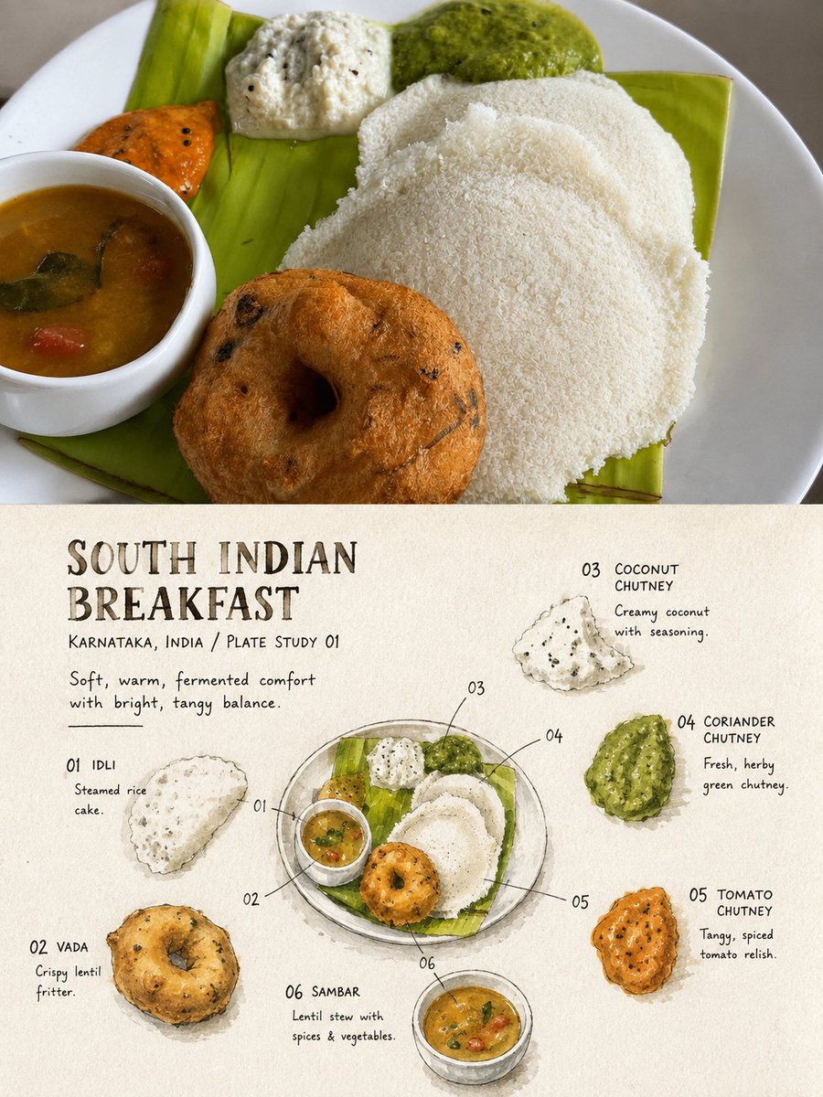
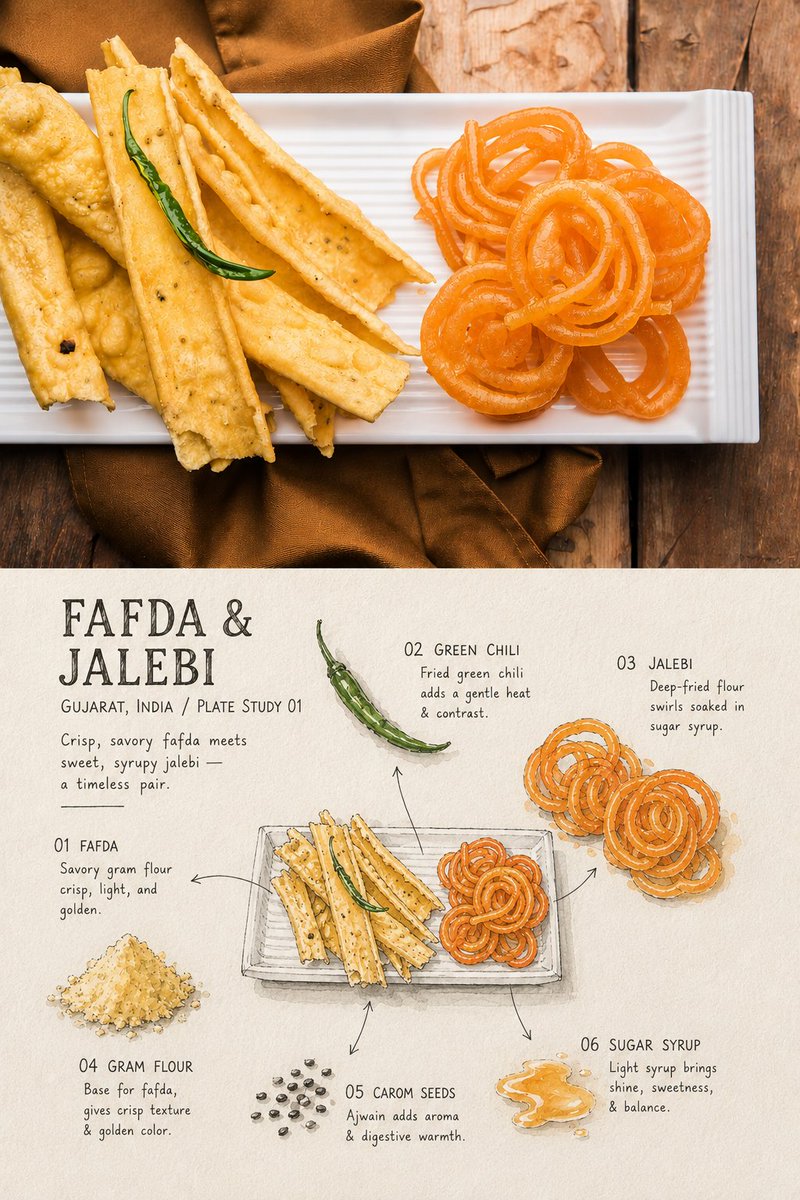
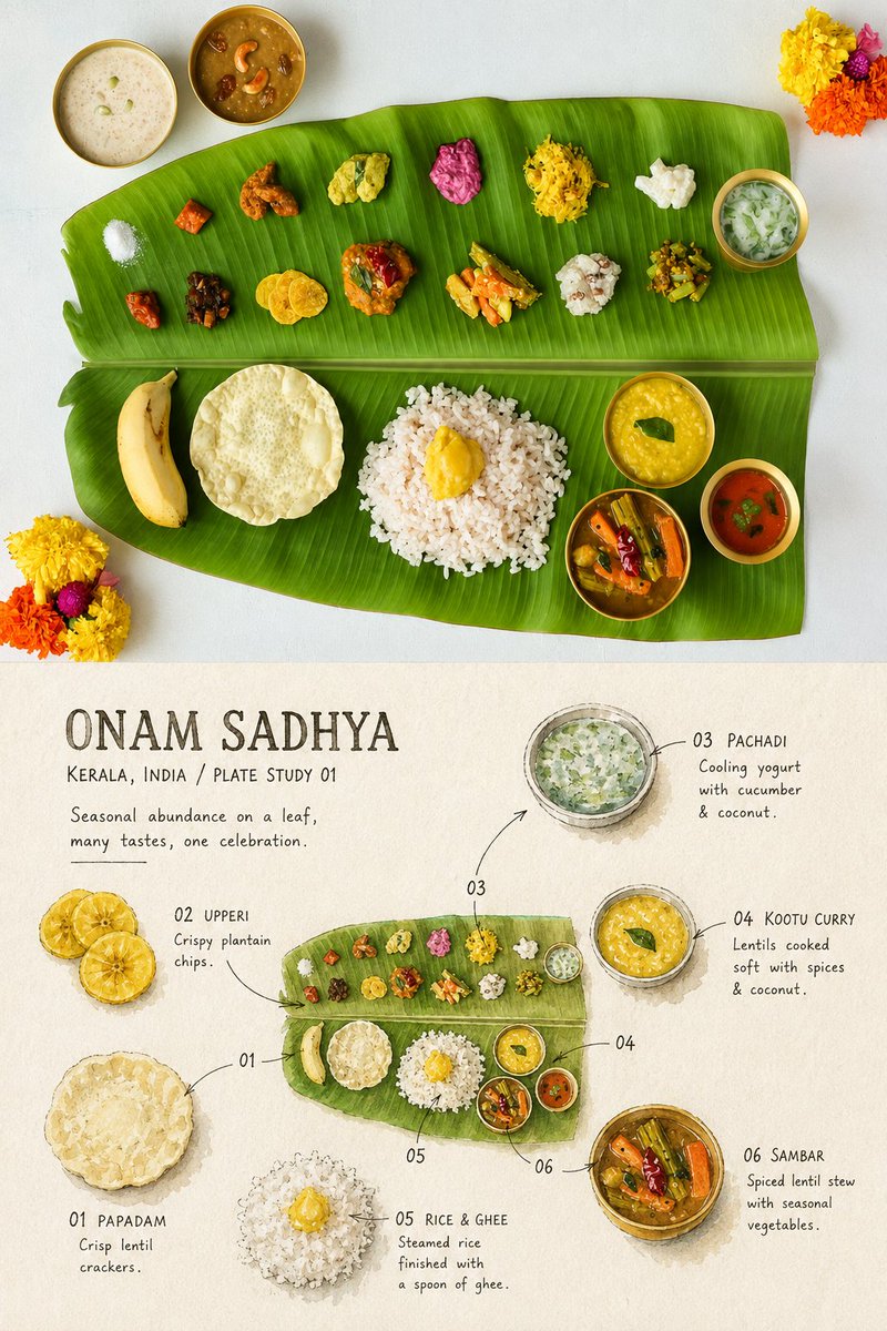
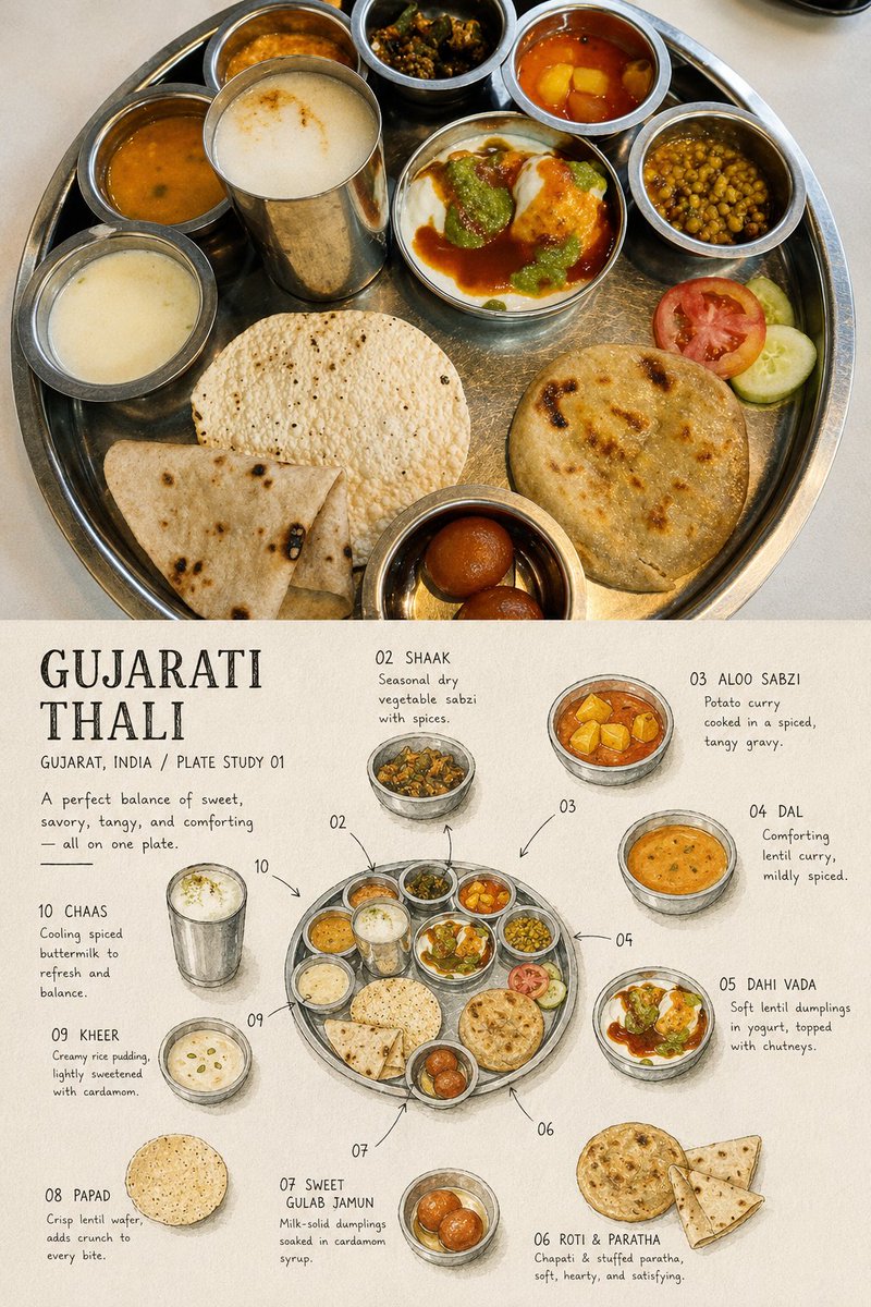
color_palette · mutedcolor_palette · warm-tonescomposition · multi-panelcomposition · overhead-flatlaymood · calmmood · nostalgic
提示词(原文,逐字保留)
Create a standalone high-end "Ingredient Observation Travel Platter" editorial poster for each local cuisine photo I upload. Output each photo as a separate piece—no splicing multiple photos, platters, or dishes into one work.
**Input:** A complete single platter or bowl as the clear subject, with at least three distinctly identifiable components (staple, meat, seafood, egg, vegetables, herbs, nuts, pickled items, sauces, garnish).
**Format:** 3:4 vertical composition, contrasting real food photography (top) with an ingredient observation sketch (bottom).
**Upper half (45%–50% of frame):**
- Faithfully retain the original photo: platter/bowl outline, ingredient quantities, placement, size relationships, textures, lighting/shadows, angle, and colors.
- Apply only subtle color grading (independent food-magazine/travel-editorial style) plus a thin film grain layer.
- Do not rearrange plating, replace/move ingredients, alter portions, add decoration, or illustrate the photo area. Restrained cropping is allowed; the full platter must stay clearly discernible.
**Boundary:** A straight, clear, restrained horizontal line between sections, with an optional narrow warm paper spacer strip. No gradients, feathering, or ingredients crossing the line.
**Lower half (50%–55% of frame):** Warm off-white/ivory drawing paper with visible fiber, grain, faint smudges, irregular surface. Do not redraw the full dish from the same top-down composition—instead:
1. Select 3–6 real, identifiable components from the photo.
2. Draw a highly abstracted but recognizable miniature of the full platter, centered or slightly lower.
3. Miniature occupies roughly 28%–40% of the lower half's width.
4. Render selected ingredients separately as standalone watercolor swatches, cross-sections, leaves, grain clusters, sauce blocks, or structural sketches.
5. Vary scale/orientation for a sparse, asymmetrical arrangement around the miniature.
6. Use fine, slightly hesitant black ink lines, arrows, and numbers linking samples to their position on the platter.
7. Leave 35%–50% continuous off-white space—don't crowd the page.
**Material language (lower half):** matte opaque gouache, restrained black ink contours, dry brush gaps, uneven pigment coverage, visible paper grain, imperfect hand-painted edges, subtle pencil construction marks, handmade culinary field-notebook feel. Shapes stay abstracted but retain true colors, outlines, cross-sections, and grain structure—no realism, no cartoon icons.
**Color:** Extract 4–6 low-to-medium saturation true tones from the photo. Background off-white/warm gray/pale photo-related shade. One warm accent (sauce, yolk, chili, fruit) as focal point. No neon or high-saturation commercial palettes.
**Text (determined strictly from photo facts):**
- Dish title, 1–3 English words
- Location/observation number, e.g., **"INDIA / PLATE STUDY 01"**
- A 5–12 word sensory/ingredient observation
- 3–6 short numbered labels, e.g., **"01 RICE" "02 DAL" "03 PICKLE"**
If an ingredient can't be reliably identified, don't invent names—default to: "RICE," "NOODLES," "GREENS," "SAUCE," "GRILLED ITEM," "PICKLED ITEM."
Fonts: narrow handwritten recipe script, old recipe letterpress, or gentle humanist sans-serif, in warm black/deep gray-brown/dark photo tone, with slight ink breaks and paper-tooth imperfections. Title must be clearly readable at preview size; labels can be smaller but never decorative fine lines. Text clusters like handwritten notes, not slick digital overlay.
**Mood:** A traveler disassembling and recording a dish after tasting it—restrained, warm, clear, handmade, evoking flavor memory and travel archive.
**Avoid:** incomplete/multi-dish photos, platter collages, restaurants/chefs as subject, invented ingredients, added garnish, full-scale redrawing, realistic menu illustration, dense infographics, cartoon food, vector icons, plastic 3D food, full-bleed backgrounds, excess text, prices, brands, logos, signatures, dates, QR codes, URLs, social UI, garbled text, fake characters, watermarks.
中文译文
为每一张我上传的地方美食照片,制作一张独立的、高端的"食材观察旅行拼盘"编辑海报。每张照片单独成稿——不要将多张照片、多份拼盘或多道菜拼合到同一张作品中。
**输入:** 一份完整独立的拼盘或碗作为清晰主体,至少包含三个可明确辨识的组成部分(主食、肉类、海鲜、蛋类、蔬菜、香草、坚果、腌渍物、酱料、装饰)。
**格式:** 3:4 竖版构图,上半部分为真实食物摄影,下半部分为食材观察手绘,形成对比。
**上半部分(画面 45%–50%):**
- 忠实保留原始照片:拼盘/碗的轮廓、食材数量、摆放位置、大小关系、质地、光影、角度与色彩。
- 仅施加轻微调色(独立美食杂志/旅行编辑风格),叠加一层细微的胶片颗粒。
- 不得重新摆放、替换/移动食材、改变分量、添加装饰,也不得在照片区域进行插画化处理。可进行克制的裁切,但完整拼盘必须保持清晰可辨。
**分隔线:** 上下两部分之间采用一条平直、清晰、克制的水平分割线,可选配一条窄幅的暖色纸张间隔条。不得使用渐变、羽化效果,也不得有食材跨越分割线。
**下半部分(画面 50%–55%):** 暖米白/象牙色绘图纸,需呈现可见纤维、纸面颗粒、轻度污渍与不规则表面。不要以同样的俯视构图重绘整道菜——而是:
1. 从照片中选取 3–6 种真实可辨识的食材。
2. 绘制一个高度抽象但可识别的拼盘微缩图,置于中央或略偏下。
3. 微缩图宽度约占下半部分的 28%–40%。
4. 将所选食材分别绘制为独立的水彩色块、剖面图、叶片、谷物簇、酱料块或结构性草图。
5. 围绕微缩图采用变化的尺度与朝向,形成稀疏、不对称的布局。
6. 使用纤细、略带迟疑的黑色墨线、箭头与数字,将各样本与拼盘上的位置相连接。
7. 保留 35%–50% 连续的米白留白区域——避免页面拥挤。
**材质语言(下半部分):** 哑光不透明水粉,克制黑色墨线轮廓,干笔留白,颜料覆盖不均,可见纸面颗粒,手绘边缘不完美,隐约的铅笔起稿痕迹,呈现手工美食田野笔记感。形状保持抽象,但保留真实色彩、轮廓、剖面与颗粒结构——不要写实,也不要卡通图标。
**色彩:** 从照片中提取 4–6 种低至中等饱和度的真实色调。背景为米白/暖灰/与照片相关的浅色调。以一处暖色点缀(酱料、蛋黄、辣椒、水果)为视觉焦点。不得使用霓虹或高饱和度的商业配色。
**文字(严格依据照片事实确定):**
- 菜品名称,1–3 个英文单词
- 地点/观察编号,例如:**"INDIA / PLATE STUDY 01"**
- 一段 5–12 词的感官/食材观察描述
- 3–6 条简短的编号标签,例如:**"01 RICE" "02 DAL" "03 PICKLE"**
若某食材无法可靠辨识,不得凭空命名——默认使用:"RICE"、"NOODLES"、"GREENS"、"SAUCE"、"GRILLED ITEM"、"PICKLED ITEM"。
字体:窄体手写食谱字体、老式凸版食谱字体或温和的人文无衬线字体,颜色为暖黑/深灰棕/深照片色调,伴有轻微的墨迹断裂与纸张颗粒瑕疵。标题在预览尺寸下必须清晰可读;标签可略小,但绝不可退化为装饰性细线。文字排布如手写笔记,而非光滑的数字叠加。
**氛围:** 一位旅人在品尝之后,拆解并记录一道菜——克制、温暖、清晰、手工感,唤起味觉记忆与旅行档案。
**避免:** 不完整或多道菜的照片、拼盘拼贴、以餐厅/厨师为主体、虚构食材、额外装饰、全尺寸重绘、写实菜单插画、密集信息图、卡通食物、矢量图标、塑料感 3D 食物、满版背景、过多文字、价格、品牌、标志、署名、日期、二维码、链接、社交界面元素、乱码文字、伪造字符、水印。
来源与署名
原文由 @VaibhavSpace 发布在 X:查看原推文。 本页逐字保留原文并提供机器翻译的中文解读;版权归原作者所有。
同工具的更多提示词
- [GPT Image 1.5 Prompt] ar 2:3 High 动漫风格的数字插画,画中是一位美丽的年轻女子,拥有苍白的瓷质肌肤、锐利的面部轮廓,以及冷…@woleswoosh
- 一幅精致的3D纸艺卷纸浮雕作品,描绘一位优雅的女性,身着由繁复白色纸花制成的时髦一字肩紧身胸衣连衣裙。她头戴一顶宽檐卷曲象牙色纸帽,帽上点缀着小巧鲜艳的绿叶与…@yourPlugAI
- 口袋里的葡萄牙 — 一场穿越里斯本与辛特拉的微缩之旅 有些地方不像是目的地。它们像是等待被发现的小小世界。🇵🇹✨ ✨ 由 GPT Image @ChatGPT…@nagarjuncreates
- 京都 — 传统在每个季节闪耀的城市 有些城市让你惊叹,京都却让你久久难忘。🇯🇵🌸 灯笼映照的街道、静谧的寺庙、抹茶、群山,以及每个角落中沉淀的百年故事。 ✨…@nagarjuncreates
- 创作一幅高度逼真、年轻化的东亚美女肖像,描绘一位成年女性,采用中近景构图,从头顶到上胸部。保持清新年轻的外观、自然的面部比例,以及精致考究的韩式/抖音美妆美学…@TaliaAariz
- 特斯拉生态系统信息图海报,超高端品质,4:5 纵向格式,概念驱动设计,标题为“特斯拉——加速世界向可持续能源的转型”,定位为高端编辑级科技宣传作品,而非常规企…@Diplomeme