高级极简扁平矢量收藏级火柴盒海报,伊斯坦布尔,土耳其,3:4 竖版。
分享链接 · https://openimages.ajiang.me/p/2093627738896932986/
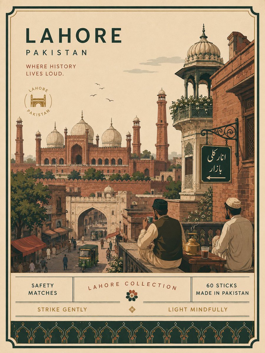
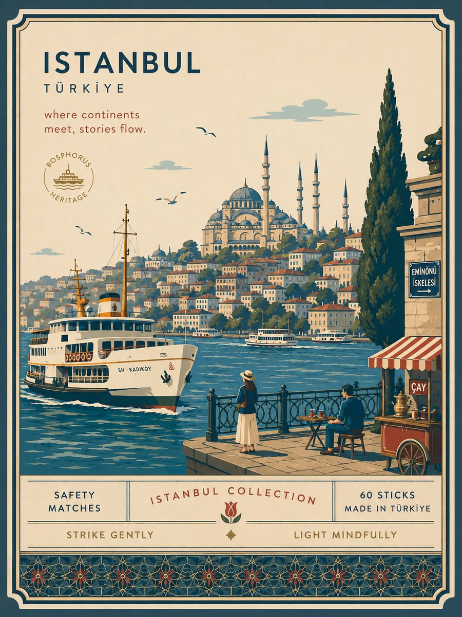
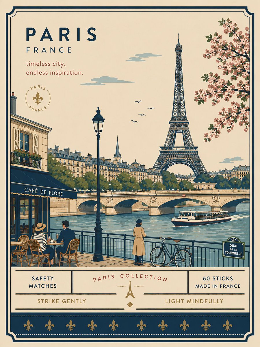
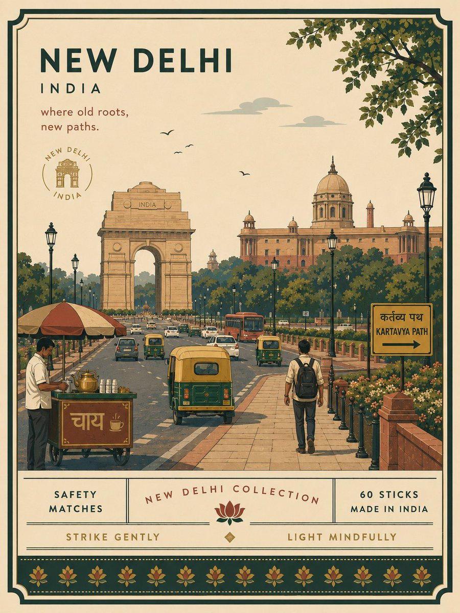
color_palette · mutedcomposition · negative-spacecomposition · wide-shotmood · elegantquality_flags · embedded-textquality_flags · typography-heavy
提示词(原文,逐字保留)
Premium minimalist flat-vector collectible matchbox poster for ISTANBUL, TURKEY, 3:4 vertical format.
Design an original, sophisticated matchbox-inspired artwork that captures the authentic visual personality of ISTANBUL, TURKEY. The composition must feel purpose-built for this city rather than following a reusable template.
CITY IDENTITY
First interpret the unique visual character of ISTANBUL and build the scene around these five elements:
1. A recognizable landmark, architectural feature, or skyline element.
2. A distinctive local way of moving through the city.
3. One subtle everyday lifestyle moment.
4. A native plant, landscape, or environmental characteristic.
5. A composition and viewpoint that naturally belongs to the city.
For Istanbul, naturally prioritize the Bosphorus, Ottoman architectural silhouettes, Istanbul ferries, Turkish tea culture, cypress trees, waterfront life, and the visual relationship between the city’s European and Asian sides.
The overall scene structure must change from city to city. Do not repeatedly use the same object positions or visual formula.
Possible compositions include:
ferry deck overlooking the Bosphorus, historic waterfront, elevated hillside viewpoint, narrow neighborhood street, tea garden beside the water, Galata-area slope, harbor passage, historic square, seaside promenade, or architectural terrace.
Choose whichever composition best represents ISTANBUL.
TYPOGRAPHY
Place “ISTANBUL” in the upper-left area with generous clean negative space.
Add one short, sophisticated English tagline inspired by the atmosphere of the city.
Typography should feel understated, editorial, spacious, and premium, while subtly referencing classic matchbox packaging typography. Never allow text to dominate the artwork.
VISUAL HIERARCHY
Use one iconic landmark or architectural feature as the main focal point.
Support it with only 2–4 carefully selected local elements. Every added detail should strengthen the sense of place.
Avoid landmark collections or postcard-style collages. Keep the scene visually quiet and intentional.
The composition should feel like a beautifully designed collectible matchbox label rather than a conventional tourist poster.
PEOPLE
Include only 3–6 small-scale figures.
Give each person a believable activity connected to local life, such as:
boarding an Istanbul ferry, drinking Turkish tea, walking beside the Bosphorus, photographing the skyline, commuting through a historic neighborhood, sitting in a waterfront tea garden, or watching boats cross the water.
Avoid crowds and avoid making any single person the main character. Figures should integrate naturally into the environment.
LOCAL CHARACTER
Use city-specific elements only when they genuinely fit ISTANBUL:
* Istanbul ferry
* Bosphorus waterfront
* Ottoman architectural details
* mosque domes and minarets
* Turkish tea glass
* cypress trees
* historic street architecture
* subtle Turkish wayfinding
* waterfront railings
* small boats
* European and Asian shoreline relationship
* local pavement and street details
Transport and signage should remain subtle. Instead of always using a large signboard, incorporate details naturally through a small ferry marker, transit symbol, waterfront sign, station detail, painted road marking, or understated architectural element.
MATCHBOX CHARACTER
Integrate the visual language of a premium collectible matchbox naturally into the artwork.
Use a restrained illustrated label frame, subtle packaging-inspired borders, compact edition details, and small decorative elements that feel purpose-built for ISTANBUL.
The artwork should feel like an original contemporary matchbox design inspired by collectible packaging, not an imitation of an existing matchbox brand or historical label.
ART DIRECTION
Japanese stationery-inspired aesthetic,
luxury collectible packaging illustration,
premium commercial vector artwork,
modern editorial travel branding,
contemporary matchbox label design,
clean delicate outlines,
uniform line weight,
simple geometric forms,
flat-color illustration,
soft shapes,
balanced visual rhythm,
high-end minimalist collectible design.
COLOR SYSTEM
Build the atmosphere primarily with:
deep Bosphorus blue, soft turquoise, warm ivory, cream, muted terracotta, and cool architectural blues.
Balance these with:
cypress green, warm beige, muted brick red, and understated architectural neutrals.
Use muted brass or dusty rose only for tiny visual accents such as typography details, flowers, clothing details, small signs, or decorative packaging elements.
Colors should remain soft, sophisticated, slightly desaturated, and cohesive.
MOOD
Fresh, atmospheric, nostalgic, refined, contemporary, elegant.
The final artwork should feel like a premium boutique matchbox collectible or luxury lifestyle-brand illustration, with generous breathing room and a relaxed sense of Istanbul.
IMPORTANT QUALITY RULES
Every city must have its own visual identity.
Change the camera angle, scene structure, landmark placement, foreground treatment, and supporting details according to the city’s character.
Do not simply replace ISTANBUL inside an existing composition.
The matchbox concept must influence the visual language, but the artwork must remain primarily an authentic representation of Istanbul.
Do not reproduce any existing matchbox brand, historical matchbox label, trademark, or specific vintage artwork.
NEGATIVE PROMPT
No photorealism.
No realism.
No watercolor.
No painterly brushwork.
No gradients.
No heavy shadows.
No dramatic cinematic lighting.
No paper texture.
No excessive detail.
No cluttered background.
No landmark collage.
No crowded streets.
No oversized characters.
No dominant hero character.
No repetitive café composition.
No fixed signboard position.
No identical foreground treatment.
No generic tourist-poster formula.
No copied matchbox artwork.
No fake excessive aging.
No excessive Ottoman ornament.
No random Turkish symbols.
No unnecessary decorative elements.
中文译文
高级极简扁平矢量收藏级火柴盒海报,伊斯坦布尔,土耳其,3:4 竖版。
设计一幅原创、精致的火柴盒灵感艺术作品,捕捉伊斯坦布尔、土耳其的真实视觉个性。构图必须为这座城市量身打造,而非套用通用模板。
城市识别
首先解读伊斯坦布尔的独特视觉特征,围绕以下五个元素构建场景:
1. 一个可识别的地标、建筑特征或天际线元素。
2. 一种当地独特的城市移动方式。
3. 一个细微的日常生活瞬间。
4. 一种本土植物、景观或环境特征。
5. 一个自然属于该城市的构图与视角。
对于伊斯坦布尔,自然优先呈现博斯普鲁斯海峡、奥斯曼建筑轮廓、伊斯坦布尔渡轮、土耳其茶文化、柏树、滨水生活,以及城市欧亚两岸的视觉关系。
整体场景结构必须因城而异。不要重复使用相同的物体位置或视觉公式。
可能的构图包括:
俯瞰博斯普鲁斯海峡的渡轮甲板、历史滨水区、山坡高处视角、狭窄街区街巷、水边茶园、加拉塔区坡道、港口通道、历史广场、海滨长廊或建筑露台。
选择最能代表伊斯坦布尔的构图。
字体排版
将“ISTANBUL”置于左上区域,留出充足而干净的负空间。
添加一句简短、精致的英文标语,灵感来自城市氛围。
字体风格应低调、编辑感、宽敞且高级,同时微妙呼应经典火柴盒包装字体。绝不能让文字主导画面。
视觉层级
以一座标志性地标或建筑特征作为主要焦点。
仅以 2–4 个精心挑选的本土元素辅助呈现。每一个细节都应强化地方感。
避免地标罗列或明信片式拼贴。保持画面视觉安静且有意境。
构图应感觉像一张精美设计的收藏级火柴盒标签,而非传统旅游海报。
人物
仅包含 3–6 个小尺度人物。
为每个人物赋予一个与本地生活相关的可信活动,例如:
登上一艘伊斯坦布尔渡轮、喝土耳其茶、沿着博斯普鲁斯海峡散步、拍摄天际线、穿过历史街区通勤、坐在滨水茶园、或观看船只驶过水面。
避免人群,避免让任何单个人物成为主角。人物应自然融入环境。
本地特色
仅在真正契合伊斯坦布尔时使用城市专属元素:
* 伊斯坦布尔渡轮
* 博斯普鲁斯海峡滨水区
* 奥斯曼建筑细节
* 清真寺穹顶与宣礼塔
* 土耳其茶杯(郁金香形玻璃杯)
* 柏树
* 历史街区建筑
* 细微的土耳其导视系统
* 滨水栏杆
* 小船
* 欧亚海岸线关系
* 本地铺装与街道细节
交通与标识应保持低调。并不总是使用大型标牌,而是通过小型渡轮标识、交通符号、滨水标志、车站细节、地面标线或低调的建筑元素自然融入细节。
火柴盒特色
将高级收藏级火柴盒的视觉语言自然融入艺术作品。
使用克制的插画标签框、微妙的包装灵感边框、紧凑的版本信息,以及为伊斯坦布尔量身打造的小型装饰元素。
该作品应感觉像是一款受收藏包装启发的原创当代火柴盒设计,而非模仿现有火柴盒品牌或历史标签。
艺术指导
日式文具灵感美学,
奢侈品收藏包装插画,
高级商业矢量艺术,
现代编辑旅行品牌,
当代火柴盒标签设计,
干净精致的线条,
统一的线条粗细,
简洁几何形态,
扁平色彩插画,
柔和造型,
均衡视觉节奏,
高端极简收藏设计。
色彩体系
主要用以下色彩构建氛围:
深博斯普鲁斯蓝、柔和绿松石、暖象牙白、奶油色、低调陶土色、冷静建筑蓝。
以以下色彩平衡:
柏树绿、暖米色、低调砖红、克制的建筑中性色。
仅在字体细节、花卉、服装细节、小标识或装饰包装元素等微小视觉点缀上使用低饱和的黄铜色或灰玫瑰色。
色彩应保持柔和、精致、略微低饱和且统一。
氛围
清新、有氛围感、怀旧、精致、当代、优雅。
最终作品应感觉像一款高级精品店收藏级火柴盒,或奢侈生活方式品牌插画,留白充足,呈现一种放松的伊斯坦布尔气息。
重要质量规则
每座城市必须拥有自己的视觉识别。
根据城市特征改变镜头角度、场景结构、地标位置、前景处理及辅助细节。
不要简单地在现有构图中替换 ISTANBUL。
火柴盒概念必须影响视觉语言,但作品必须主要保持对伊斯坦布尔的真实呈现。
不要复制任何现有火柴盒品牌、历史火柴盒标签、商标或特定 vintage 艺术作品。
负面提示
无照片写实。
无写实主义。
无水彩。
无绘画笔触。
无渐变。
无浓重阴影。
无戏剧性电影光。
无纸张质感。
无过度细节。
无杂乱背景。
无地标拼贴。
无拥挤街道。
无超大角色。
无主角人物。
无重复咖啡馆构图。
无固定标牌位置。
无雷同前景处理。
无通用旅游海报公式。
无抄袭火柴盒艺术。
无虚假过度做旧。
无过度奥斯曼装饰。
无随意土耳其符号。
无多余装饰元素。
来源与署名
原文由 @Diplomeme 发布在 X:查看原推文。 本页逐字保留原文并提供机器翻译的中文解读;版权归原作者所有。
同工具的更多提示词
- 为 [DESTINATION] 创作一张比例为 3:4 的高级编辑风格旅行海报,副标题为“[SUBTITLE]”,灵感来自精致奢华的旅行宣传。 使用温润的象牙…@Goodmanprotocol
- 一段电影感十足的复古双重曝光人像,主体是一位留着乌黑长发、轻薄碎刘海的年轻女子。画面构图将上方的大幅面部侧脸特写,与同一位女子站在室内楼梯间的较小全身场景相结…@Aqsahere_
- 使用 ChatGPT 上的 GPT image 2.0 创作。 提示词 1:超写实奢华汽车编辑级摄影作品,竖版 4:5 比例。一位美丽的东亚年轻女性,27–2…@auqibhabib
- 一位惊艳的成年女性优雅地伫立在雨后湿漉的首尔夜晚街头,身着一袭优雅的黑色缎面及地长裙,设计精致高级。细雨轻柔地落在她的发丝与肩头,裙面和肌肤上可见细密的水珠…@MissDelulu9
- 复制的智能手机品牌名称,复制的标志,复制的摄像头布局,可见水印,文字,字体设计,标语,廉价安卓广告外观,塑料手机机身,浑浊的蓝色背景,噪点过多的渐变,低分辨率…@ou_zhen599
- 抄袭的品牌名称、抄袭的标题、抄袭的广告语,模糊的威化层,断裂点无力,环绕流动无力,融化的巧克力,飞溅物理混乱,包装不可辨认,手指扭曲,多出多余手指,手部解剖结…@ou_zhen599