围绕达美乐披萨构建的 SMM(社交媒体营销)活动
分享链接 · https://openimages.ajiang.me/p/2092924708346073379/
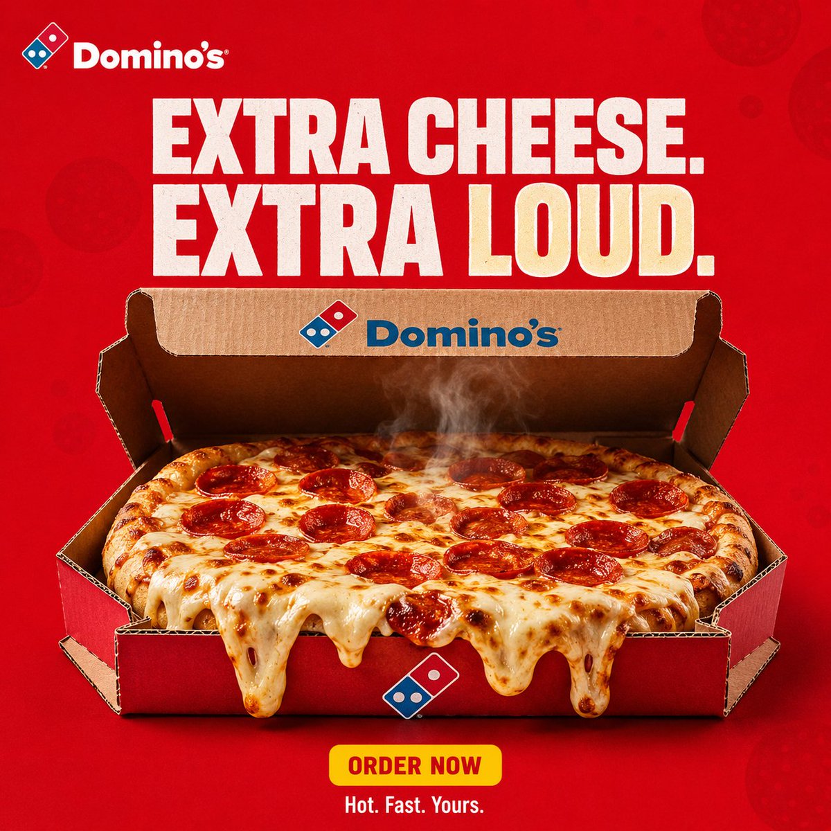
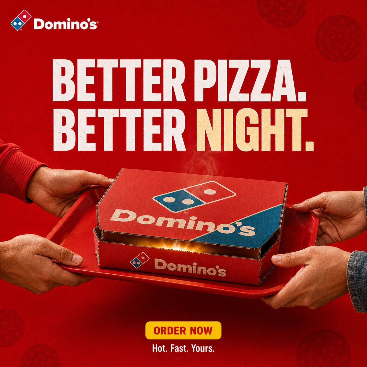
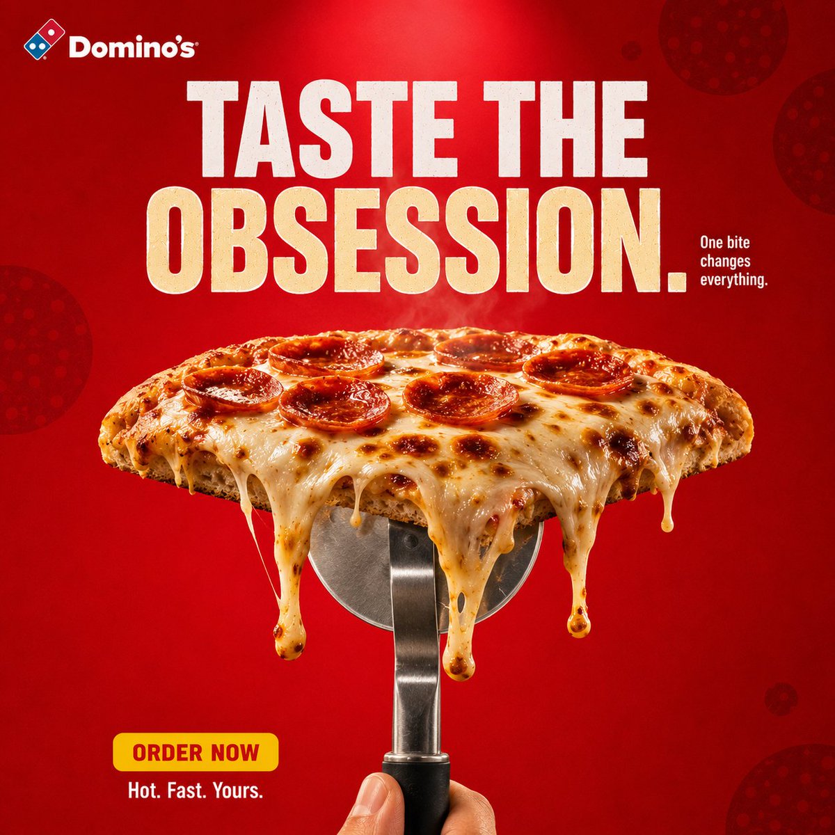
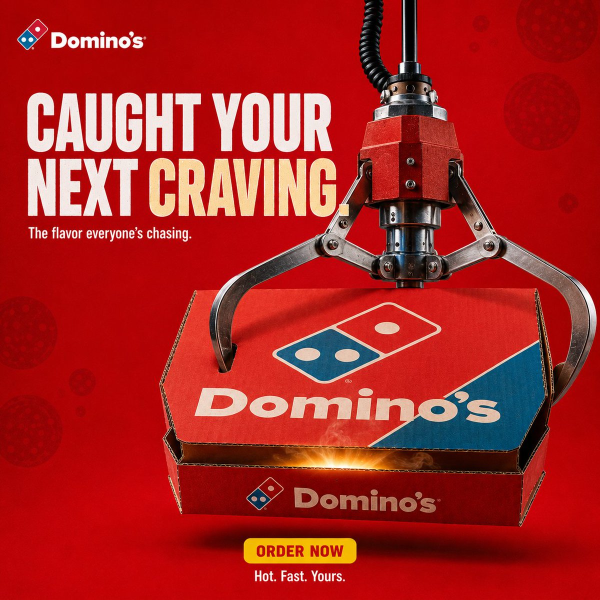
color_palette · vibrantcomposition · multi-panellighting · studio-lightquality_flags · embedded-textquality_flags · typography-heavyscene · studio
提示词(原文,逐字保留)
SMM campaign built around Dominos Pizza
- GPT image V2 for images
- Grok 4.5 for prompts
Try it with prompt structure : CREATIVE DIRECTION
Create a premium, agency-level DOMINO'S advertising poster inspired by the visual language of bold QSR / FMCG social campaigns: strong graphic composition, one instantly readable visual metaphor, controlled product photography, saturated brand colour as the entire world, clean negative space, tactile food realism, short stacked typography and carousel-system consistency.
Do not copy any specific reference composition.
Extract the common principles and build an original DOMINO'S execution.
The poster must feel like a real global pizza campaign art-directed for Instagram, photographed by a commercial food photographer, not a generic AI food poster.
The visual must communicate the idea before the viewer reads the copy.
CAMPAIGN DNA
Brand: DOMINO'S
Hero product: signature pepperoni / cheese pizza in authentic Domino's packaging language
Campaign territory: craving + delivery win
Concept: THE BOX IS THE WIN
Personality: hungry, playful, confident, fast, slightly cheeky
Colour system
- Dominant Domino's red (#E31837)
- Domino's blue (#006491) used only as logo, box accent, small graphic punctuation
- White
- Soft cream / mozzarella highlight
- Restrained dark red shadow
The red must own the frame immediately. It should not look like generic ketchup advertising.
CREATIVE EXECUTION
Graphic visual metaphor + premium pizza hero + QSR social poster
Use:
- oversized short typography
- product scale
- repetition of brand red
- negative space
- one gag / one object relationship
- controlled steam and cheese gloss
- strong alignment
Avoid environmental documentary. This is not a street-lifestyle film still unless the specific frame requires hands/tray.
BACKGROUND
A completely controlled advertising field.
Rich saturated Domino's red with subtle tonal depth.
Allowed:
- extremely subtle blob / pepperoni-dot pattern at very low contrast
- restrained radial falloff
- soft dimensional shadowing
Forbidden:
- random restaurant interior as default
- dirty kitchen
- city street
- collage clutter
- extra brands
HERO PRODUCT
Photoreal Domino's pizza as the most important physical object.
Preserve recognizable Domino's box / logo geometry. Do not invent a new logo. Do not redesign the wordmark.
Show:
- molten mozzarella
- pepperoni oil
- realistic crust blistering
- visible steam, restrained
- authentic corrugated pizza box when the box is in frame
- believable grease sheen, not plastic CGI
Product occupies roughly 50–65% of the frame width unless the idea needs scale contrast.
TYPOGRAPHIC SYSTEM
Headline: short, 3–6 words, bold contemporary grotesk / heavy sans.
Primary line in white.
One hook word may be cream-yellow.
Secondary line smaller, quieter.
Optional bottom lockup: ORDER NOW as a small yellow pill.
Optional footer: Hot. Fast. Yours.
Typography is hierarchy, not decoration.
Do not flood the frame with copy.
Do not use fake legal paragraphs.
COMPOSITION
Format: 1:1 square, Instagram carousel advertising frame
Structure:
TOP — small Domino's logo lockup, consistent position top-left
UPPER THIRD — headline
CENTRE — product + the single visual idea
BOTTOM — small CTA pill + tiny footer, clean
Keep identical padding logic across the whole campaign so nine frames feel like one system.
VISUAL HIERARCHY
Eye order:
1. pizza / box
2. the metaphor
3. headline
4. CTA
Product stays readable at thumbnail size.
LIGHTING
Premium QSR product photography.
Large soft key from above-front.
Subtle rim to separate cheese and crust from the red field.
Soft contact shadow under box / pizza.
Controlled specular highlights on oil and mozzarella.
No cinematic teal-orange grade.
No heavy bloom.
No anamorphic flares.
CAMERA / QUALITY
Simulate high-end commercial food photography.
Approx 80–90mm product feel, f/5.6–f/8.
Critical focus on cheese and box logo.
High micro-detail. Natural perspective. Edible texture.
Looks photographed, then art-directed, not generated and decorated.
BRANDING
Packaging and one small Domino's logo only.
No scattered badges.
No competitor marks.
No watermark.
No extra app UI unless the frame idea is delivery.
NEGATIVE DIRECTION
NO dark cinematic alley.
NO lifestyle party crowd.
NO unbranded generic pizza.
NO warped logo.
NO extra fingers / melted anatomy.
NO chocolate-style splash logic.
NO multiple concepts in one frame.
NO Canva template look.
NO tiny unreadable paragraphs.
NO fake HDR plastic food.
NO changing the red world between frames.
FINAL CREATIVE TESTS
1. Thumbnail test: pizza + idea readable at IG grid size.
2. One-sentence test: the frame idea can be said in one line.
3. System test: this frame could sit next to eight siblings and still look like Domino's.
中文译文
围绕达美乐披萨构建的 SMM(社交媒体营销)活动
- 图像使用 GPT image V2
- 提示词使用 Grok 4.5
请使用以下提示词结构进行尝试:CREATIVE DIRECTION(创意方向)
创作一张高端、达到广告公司水准的 DOMINO'S(达美乐)广告海报,灵感来自大胆的 QSR(快餐服务)/ FMCG(快速消费品)社交活动的视觉语言:强劲的图形构图、一个一眼可读的视觉隐喻、受控的产品摄影、饱和的品牌色作为整个画面、干净的负空间、可触的食物真实感、短小堆叠的字体以及轮播系统的一致性。
不要复制任何特定的参考构图。
提取通用原则,构建一个原创的 DOMINO'S 演绎。
这张海报必须感觉像一场真实的全球披萨活动,由商业美食摄影师为 Instagram 拍摄,而不是一张通用的 AI 食物海报。
视觉必须在观众阅读文案之前就传达出这个想法。
CAMPAIGN DNA(活动基因)
品牌:DOMINO'S(达美乐)
主打产品:采用真实达美乐包装语言的招牌意式香肠 / 芝士披萨
活动领域:渴望 + 外送获胜
概念:THE BOX IS THE WIN(盒子即是胜利)
个性:饥饿、俏皮、自信、快速、略带顽皮
色彩系统
- 主导的达美乐红 (#E31837)
- 达美乐蓝 (#006491) 仅用于 logo、盒子点缀、小型图形标点
- 白色
- 柔和的奶油色 / 马苏里拉芝士高光
- 克制的深红色阴影
红色必须立即统领整个画面。它不应看起来像通用的番茄酱广告。
CREATIVE EXECUTION(创意执行)
图形视觉隐喻 + 高端披萨主角 + QSR 社交海报
使用:
- 超大短字标语
- 产品尺度
- 品牌红的重复
- 负空间
- 一个笑点 / 一种物体关系
- 受控的蒸汽和芝士光泽
- 强烈的对齐
避免环境纪实风格。除非特定画面需要手 / 托盘,否则这不是街头生活方式电影剧照。
BACKGROUND(背景)
一个完全受控的广告画面。
浓郁饱和的达美乐红,带有微妙的色调深度。
允许:
- 极微妙的色块 / 意式香肠圆点图案,对比度极低
- 克制的径向衰减
- 柔和的立体阴影
禁止:
- 默认的随机餐厅内部
- 肮脏的厨房
- 城市街道
- 拼贴杂乱
- 额外的品牌
HERO PRODUCT(主打产品)
照片级真实的达美乐披萨,作为最重要的物理对象。
保留可识别的达美乐盒子 / logo 几何形状。不要发明新 logo。不要重新设计字标。
展示:
- 融化的马苏里拉芝士
- 意式香肠油
- 真实的饼皮起泡
- 可见的蒸汽,但要克制
- 当盒子在画面中时,要呈现真实的瓦楞披萨盒
- 可信的油脂光泽,而不是塑料 CGI
除非创意需要尺度对比,产品约占画面宽度的 50–65%。
TYPOGRAPHIC SYSTEM(字体系统)
标题:短,3–6 个词,大胆的现代 grotesk / 粗体无衬线字体。
主标题线为白色。
一个钩子词(hook word)可以是奶油黄。
次级标题更小、更安静。
可选底部组合:ORDER NOW 作为一个小黄色胶囊。
可选页脚:Hot. Fast. Yours.
字体是层级,而非装饰。
不要用文案淹没画面。
不要使用虚假的法律段落。
COMPOSITION(构图)
格式:1:1 正方形,Instagram 轮播广告画面
结构:
顶部 — 小型达美乐 logo 组合,固定位置在左上
上三分之一 — 标题
中心 — 产品 + 唯一的视觉创意
底部 — 小型 CTA(行动号召)胶囊 + 微小页脚,干净
在整个活动中保持完全相同的留白逻辑,使九个画面感觉像同一个系统。
VISUAL HIERARCHY(视觉层级)
视觉顺序:
1. 披萨 / 盒子
2. 隐喻
3. 标题
4. CTA(行动号召)
产品在缩略图尺寸下仍可读。
LIGHTING(打光)
高端 QSR 产品摄影。
来自上方前方的柔和大型主光。
微妙的轮廓光,将芝士和饼皮与红色画面分离。
盒子 / 披萨下方柔和的接触阴影。
油脂和马苏里拉上的受控高光。
不要电影感的青橙色调。
不要过度泛光。
不要变形镜头光斑。
CAMERA / QUALITY(相机 / 画质)
模拟高端商业美食摄影。
约 80–90mm 产品镜头感,f/5.6–f/8。
对芝士和盒子上 logo 的关键对焦。
高微观细节。自然的透视。可食用的质感。
看起来是先拍摄后艺术指导的,而不是生成后装饰的。
BRANDING(品牌呈现)
包装和仅一个小型达美乐 logo。
不要分散的徽章。
不要竞品标识。
不要水印。
不要额外的 app UI,除非画面创意是外送。
NEGATIVE DIRECTION(负面指引)
不要黑暗的电影感小巷。
不要生活方式派对人群。
不要无品牌的通用披萨。
不要扭曲的 logo。
不要多余的手指 / 融化的解剖结构。
不要巧克力风格的飞溅逻辑。
不要一个画面中多个概念。
不要 Canva 模板风格。
不要微小不可读的段落。
不要虚假的 HDR 塑料食物。
不要在画面之间改变红色世界。
FINAL CREATIVE TESTS(最终创意测试)
1. 缩略图测试:披萨 + 创意在 Instagram 网格尺寸下可读。
2. 一句话测试:画面创意可以用一句话概括。
3. 系统测试:这个画面可以与其他八个兄弟画面并列,仍然看起来像达美乐。
来源与署名
原文由 @Diplomeme 发布在 X:查看原推文。 本页逐字保留原文并提供机器翻译的中文解读;版权归原作者所有。
同工具的更多提示词
- [GPT Image 1.5 提示词] ar 2:3 High 一张高度精细的特写肖像,主体是一位二十岁出头的东亚年轻女性,拥有白皙的瓷质肌肤,妆容自然柔和…@woleswoosh
- 威尼斯黄金时刻,裹着一缕印度风情。🇮🇹✨ 有些旅程之所以令人难忘,不是因为你去了哪里,而是因为那个瞬间以多么美好的方式与你相遇。 ✨ 由 GPT Image…@nagarjuncreates
- 使用参考面孔,创作一张写实风格的韩式肖像。保持她的面部不变,搭配优雅的韩式发型以及端庄保守的韩式服装(高领口、全面覆盖)。让她身处一间舒适的韩式卧室中,坐在一…@Lianaalane
- 创作一张史诗般的电影感照片:一名孤独的宇航员站在红色外星悬崖上,仰望两轮巨大的卫星和漩涡状星云密布的天空。格式:4:5 竖版,电影级科幻构图。光线:来自远处太…@im_shahid7
- 磷光草稿 将用户的文字、图像或两者重写为一条适用于 GPT 图像生成 V2 或 Nano Banana Pro 的成品提示词。除非明确指定 Nano,否则使用…@IamEmily2050
- 创作一幅高度逼真、年轻化的东亚美女肖像,描绘一位成年女性,采用中近景构图,从头顶到上胸部。保持清新年轻的外观、自然的面部比例,以及精致考究的韩式/抖音美妆美学…@TaliaAariz