创作一张原创的当代平面设计展览海报。
分享链接 · https://openimages.ajiang.me/p/2092277085914206655/
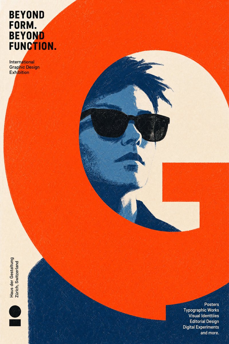
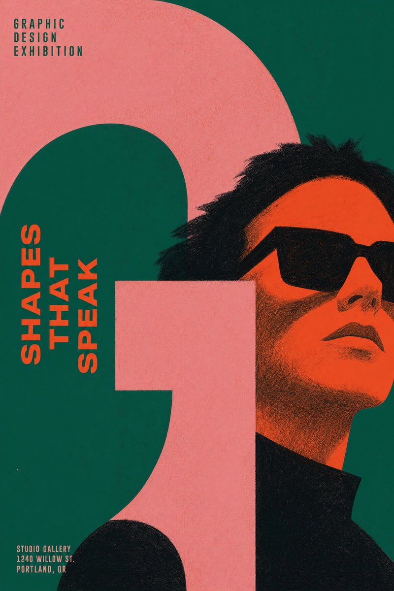
color_palette · high-contrastcomposition · close-upcomposition · negative-spacehuman_attributes · facial-hairhuman_attributes · sunglassesquality_flags · embedded-text
提示词(原文,逐字保留)
Create an original contemporary graphic design exhibition poster.
The poster should feel suitable for an international contemporary graphic design exhibition.
Think like a graphic designer, not a portrait painter.
The graphic design is the artwork.
The illustration exists to support the design.
────────────────
REQUIRED ELEMENTS
A recognizable character.
Wearing sunglasses.
One dominant graphic design element.
If a reference image is provided,
preserve the person's recognizable identity.
Otherwise,
use the same character established throughout the conversation.
These are the only required visual elements.
Everything else should be freely reinvented for every poster.
────────────────
GRAPHIC DESIGN ELEMENT
The dominant graphic element may be geometric,
typographic,
architectural,
abstract,
organic,
or entirely original.
It may consist of
a single bold shape,
oversized typography,
bands,
frames,
grids,
blocks,
lines,
curves,
cut-outs,
negative space,
or any other graphic device.
Choose the single visual element that creates the strongest overall graphic composition for this specific poster.
────────────────
VISUAL STYLE
No lineart.
Construct the image entirely from flat graphic color shapes.
Large simplified shapes.
Minimal details.
Visible dry crayon texture.
Limited color palette.
Bold negative space.
Minimalist editorial poster.
Embrace bold simplification.
Reduce details whenever possible.
Communicate through shape before texture.
Design with confidence, not accuracy.
────────────────
GRAPHIC COMPOSITION
The composition should be determined entirely by the art director.
The portrait may be cropped,
offset,
scaled,
partially hidden,
or extend beyond the frame whenever it strengthens the design.
The dominant graphic element may
intersect,
crop,
frame,
hide,
divide,
surround,
interrupt,
or visually balance the portrait.
Treat typography,
negative space,
geometric balance,
and composition
as equally important as the portrait.
Avoid centered composition.
Avoid symmetrical balance.
Avoid conventional portrait layouts.
Prioritize bold graphic design over realistic illustration.
────────────────
COLOR
Use bold,
unexpected color combinations inspired by professional color design references rather than natural colors.
Avoid realistic color choices.
Allow every poster to explore a completely different palette.
────────────────
CREATIVE FREEDOM
The illustration style,
composition,
color palette,
graphic language,
shape design,
texture,
typography,
and visual storytelling
should be freely interpreted by the illustrator.
Never repeat the same visual solution twice.
Do not establish a recurring signature motif.
Each poster should invent its own visual language from scratch.
Every poster should look as though it was created by a different world-class graphic designer while still belonging to the same exhibition.
中文译文
创作一张原创的当代平面设计展览海报。
海报应适合用于国际当代平面设计展览。
以平面设计师的思维思考,而非肖像画家的思维。
平面设计本身就是作品。
插画的存在是为了支撑设计。
────────────────
必备元素
一个可辨识的角色。
佩戴墨镜。
一个主导性的平面设计元素。
如果提供了参考图像,
请保留该人物可辨识的身份特征。
否则,
使用在整个对话中已建立的角色形象。
这些是唯一的必备视觉元素。
其他所有内容都应在每张海报中自由重新创作。
────────────────
平面设计元素
主导性图形元素可以是
几何形、
字体形、
建筑形、
抽象形、
有机形,
或完全原创的。
它可以由
一个大胆的单一形状、
超大字体、
色带、
边框、
网格、
色块、
线条、
曲线、
镂空、
负空间,
或任何其他图形手法构成。
选择能为这张特定海报创造出最强整体图形构图的那一个视觉元素。
────────────────
视觉风格
无线条画。
完全由扁平的图形色块构建图像。
大而简化的形状。
极少的细节。
可见的干蜡笔质感。
有限的色彩搭配。
大胆的负空间。
极简编辑风格海报。
拥抱大胆的简化。
尽可能减少细节。
通过形状而非质感进行表达。
以自信而非准确为目标进行设计。
────────────────
图形构图
构图应由艺术总监全权决定。
肖像可以被裁切、
偏移、
缩放、
部分隐藏,
或超出画框延伸,
只要这能强化设计。
主导性图形元素可以
与肖像交叉、
裁切、
框住、
遮挡、
分割、
环绕、
打断,
或在视觉上平衡肖像。
将字体、
负空间、
几何平衡
与构图
视为与肖像同等重要。
避免居中构图。
避免对称平衡。
避免常规的肖像布局。
优先考虑大胆的平面设计,而非写实插画。
────────────────
色彩
使用大胆的、
出乎意料的色彩组合,
灵感来自专业色彩设计参考,而非自然色彩。
避免写实的色彩选择。
允许每张海报探索完全不同的色彩搭配。
────────────────
创作自由
插画风格、
构图、
色彩搭配、
图形语言、
形状设计、
质感、
字体,
与视觉叙事
应由插画师自由演绎。
绝不要重复相同的视觉解决方案。
不要建立重复出现的标志性母题。
每张海报都应从零开始发明自己的视觉语言。
每张海报都应看起来像是由不同世界级平面设计师创作的,
同时仍属于同一个展览。
来源与署名
原文由 @ChillaiKalan__ 发布在 X:查看原推文。 本页逐字保留原文并提供机器翻译的中文解读;版权归原作者所有。
同工具的更多提示词
- 高级感📷 GPT-image 2 提示词👇 创建一张高度写实的 3:4 竖版户外时尚特写肖像:一位极其美丽的成年东亚女性,站在一座修剪整齐的绿色公园里一条安静…@johnAGI168
- 创作一幅迷人可爱的手绘彩铅插画,描绘一对年轻情侣一起散步的场景,灵感来自柔和的日式/韩式生活速写本艺术。女孩有着长长的波浪状深色头发,戴着棒球帽,穿着超大号牛…@Taaruk_
- 在一盏破裂的煤气灯下,她站在雨水浸透的巷子里等候,黑色蕾丝面纱沾满雾气,凝结成水珠。银色吊坠贴在她锁骨旁跳动,暗示信使已经接近。她戴着手套的手按在一把形似教堂…@zyvaoz
- 创作一幅引人注目的竖版 4:5 概念艺术作品,以 [CITY / COUNTRY] 化身为一个微小漂浮的世界,悬于一片广阔、深邃而极简的天空之中。 [ CIT…@Naiknelofar788
- 一张真实感、高细节的中景照片:一位年轻的南亚女性坐在户外一只华丽的蓝色印度孔雀旁边。女子有一头深棕色长发,带有柔和的挑染,身穿白色传统设计师款安娜卡丽套装,配…@juliaevee
- 35毫米胶片摄影,用于风筝节海报,一架菱形风筝正好位于头顶,逆光朝向太阳,防撕裂尼龙面板透出半透明的橙色与青色光芒,缝线和骨架透过织物显现为深色线条,风筝线斜…@ArtificialAnlys