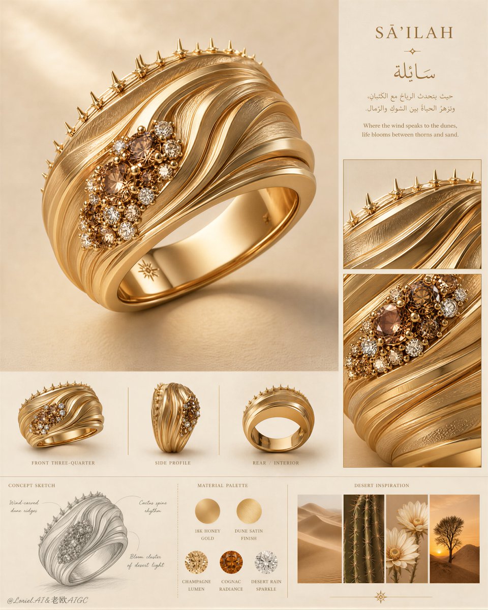
这块版面之所以有效,是因为戒指被当作一件带有周边证据的文物来对待。
分享链接 · https://openimages.ajiang.me/p/2089623443830682036/
color_palette · warm-tonescomposition · multi-panellighting · soft-lightlighting · studio-lightmood · elegantmood · luxurious
提示词(原文,逐字保留)
This board works because the ring is treated like an artifact with evidence around it.
The strongest control point is hierarchy: one monumental hero render, then detail windows and inspiration references. The supporting sections explain the idea, but never compete with the ring.
💍 oversized hero ring dominating the upper-left and center of a clean luxury archive board
This makes the ring feel like the sovereign object. The dune ridges, thorn edge, and bloom-like stone cluster are readable before the viewer notices the sketches or labels.
🏜️ bottom inspiration strip with dunes, cactus spines, pale desert flowers, and sunset tree
This anchors the concept without overexplaining it. You see the ring’s logic in four small references: flowing topography, thorn rhythm, rare bloom, and desert atmosphere.
GPT- image 2 prompt👇
Create an ultra-premium vertical jewelry concept presentation board for a luxury ring collection, merging the clarity of an international high-jewelry maison design archive with the visual poetry of a desert-inspired material study. Preserve the original board logic but refine it to its most powerful form: one oversized hero ring render dominates the upper-left and center, a disciplined right-side editorial column contains a short concept heading and two close-up detail windows, a middle strip presents three smaller orthographic product views, a lower-left graphite concept sketch explains the structural idea, a lower-middle palette section shows metal and gemstone swatches, and a lower-right inspiration strip contains four small desert-nature images. The whole layout must feel exceptionally clean, globally premium, intelligent, and exhibition-ready.
Design a new couture statement ring inspired by wind-carved dunes, cactus spine rhythm, and rare blossoms surviving in arid land, without copying any existing form. The ring should be a wide 18k gold band with layered sculptural ridges sweeping diagonally around the surface like flowing desert topography. Strengthen the Orbit energy by making the ridge lines more dynamic and directional, as if shaped by persistent wind, with elegant wave acceleration across the band. Along one upper edge, integrate a refined row of thorn-like micro protrusions inspired by cactus silhouettes, delicate and luxurious rather than aggressive. Near one side of the ring, place a tightly composed cluster of champagne, cognac, and clear stones, like a sudden bloom of desert flowers after rain. The ring must feel iconic, feminine, sculptural, and instantly recognizable.
Push the Transit direction strongly: simplify the board, increase negative space, reduce unnecessary explanatory density, refine alignment, and make every section feel more expensive and internationally art-directed. Push the Port direction strongly: compress the entire page memory into three dominant symbols only, the hero ring, the right-side detail windows, and the bottom inspiration strip. All other elements should remain faint, supportive, and highly controlled. The ring must remain the absolute visual sovereign of the page.
Lighting should be soft, warm, and precisely directed from the upper left, with premium studio control. Create delicate gradients across the gold ridges, restrained highlights along polished edges, subtle gemstone sparkle, and soft grounded shadows that make the hero ring feel tactile and monumental. Increase material contrast enough to reveal the dune-like topography and gemstone relief, but keep the atmosphere calm, noble, and flagship-level. No harsh glare, no catalog harshness, no overexposed metal.
Materials must be exquisitely rendered: rich warm 18k gold, alternating satin-brushed and softly polished ridge planes, tiny claw or bead gemstone settings, realistic champagne and cognac diamond depth, restrained clear diamond fire, and a perfectly smooth polished interior band. The right-side close-up windows should magnify the dune-ridge texture, thorn-edge craftsmanship, and floral gemstone cluster. The middle row of smaller product views should include front three-quarter view, side profile, and rear/interior view, evenly lit and neatly aligned. The lower-left concept sketch should be a fine graphite drawing with elegant original annotation lines. The palette section should present circular swatches of gold tone and gemstone colors with invented premium labels. The lower-right inspiration strip should show coordinated desert dunes, cactus detail, pale desert flowers, and a solitary desert tree at sunset.
Typography should be sparse, elegant, and original, using a refined serif Latin title with a graceful Arabic-inspired companion text block. Do not copy any wording from the source. Text must behave like compositional architecture only, never overpowering the ring. Background should be warm sand-beige with subtle matte paper softness and very faint editorial texture.
Color system: sand beige, warm ivory, honey gold, matte camel, champagne, cognac amber, soft white sparkle, muted desert brown, and tiny pale botanical accents. The final image must feel like a Cannes-level luxury jewelry concept board: clean, dramatic, collectible, and ready for a flagship campaign or museum exhibition.
No copied title, no copied wording, no watermark, no existing brand logo, no clutter, no extra jewelry pieces, no cheap CGI, no plastic gold, no oversaturated orange, no messy layout, no random props, no low-detail sketches, no black blotches, no muddy shadows, no distorted ring geometry, no inconsistent material logic, no illegible typography, no visual noise.
中文译文
这块版面之所以有效,是因为戒指被当作一件带有周边证据的文物来对待。
最强的控制点是层级关系:一个纪念碑式的主角渲染图,其次是细节窗口和灵感参考。支撑性的板块负责阐释理念,但绝不与戒指争抢视觉焦点。
💍 在干净奢华的档案式版面上,一枚超大尺寸的主角戒指占据左上方和中央
这让戒指感觉像是一个至高无上的主体。沙丘脊线、荆棘边缘和花朵般的宝石簇,在观众注意到草图或标签之前就已经清晰可读。
🏜️ 底部灵感条带,包含沙丘、仙人掌刺、淡色沙漠花卉和落日孤树
这在不做过分解读的情况下锚定了概念。你能在四个小型参考中读出戒指的设计逻辑:流动的地形、荆棘节奏、稀有绽放和沙漠氛围。
GPT- 图片 2 提示词👇
为奢华戒指系列打造一块超高端的竖版珠宝概念呈现板,将国际高级珠宝世家的清晰档案感与沙漠灵感的材质研究的视觉诗意相融合。保留原始版面的逻辑,但将其打磨到最有力的形态:一枚超大尺寸的主角戒指渲染图主导左上方与中央;右侧纪律严明的编辑栏包含一段简短的概念标题和两个特写细节窗口;中段条带呈现三个较小的正投影视角产品图;左下方的石墨概念草图解释结构构思;中下方的色板区展示金属与宝石色块;右下方的灵感条带包含四张小尺寸沙漠自然图像。整体布局必须感觉异常干净、全球高端、智慧且具备展览级水准。
设计一款全新的高级定制宣言戒指,灵感来自风蚀沙丘、仙人掌刺的节奏以及在干旱土地上顽强存续的稀有花朵,且不抄袭任何已有形态。戒指应为宽版 18K 金戒圈,表面环绕着斜向流动的分层雕塑感脊线,如同流动的沙漠地形。通过让脊线更具动感与方向性来强化 Orbit 能量,仿佛被持续的风所塑造,在戒圈上呈现优雅的波浪加速感。沿一侧上缘,融入一排精致的荆棘状微型凸起,灵感来自仙人掌的剪影,细腻奢华而不显攻击性。在戒指一侧附近,安置一团紧凑组合的香槟色、干邑色与透明宝石,犹如雨后沙漠花朵的突然绽放。戒指必须感觉标志化、女性化、雕塑感且一眼可辨。
强力推进 Transit 方向:简化版面、增加负空间、削减不必要的解释性密度、精调对齐方式,让每一区块都更显昂贵与国际化艺术指导质感。强力推进 Port 方向:将整页记忆压缩为仅三个主导符号——主角戒指、右侧细节窗口和底部灵感条带。其余元素应保持淡雅、辅助且高度受控。戒指必须保持为页面的绝对视觉主权。
灯光应柔和、温暖,并精准地从左上方投射,具备高端影棚控制力。在金色脊线上营造细腻的渐变、在抛光边缘保持克制的高光、呈现含蓄的宝石闪光,并投下柔和的着地阴影,使主角戒指具有触觉感与纪念碑感。增强足够的材质对比以揭示沙丘般的地形与宝石浮雕,但保持氛围的沉静、高贵与旗舰级水准。杜绝刺眼的眩光、目录式的生硬、过曝的金属。
材质必须被精致地呈现:浓郁温暖的 18K 金、缎面拉丝与柔和抛光的脊面交替、精细的爪镶或珠粒镶嵌、真实的香槟色与干邑色钻石深度、克制的透明钻石火彩,以及完美光滑的抛光内圈。右侧的特写窗口应放大沙丘脊线纹理、荆棘边缘工艺与花团宝石簇。中排较小的产品视图应包含前四分之三视角、侧视图与后部/内圈视图,光线均匀、整齐对齐。左下方的概念草图应是一幅细腻的石墨素描,带有优雅的原创标注线条。色板区应以圆形色块呈现金色调与宝石色,并配有自创的奢华标签。右下方的灵感条带应展示协调的沙漠沙丘、仙人掌细节、淡色沙漠花朵,以及一棵落日下的孤独沙漠树。
字体应稀少、优雅且原创,使用精致的衬线拉丁标题与一段优雅的阿拉伯灵感伴生文字块。不要照搬原文用词。文字必须仅作为构图架构存在,绝不可压过戒指。背景应为温暖沙米色,带有细腻的哑光纸张柔和感与极淡的编辑纹理。
色彩系统:沙米色、温暖象牙色、蜜糖金、哑光驼色、香槟色、干邑琥珀色、柔和白色闪光、低调沙漠棕,以及微小的淡色植物点缀。最终图像必须感觉像戛纳级的奢华珠宝概念板:干净、戏剧化、可收藏,并准备好用于旗舰广告或博物馆展览。
不得照搬标题、不得照搬文字、不得有水印、不得出现现有品牌标志、不得杂乱、不得有多余的珠宝、不得有廉价 CGI、不得有塑料感的金色、不得有过度饱和的橙色、不得有混乱的布局、不得有随机道具、不得有低细节草图、不得有黑色斑块、不得有浑浊阴影、不得有扭曲的戒指几何、不得有不一致的材质逻辑、不得有难以辨认的字体、不得有视觉噪点。
来源与署名
原文由 @ou_zhen599 发布在 X:查看原推文。 本页逐字保留原文并提供机器翻译的中文解读;版权归原作者所有。
同工具的更多提示词
- 为[COUNTRY](国家名称)创作一幅令人惊叹的高端4:5竖版电影质感旅游海报,基于以下构思: 一面巨大的[COUNTRY]国旗如奢华流动的丝绸般铺满整个画…@Naiknelofar788
- 真实感编辑级人像。 全身肖像,肩部高度的视角,正前方偏左的三分之三侧面视角。从女性的正前方偏左侧拍摄。她的左肩和左髋更靠近镜头,胸部、盆骨、腿部和脚部构成正前…@VIBEQUIRKLABS
- 超写实全身编辑时尚人像:一位美丽的年轻女性以放松的宽腿姿势低坐,膝盖抬起并微微分开,双手自然握住一只位于双脚之间的亮橙色尼龙手提袋的提手。面部身份与面部比例与…@miratechtool
- 1960年代–70年代启发的半色调肖像海报。 [ 海报系列 - 第1部分 ] Prompt: { "task": "将上传的参考照片(或该知名人物的常见形象)…@SaasJunctionHQ
- Gemini Nano Banana 2 vs Grok Imagine vs ChatGPT Image 2 🖤 谁做得更好? 1️⃣ Nano Banan…@punkhuri1
- 为[PRODUCT](产品)打造一个超写实的奢华广告活动,定位为高端时尚、生活方式、美妆或科技品牌的优质商业广告。 场景与建筑 设定场景为一个未来主义、极简奢…@Goodmanprotocol