水彩与墨水旅行海报,关于 {CITY},{COUNTRY}。竖版 3:4。
分享链接 · https://openimages.ajiang.me/p/2089060880835309948/
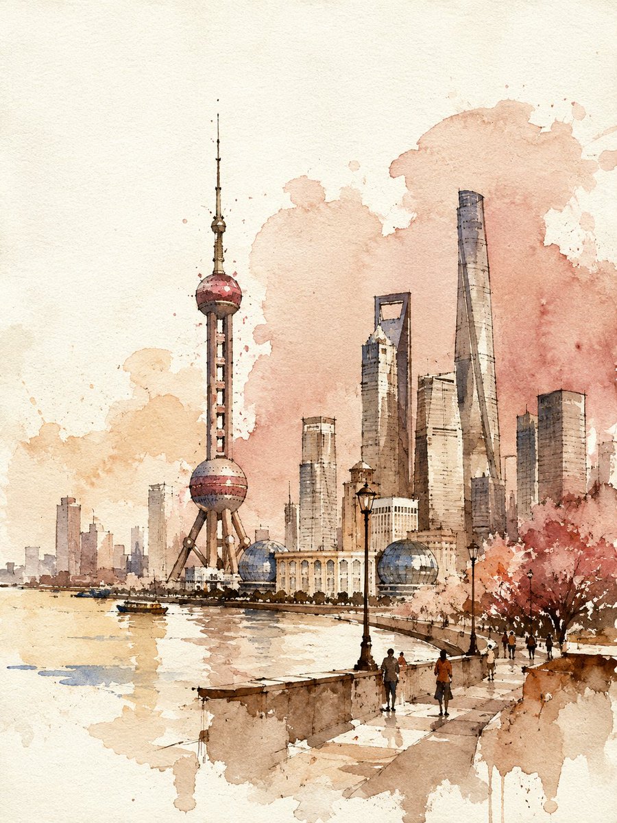
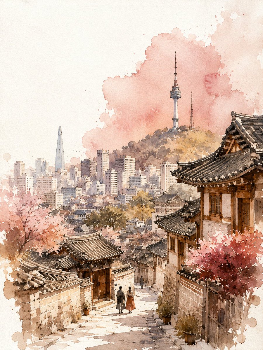
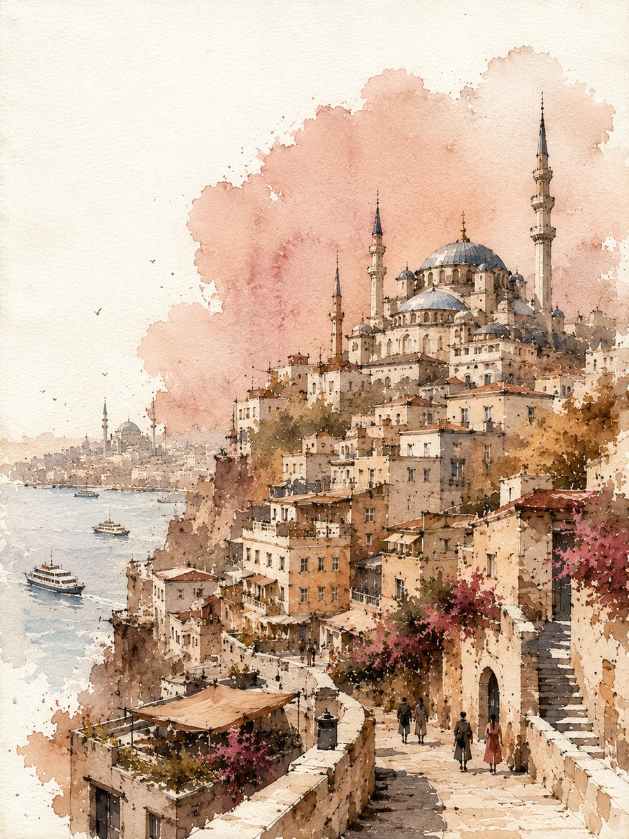
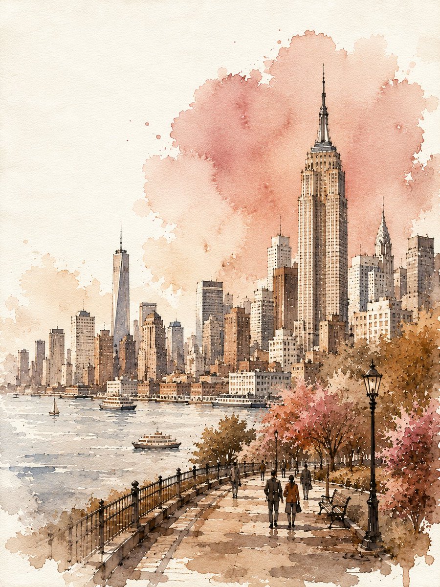
color_palette · pastelcolor_palette · warm-tonescomposition · medium-shotcomposition · rule-of-thirdsmood · nostalgicsubject_type · architecture-interior
提示词(原文,逐字保留)
Watercolor and ink travel poster of {CITY}, {COUNTRY}. Vertical 3:4.
Loose hand-painted poster, finished — not an abandoned sketch.
IDENTITY LOCK — drawn clearly AND painted, never bare outline:
Choose 3–5 instantly recognizable symbols of {CITY}, prioritizing landmarks with clearly different silhouettes. Simplify them into strong, readable shapes while preserving their defining visual identities.
One or two landmarks should act as the primary visual destinations. Establish the city's characteristic architecture, landscape or skyline clearly.
Simplify everything else; never the key landmarks.
COMPOSITION
Main city subject occupies approximately 65–75 percent of the frame height, arranged asymmetrically rather than perfectly centered. Keep the major landmarks fully visible, never touching the top edge and never awkwardly cropped.
Top 15 percent: mostly empty paper sky.
Foreground anchor band across the bottom 25 percent: include simplified elements characteristic of the city — streets, waterfront, landscape, vegetation, architecture or tiny figures — depending on the location.
INK — two weights, obviously different:
Wet waterline: soft round brush, diluted warm sepia, so wet the paper drinks it — feathers 2–3 mm, pooling into dark blooms at stroke ends.
Dry fine nib: raw umber hairline on top, broken and scratchy.
Use ink only for essential structure, joints, selected contours and architectural details. No line should be perfectly thin, even or continuous throughout.
VALUE — all four steps present:
1. Bare white paper, 30–35 percent — sky, illuminated surfaces and outer margins.
2. Light wash — main buildings, landmarks and landscape.
3. Mid tone — shadows, secondary structures, foreground and cast shadows.
4. DARK ANCHORS — 6–10 fingertip-sized deep burnt umber accents placed only in important recesses, doorway/window masses, structural shadows, landmark bases and tiny figure marks. Mandatory: without them the poster becomes a flat pastel blur.
WATERCOLOR — warm pastel tints mixed ON THE PAPER, never premixed:
Pale apricot (main), butter cream (lightest), dusty rose (secondary surfaces and atmospheric accents), clay taupe (shadows), muted dusty blue (only for selected cool elements appropriate to {CITY}), deep burnt umber (dark anchors only).
Wet-on-dry, with a second glaze dropped in while damp so colours naturally bleed into a third tone. Hard pooled edges, granulation and cauliflower blooms.
Every wash boundary dissolves into bare paper over 5–15 mm — no wash ends at a hard line.
FADE ZONE
Dissolving happens at the picture's outer edges, never through the primary landmarks.
Use fading along the left and right margins, distant background, far landscape or skyline, and outer ends of the foreground anchor band.
The main subject remains whole, solid and immediately recognizable.
OFF-REGISTER
Allow watercolor washes to drift 4–8 mm outside selected contours and stop short in others, leaving natural white slivers.
Colour never outlines the subject.
ABSTRACT ACCENT
One soft, irregular colour field behind the main subject, using a muted dusty rose or another warm pastel tone appropriate to the composition.
Overlap the main silhouette by roughly one-third and allow the field to run naturally off one canvas edge.
Irregular wet edges, pooled bloom and visible granulation. It must feel like an intentional painterly gesture, never a rectangular stain.
PAPER & FINISH
Pure white cold-press paper, visible tooth and scanned handmade texture. Natural watercolor bleeding reaches all four edges.
AVOID:
Repeated identical windows, generic landmarks, tourist crowds, postcard saturation, electric blue, flat even fills, uniform line weight, technical architectural drawing, unpainted main subject, floating rectangular stains, muddy grey, cream or beige paper cast, pure black, photorealism, text, lettering, signature, watermark and border frame.
中文译文
水彩与墨水旅行海报,关于 {CITY},{COUNTRY}。竖版 3:4。
松散的手绘海报,已完成 — 不是未完成的草稿。
身份锁定 — 画得清晰并上色,绝不只留空线条:
选取 {CITY} 的 3–5 个一眼可辨的标志,优先选用剪影明显不同的地标。将其简化为强烈、可读的形状,同时保留其核心视觉特征。
一两个地标应作为主要视觉焦点。清晰呈现该城市特有的建筑、景观或天际线。
其他一切都可以简化;关键地标绝不可简化。
构图
主要城市主体约占画面高度的 65–75%,以不对称方式排布,而非完美居中。主要地标必须完整可见,不得触及上边缘,也不得被生硬裁切。
顶部 15%:基本为留白的纸面天空。
横跨底部 25% 的前景锚定带:包含该城市特有的简化元素 —— 街道、滨水区、景观、植被、建筑或微小人物 —— 根据地点而定。
墨水 —— 两种粗细,明显不同:
湿润的水线:柔软的圆头笔,稀释的暖色棕褐,湿度足以让纸张吸收——羽化 2–3 毫米,在笔触末端积聚为深色墨晕。
干燥的细尖笔:上层生赭石发丝线,断续而粗涩。
墨水仅用于关键结构、接缝、选定轮廓与建筑细节。任何线条都不应在全幅保持完全纤细、均匀或连续。
明度 —— 四级全部呈现:
1. 留白纸面,30–35% —— 天空、受光面与外缘。
2. 浅色罩染 —— 主要建筑、地标与景观。
3. 中间调 —— 阴影、次要结构、前景与投影。
4. 深色锚点 —— 6–10 处指尖大小的深焦赭点缀,仅置于关键凹陷、门窗群块、结构阴影、地标基座与微小人物标记处。强制要求:缺少它们海报会变成扁平的粉彩糊。
水彩 —— 暖色粉彩色调在纸面上混合,绝不预先调色:
淡杏色(主色)、奶油黄(最浅)、灰玫瑰(次要表面与氛围点缀)、陶土褐(阴影)、低饱和灰蓝(仅用于符合 {CITY} 的特定冷色元素)、深焦赭(仅用于深色锚点)。
湿叠干,趁未干时再点染一层罩染,使色彩自然晕染出第三色。硬朗的积色边缘、颗粒感与花椰菜式墨晕。
每一处罩染边界在 5–15 毫米内过渡为留白纸面 —— 任何罩染都不得以硬边结束。
渐隐区域
溶解感出现在画面外缘,而非主要地标之上。
在左右边距、远景背景、远处景观或天际线、前景锚定带的外端使用渐隐。
主要主体保持完整、坚实、立即可辨。
套印偏移
允许水彩罩染在选定轮廓外偏移 4–8 毫米,而在另一些轮廓处止于其内,留下自然的白色窄缝。
色彩绝不勾画主体。
抽象点缀
主体后方放置一处柔和、不规则的色块,使用灰玫瑰或其他适合构图的暖色粉彩调。
与主体轮廓重叠约三分之一,并让该色块自然延伸出画布一边。
不规则的湿润边缘、积色晕染与可见的颗粒感。必须像是有意为之的绘画笔触,而非方形污渍。
纸张与成色
纯白冷压纸,可见纸纹肌理与扫描出的手工质感。自然的水彩渗色延伸至四边。
避免:
重复相同的窗户、通用地标、游客人群、明信片式饱和、电光蓝、平涂均匀填充、统一线宽、技术性建筑制图、未上色的主体、漂浮的方形污渍、浑浊的灰色、米色或米黄纸调、纯黑、超写实、文字、字母、签名、水印与边框。
来源与署名
原文由 @Goodmanprotocol 发布在 X:查看原推文。 本页逐字保留原文并提供机器翻译的中文解读;版权归原作者所有。
同工具的更多提示词
- 一个梦幻般的童话美妆世界,微小的女性化妆师正在为一位美丽年轻女子的巨大眼睛打造眼妆。这位女子拥有无瑕的瓷白肌肤、深邃传神的眼睛、涂着睫毛膏的纤长卷翘睫毛,以及…@SheBuildsAI_
- 创作一幅高端竖版 4:5 水彩旅行海报,以浪漫、沉浸式的旅行场景描绘 [CITY]([CITY])和 [COUNTRY]([COUNTRY])。 展示一条迷人…@Naiknelofar788
- { "prompt_template": { "instructions": "用户只需提供 {{COMPANY_NAME}} 和/或上传 {{LOGO_IM…@SaasJunctionHQ
- 一位机器人女性为一台家用小型核反应堆拍摄广告 1. 照片:一张逼真的特写肖像,展现一位外形流畅的机器人女性,她拥有拉丝钛金属般的肌肤和微微发光的青色接缝,嘴角…@TraffAlex
- 白昼中一座冰封的瀑布。晶体如吊灯般捕捉阳光。 1. 照片:创作一张白昼中冰封瀑布的写实风景摄影作品,使用 24mm 广角镜头,f/8 光圈以获得深焦,捕捉阳光…@TraffAlex
- 电影感黄金时段的照片写实风格人像肖像:一位年轻男子,自然蓬松的深色波浪卷发,身穿简约白色T恤搭配黑色轻薄夹克,在日落时分的城市街道上随意地站在一扇大型玻璃窗旁…@aatif_j