🧳 旅游海报最有效的“打开方式”,不是把地标拍满,而是先画出一条进入目的地的笔触。
分享链接 · https://openimages.ajiang.me/p/2085345973107392741/
color_palette · earthycolor_palette · warm-tonescomposition · dynamic-diagonallighting · golden-hourmood · elegantmood · nostalgic
提示词(原文,逐字保留)
🧳旅游海报最有效的“打开方式”,不是把地标拍满,而是先画出一条进入目的地的笔触。
笔触在这里不是边框,它承担了镜头、叙事和情绪:从浓重的颜料与遗迹细节起笔,向光、天空与地标收束。一个旅游地,就有了被“揭开”的瞬间。
one monumental brushstroke as the visual container
只用一笔承载整座城市或文明,其他区域大胆留白。它解决“景点太多、没有主视觉”的问题。
destination world emerging inside the paint
让寺庙、水面、植被、街区从颜料纹理里长出来,边缘保留干刷飞白。它解决“照片贴进笔刷蒙版”的廉价感。
dense-to-luminous visual journey
笔触起点放材料感与近景细节,终点打开天空、日光与主地标。它让观众顺着笔触完成一次抵达。
quiet paper field, editorial typography
把大面积纸张留给呼吸,标题只做落款,不跟地标抢戏。它解决旅游海报常见的“信息太满”。
GPT- image 2 prompt👇
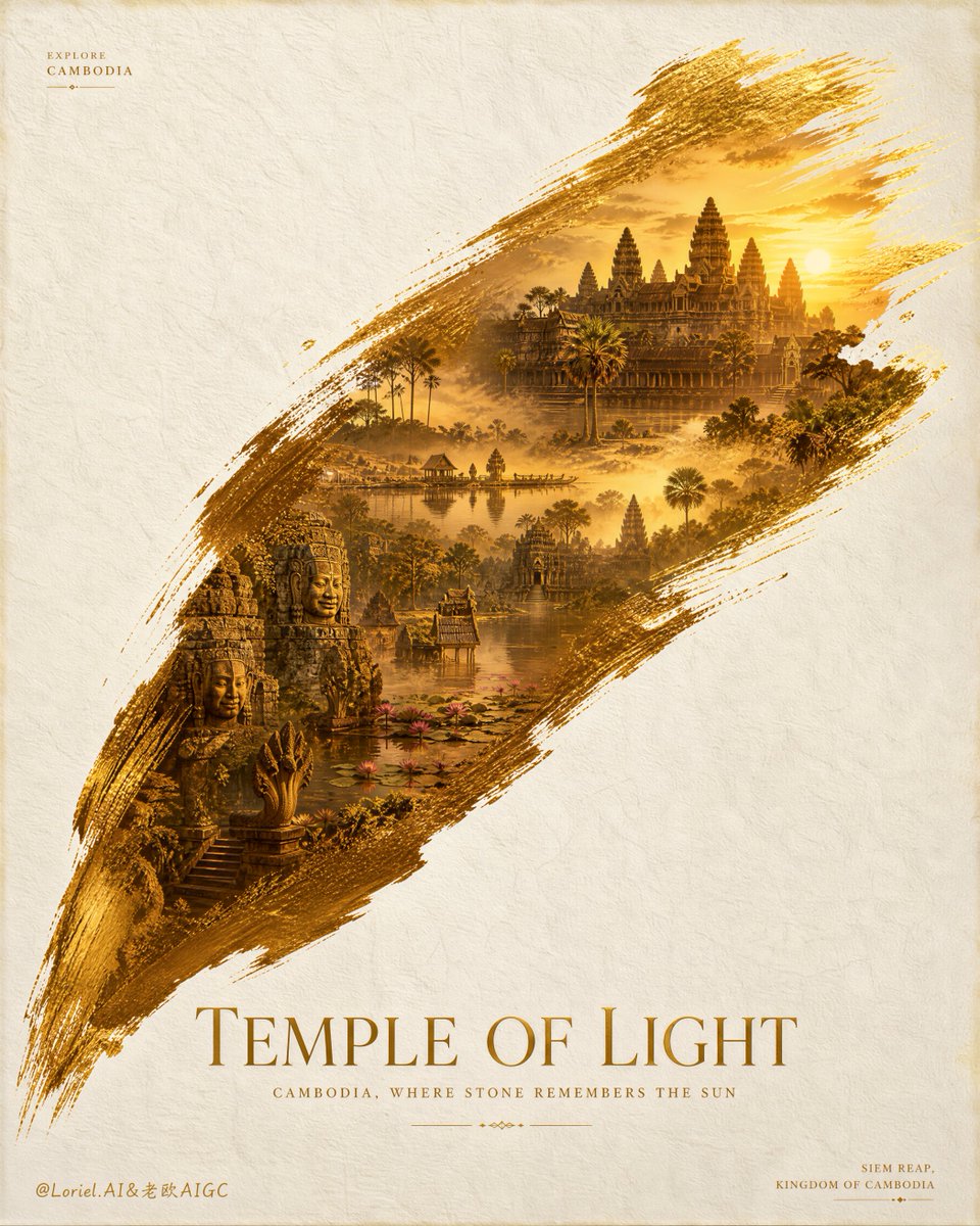
Create an ultra-premium tourism advertising poster for Cambodia, designed as a Cannes-award-level destination campaign visual with extreme realism, poetic restraint, and museum-grade print elegance. Preserve the exact structural logic of a vast warm-white textured paper background with one single monumental golden brushstroke sweeping diagonally across the center, and within that brushstroke reveal an entire dreamlike world of Cambodia. The final image must feel like a collector-edition travel poster: clean, iconic, emotionally transporting, and instantly memorable.
Core composition:
Use a tall vertical poster with a large field of quiet negative space on a refined handmade-paper background. The paper must show subtle fibers, soft grain, elegant matte texture, and premium print realism. Across the center, place one dramatic painterly brushstroke sweeping from lower left to upper right in rich tones of saffron gold, amber, bronze, sunlit ochre, and faint metallic warmth. This brushstroke must be the only major visual container and the absolute central hero. Inside it, Cambodia should appear as if painted into existence in one unforgettable gesture.
Destination world inside the brushstroke:
Build a seamless panoramic miniature world centered on Cambodia’s most iconic visual identity. Let Angkor Wat dominate as the primary landmark, supported by layered Khmer temple towers, weathered sandstone galleries, carved bas-relief fragments, jungle-softened ruins, palm silhouettes, lotus-edged reflective water, and subtle tropical haze. Add carefully integrated secondary destination cues such as serene Tonle Sap water atmosphere, elegant stone faces, sacred stairways, distant tree lines, and quiet heritage textures. The internal world should feel like a complete civilization contained within one brushstroke, not a collage of disconnected landmarks.
Visual storytelling:
The brushstroke should feel like a symbolic act of revealing a kingdom of memory, light, and heritage. The lower-left area of the stroke should feel denser, earthier, and more tactile, with richer pigment buildup and strong materiality. As it sweeps upward to the right, the destination should open into brighter light, air, and spiritual elevation, creating a sense of ascent, wonder, and timeless discovery. The image should communicate that Cambodia is not just a place, but an illuminated cultural world.
Tourism brand language:
Use English-only destination titling for the main campaign line. Create a new original main title centered below the brushstroke in elegant large serif typography: “Temple of Light”. Add a refined subtitle beneath it: “Cambodia, Where Stone Remembers the Sun”. In the upper left corner, place a tiny premium destination signature such as “Explore Cambodia”. In the lower right corner, place a small minimal location line such as “Siem Reap, Kingdom of Cambodia”. All wording must be newly invented. Do not include any real person names or any company names.
Typography and layout:
The typographic system must feel luxurious, architectural, and internationally polished. Keep the text minimal, beautifully spaced, and perfectly aligned with the large negative space. The main title should feel like a premium cultural tourism campaign, not a generic travel flyer. Every text element must be quiet, deliberate, and elegant. No heavy crude fonts, no cluttered copy, no commercial cheapness.
Lighting and atmosphere:
Use soft golden sunrise light inside the brushstroke, with delicate mist, warm highlights on temple stone, subtle water reflections, and atmospheric tropical depth. The surrounding paper field must remain calm and matte, allowing the central brushstroke to glow like a precious revealed artifact. The mood should feel spiritual, timeless, luminous, and quietly overwhelming.
Material realism:
Push every element to elite commercial-art realism. Show realistic sandstone texture, aged carvings, fine vegetation detail, tropical humidity, soft reflective water, and premium pigment layering in the brushstroke. The edges of the stroke should show dry-brush drag, painterly fiber breakup, subtle gold dust shimmer, and tactile paint thickness. The whole poster must feel beautifully printed, collectible, and gallery-worthy.
Campaign-grade finish:
This must look like a real flagship destination poster suitable for international tourism promotion, cultural exhibitions, airport campaign walls, luxury travel publications, and collector prints. Strengthen the destination impact through a more breathtaking Angkor-centered world, strengthen the system maturity through more disciplined typography and spacing, and strengthen the final presentation through collector-grade paper, pigment, and print atmosphere.
Creative emphasis:
Combine three layers in one final result:
Orbit-level impact through a more overwhelming golden brushstroke spectacle and a more breathtaking Angkor-world reveal;
Transit-level maturity through cleaner title hierarchy, tighter negative-space control, and a more official tourism-campaign structure;
Port-level completeness through collector-edition print texture, premium destination branding, and a fully resolved international poster finish.
No copied text, no real person names, no company names, no cluttered layout, no cheap travel-flyer styling, no weak typography, no chaotic montage, no low-detail temples, no stock-photo feeling.
中文译文
🧳 旅游海报最有效的“打开方式”,不是把地标拍满,而是先画出一条进入目的地的笔触。
笔触在这里不是边框,它承担了镜头、叙事和情绪:从浓重的颜料与遗迹细节起笔,向光、天空与地标收束。一个旅游地,就有了被“揭开”的瞬间。
one monumental brushstroke as the visual container
只用一笔承载整座城市或文明,其他区域大胆留白。它解决“景点太多、没有主视觉”的问题。
destination world emerging inside the paint
让寺庙、水面、植被、街区从颜料纹理里长出来,边缘保留干刷飞白。它解决“照片贴进笔刷蒙版”的廉价感。
dense-to-luminous visual journey
笔触起点放材料感与近景细节,终点打开天空、日光与主地标。它让观众顺着笔触完成一次抵达。
quiet paper field, editorial typography
把大面积纸张留给呼吸,标题只做落款,不跟地标抢戏。它解决旅游海报常见的“信息太满”。
GPT- image 2 prompt👇
Create an ultra-premium tourism advertising poster for Cambodia, designed as a Cannes-award-level destination campaign visual with extreme realism, poetic restraint, and museum-grade print elegance. Preserve the exact structural logic of a vast warm-white textured paper background with one single monumental golden brushstroke sweeping diagonally across the center, and within that brushstroke reveal an entire dreamlike world of Cambodia. The final image must feel like a collector-edition travel poster: clean, iconic, emotionally transporting, and instantly memorable.
Core composition:
Use a tall vertical poster with a large field of quiet negative space on a refined handmade-paper background. The paper must show subtle fibers, soft grain, elegant matte texture, and premium print realism. Across the center, place one dramatic painterly brushstroke sweeping from lower left to upper right in rich tones of saffron gold, amber, bronze, sunlit ochre, and faint metallic warmth. This brushstroke must be the only major visual container and the absolute central hero. Inside it, Cambodia should appear as if painted into existence in one unforgettable gesture.
Destination world inside the brushstroke:
Build a seamless panoramic miniature world centered on Cambodia's most iconic visual identity. Let Angkor Wat dominate as the primary landmark, supported by layered Khmer temple towers, weathered sandstone galleries, carved bas-relief fragments, jungle-softened ruins, palm silhouettes, lotus-edged reflective water, and subtle tropical haze. Add carefully integrated secondary destination cues such as serene Tonle Sap water atmosphere, elegant stone faces, sacred stairways, distant tree lines, and quiet heritage textures. The internal world should feel like a complete civilization contained within one brushstroke, not a collage of disconnected landmarks.
Visual storytelling:
The brushstroke should feel like a symbolic act of revealing a kingdom of memory, light, and heritage. The lower-left area of the stroke should feel denser, earthier, and more tactile, with richer pigment buildup and strong materiality. As it sweeps upward to the right, the destination should open into brighter light, air, and spiritual elevation, creating a sense of ascent, wonder, and timeless discovery. The image should communicate that Cambodia is not just a place, but an illuminated cultural world.
Tourism brand language:
Use English-only destination titling for the main campaign line. Create a new original main title centered below the brushstroke in elegant large serif typography: “Temple of Light”. Add a refined subtitle beneath it: “Cambodia, Where Stone Remembers the Sun”. In the upper left corner, place a tiny premium destination signature such as “Explore Cambodia”. In the lower right corner, place a small minimal location line such as “Siem Reap, Kingdom of Cambodia”. All wording must be newly invented. Do not include any real person names or any company names.
Typography and layout:
The typographic system must feel luxurious, architectural, and internationally polished. Keep the text minimal, beautifully spaced, and perfectly aligned with the large negative space. The main title should feel like a premium cultural tourism campaign, not a generic travel flyer. Every text element must be quiet, deliberate, and elegant. No heavy crude fonts, no cluttered copy, no commercial cheapness.
Lighting and atmosphere:
Use soft golden sunrise light inside the brushstroke, with delicate mist, warm highlights on temple stone, subtle water reflections, and atmospheric tropical depth. The surrounding paper field must remain calm and matte, allowing the central brushstroke to glow like a precious revealed artifact. The mood should feel spiritual, timeless, luminous, and quietly overwhelming.
Material realism:
Push every element to elite commercial-art realism. Show realistic sandstone texture, aged carvings, fine vegetation detail, tropical humidity, soft reflective water, and premium pigment layering in the brushstroke. The edges of the stroke should show dry-brush drag, painterly fiber breakup, subtle gold dust shimmer, and tactile paint thickness. The whole poster must feel beautifully printed, collectible, and gallery-worthy.
Campaign-grade finish:
This must look like a real flagship destination poster suitable for international tourism promotion, cultural exhibitions, airport campaign walls, luxury travel publications, and collector prints. Strengthen the destination impact through a more breathtaking Angkor-centered world, strengthen the system maturity through more disciplined typography and spacing, and strengthen the final presentation through collector-grade paper, pigment, and print atmosphere.
Creative emphasis:
Combine three layers in one final result:
Orbit-level impact through a more overwhelming golden brushstroke spectacle and a more breathtaking Angkor-world reveal;
Transit-level maturity through cleaner title hierarchy, tighter negative-space control, and a more official tourism-campaign structure;
Port-level completeness through collector-edition print texture, premium destination branding, and a fully resolved international poster finish.
No copied text, no real person names, no company names, no cluttered layout, no cheap travel-flyer styling, no weak typography, no chaotic montage, no low-detail temples, no stock-photo feeling.
来源与署名
原文由 @ou_zhen599 发布在 X:查看原推文。 本页逐字保留原文并提供机器翻译的中文解读;版权归原作者所有。
同工具的更多提示词
- 一张超写实的特写肖像照,一位惊艳的年轻女子坐在车内,正值黄金时刻。她有一头柔顺的深棕色长发,柔和的自然波浪垂落在脸颊两侧,肌肤如瓷般光洁、肤质无瑕,拥有一双引…@jzaib4269
- 使用 Grok Imagine Video 1.5 制作(参考生成视频,3 个图像槽位)。 全部 4 张源静帧均使用 GPT-Image-2 生成,模拟 Fu…@Nine_Shell
- 以一个以人为本的生活瞬间为主题,创作一张 9:16 的编辑式字体海报。 将超大号字体作为主要的构图结构。让人物、动作、城市空间或日常场景出现在字母内部、穿过字…@ChillaiKalan__
- 推荐一座文明古城,别先放全景地标;先放一块能让人想触摸的“证据”。 一根残柱、一道纹饰、一个面具,足以承载整座城市的时间感。旅游海报从“介绍景点”变成“邀请你…@ou_zhen599
- 电影极简风格肖像:一位美丽的年轻东亚女性独自伫立在开阔的野花草甸上,头顶是无限的蓝天,她双眼微闭或半睁,仰望天空,仿佛在拥抱微风。乌黑长发自然蓬松,随风自由飘…@Taaruk_
- 你是一位世界级的艺术总监,专精于编辑设计、品牌叙事、时装设计与平面艺术领域。 你的任务不是创作一张肖像式的写实作品。请基于与用户的全部沟通历史,深入理解他的生…@im_shahid7