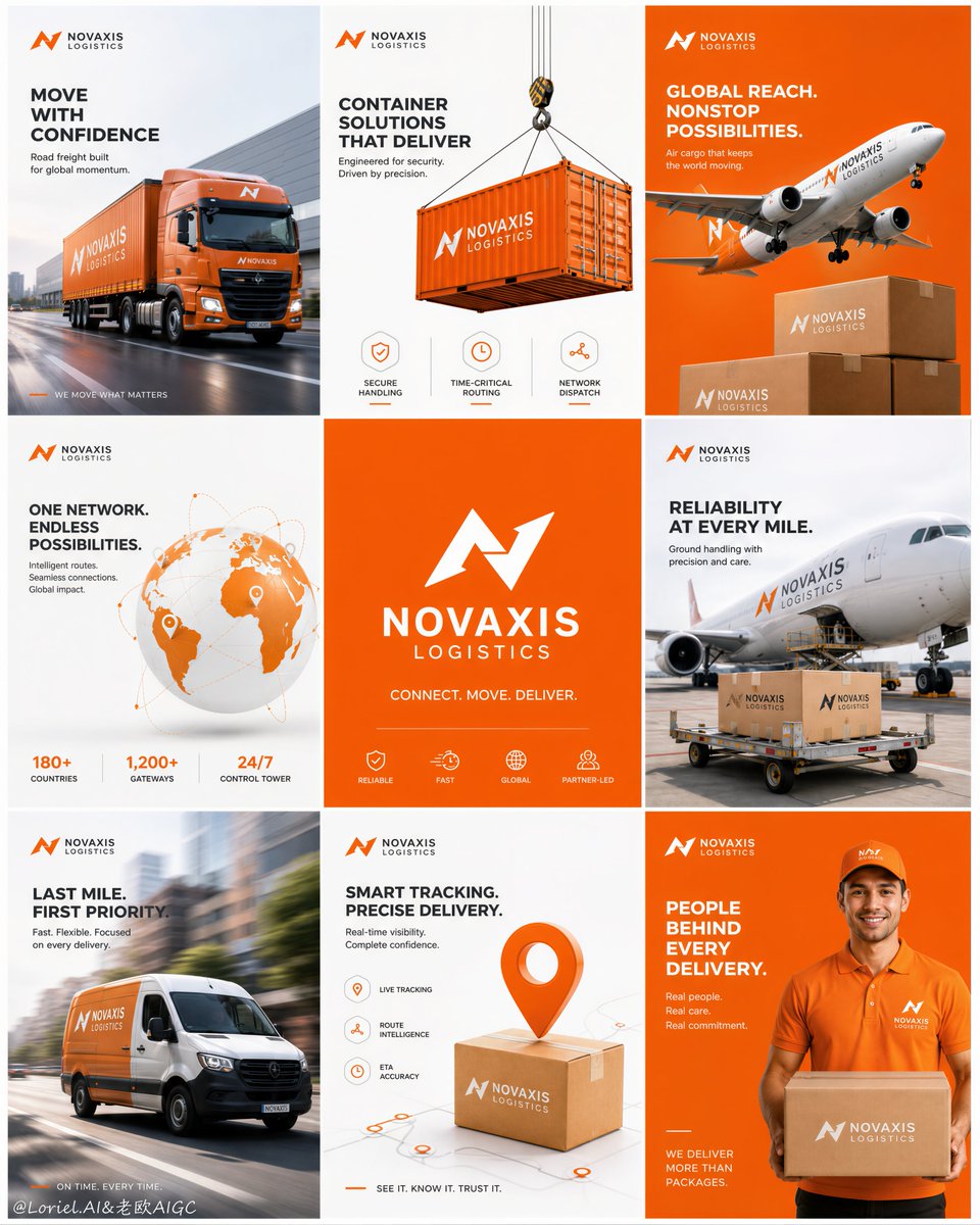
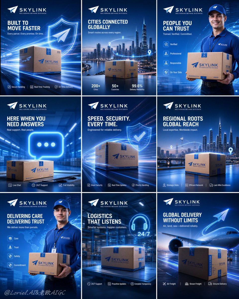
🚚 物流品牌做九宫格时,不要九张图都放卡车。让同一只包裹反复出现,才能把"速度、范围、信任、服务"变成一套完整的品牌记忆。
分享链接 · https://openimages.ajiang.me/p/2085334149737611348/
color_palette · cool-tonescomposition · multi-panelhuman_attributes · headwearquality_flags · multi-panel-layoutquality_flags · typography-heavysubject_type · graphic-design
提示词(原文,逐字保留)
🚚物流品牌做九宫格,不要九张都放卡车。让同一个包裹反复出现,才会把“速度、范围、信任、服务”变成一套记忆。
包裹不是道具,而是整场传播的主角。
★ branded parcel as the recurring hero object
同一只包裹出现在城市、机场、仓库、配送员手里;场景不断变,品牌识别始终不变。
★ four themes repeated across nine tiles
把内容收敛成速度、网络、人、服务四类主题,再有节奏地重复。九张图就有系统,而不是九条口号。
★ one tile, one service promise
每张只讲一个明确价值:准时、追踪、安全、覆盖、客服。用户扫九宫格时能拼出完整服务能力。
★ fixed logo, headline, and icon zones
顶部固定品牌,底部固定图标卖点,中间留给主视觉。换运输方式、人物或城市,都不会破坏系列感。
GPT- image 2 prompt👇
Create an ultra-premium 3x3 campaign board for a fictional international logistics group, designed as a Cannes-award-level advertising system with extreme realism, high brand recall, and a futuristic blue technology atmosphere. Preserve the exact structural logic of a nine-panel square grid layout: nine equal poster modules arranged in a perfect 3-by-3 composition with clean gutters, each panel functioning as part of one unified global logistics campaign. The final image must feel like an official flagship rollout for a world-class delivery brand, combining premium package realism, cinematic service storytelling, clean typography, and highly standardized corporate design language.
Core composition:
Use a strict nine-tile grid with equal proportions, precise spacing, and strong visual rhythm. Every tile must contain a consistent top logo area, a dominant hero visual zone, and a controlled message zone. The whole board should read as one integrated campaign, not nine disconnected posters. Keep the visual system highly unified through repeated blue-gradient environments, white and cyan light energy, elegant paper-airplane motifs, subtle route graphics, glowing technology accents, and consistent branded parcel design.
Brand identity:
Invent a short, memorable, English-only logistics brand name with a refined English tagline. The logo should feel minimal, aerodynamic, global, and scalable across fleet branding, social media campaigns, expo walls, and packaging systems. All visible text must be newly invented and must not copy any wording from the source image. The brand world should communicate speed, trust, smart routing, customer care, secure handling, and premium global delivery capability.
Visual atmosphere:
Build the entire board around a polished blue-forward palette dominated by royal blue, electric cyan, white, subtle silver, and restrained luminous highlights. The lighting should feel premium, futuristic, and physically believable, with soft glow, atmospheric depth, glossy reflections, and cinematic contrast. The image must feel clean, expensive, fast, and intelligent.
Nine-panel campaign logic:
Create a repeating four-theme storytelling system distributed rhythmically across the nine tiles so the board feels memorable and systematic.
Theme A, premium parcel velocity:
Show a branded parcel or shipping box as a hero product object in a dynamic high-speed environment with elegant motion-light streaks, aerodynamic energy trails, subtle shield or verification graphics, and precision-delivery symbolism. The package must feel highly realistic and visually dominant.
Theme B, citywide and regional reach:
Show a branded parcel placed against a cinematic metropolitan skyline or strategic urban-delivery environment, communicating large-scale geographic reach, last-mile fulfillment, and regional distribution power. Add subtle route-flow accents and premium environmental depth.
Theme C, human trust and frontline service:
Show a professional courier in a polished branded uniform, holding or presenting a parcel in a clean futuristic blue setting. Add minimal supporting symbolic elements such as service icons, value cues, or operational trust markers. The human figure must feel confident, reliable, and campaign-ready.
Theme D, support and smart logistics communication:
Show a premium contact-and-support concept featuring a glowing communication symbol, a branded parcel, and a clean logistics-hub or warehouse-inspired environment. This theme should communicate responsive service, full information transparency, and operational clarity.
Distribute these themes across the 3x3 board in a deliberate repetition pattern so the campaign feels like a real brand rollout with strong visual memory rather than nine unrelated ads. Slightly vary angle, crop, and secondary composition while preserving strict brand governance.
Commercial realism:
Render every parcel, courier uniform, skyline, warehouse space, floor reflection, communication symbol, and paper-airplane motif with elite advertising realism. Emphasize cardboard texture, printed identity graphics, realistic fold lines, subtle material wear, polished highlights, believable skin tones, garment stitching, reflective surfaces, and premium cinematic lighting control. Avoid generic stock-photo feeling.
Design-system discipline:
This must look like a mature enterprise campaign system. Unify logo placement, margin logic, headline scale, icon style, copy length, spacing rhythm, and color balance across all nine posters. Add subtle signs of system rigor such as repeated alignment rules, modular text blocks, restrained graphic separators, and consistent negative-space strategy. The result should feel scalable, intentional, and professionally art-directed.
Typography and copy:
Use English-only headlines and supporting copy throughout. Headlines must be short, high-impact, beautifully spaced, and premium in tone. Supporting lines should remain concise, strategic, and brand-consistent. Typography must feel architectural, clean, contemporary, and internationally polished. No heavy crude fonts, no cluttered paragraphs, no random slogans.
Creative emphasis:
The final board must merge three layers at once:
Orbit-level impact through stronger parcel hero shots, more electric motion energy, and more aggressive blue-brand presence;
Transit-level maturity through stricter layout consistency, clearer repeated service themes, and more believable logistics-system logic;
Port-level completeness through a full campaign rollout feeling, stronger repetition memory, and official flagship-presentation quality suitable for expo walls, social media launches, brand decks, and international advertising showcases.
No copied brand name, no copied slogans, no messy backgrounds, no chaotic grid, no weak hierarchy, no distorted figures, no low-detail parcels, no generic stock-ad feeling, no cheap effects, no random icons.
中文译文
🚚 物流品牌做九宫格时,不要九张图都放卡车。让同一只包裹反复出现,才能把"速度、范围、信任、服务"变成一套完整的品牌记忆。
包裹不是道具,而是整场传播的主角。
★ 同一只包裹作为反复出现的核心主角
同一只包裹出现在城市、机场、仓库和快递员手中;场景不断变换,品牌识别始终如一。
★ 四个主题在九张图中反复出现
把内容收敛为速度、网络、人、服务四个主题,再有节奏地重复。九张图就形成一套系统,而不是九条独立口号。
★ 一张图,一个服务承诺
每张只传达一个明确价值:准时、追踪、安全、覆盖、客服。用户扫过九宫格时,能拼出完整的品牌服务能力。
★ 固定的 Logo、标题与图标区域
顶部固定品牌位,底部固定图标卖点区,中间留给主视觉。无论切换运输方式、人物或城市,都不会破坏系列感。
GPT- image 2 prompt👇
为一家虚构的国际物流集团打造一张极致高级的 3x3 活动主视觉板,设计目标是戛纳广告奖级别的广告系统:极致真实感、强品牌记忆度、未来感蓝色科技氛围。严格保留九宫格方阵的结构逻辑:九个等大海报模块以完美的 3x3 排列,间距干净利落,每一块都作为同一个全球物流传播的一部分。成品必须像一家世界级快递品牌的官方旗舰发布稿,融合高端包裹真实感、电影化的服务叙事、干净的字体排印,以及高度规范化的企业设计语言。
核心构图:
采用严格的九宫格,等比、精确留白、强烈视觉节奏。每块都必须包含统一的顶部 Logo 区、主导主视觉区与受控文案区。整板应被视为一次整合传播,而非九张割裂海报。通过重复使用的蓝色渐变环境、白与青色的光能、优雅的纸飞机元素、克制的路线图形、发光的科技点缀,以及统一设计的品牌包裹,保持视觉系统高度统一。
品牌识别:
虚构一个简短、易记、纯英文的物流品牌名,搭配一句精致的英文 tagline。Logo 应呈现极简、流线型、全球化、可在车队涂装、社交媒体投放、展会墙面、包装系统上无缝延展。所有可见文字必须为全新原创,不得复制原图中的任何字句。品牌世界应传达速度、信任、智能调度、客户服务、安全处理与高端全球配送能力。
视觉氛围:
整板以精致、前置的蓝色调为主导,主色为皇家蓝、电光青、白色、淡银与克制的发光高光。光线应呈现高端、未来感且物理可信的质感:柔和辉光、大气纵深、光泽反射、电影化对比。画面必须干净、昂贵、快速、智慧。
九宫格传播逻辑:
构建一套由四个主题组成的重复叙事系统,有节奏地分布于九块之中,让整板既好记又成体系。
主题 A:高端包裹的速度
将品牌包裹或快递箱作为主角产品,置于高速动态环境中,配以优雅的运动光痕、流线能量轨迹、克制的护盾或校验图形,以及精准送达的符号。包裹必须高度真实且视觉主导。
主题 B:城市与区域覆盖
将品牌包裹置于电影化的都市天际线或战略性城市配送环境前,传达大规模地理覆盖、最后一公里履约与区域分发实力。加入克制的路线流动点缀与高端环境纵深。
主题 C:人的信任与一线服务
展示一名身着精致品牌制服的专业快递员,在干净未来感的蓝色场景中手持或呈递包裹。辅以极简的支持性符号,如服务图标、价值暗示或运营信任标记。人物形象必须自信、可靠、上镜。
主题 D:支持与智慧物流沟通
呈现高端的联系与支持概念:发光的沟通符号、品牌包裹,以及干净受物流枢纽或仓库启发的环境。此主题应传达响应式服务、信息的完全透明与运营清晰度。
将这四个主题以刻意重复的节奏排布在 3x3 板面上,让传播感觉像真实品牌的全面发布,具备强视觉记忆,而不是九张互不相关的广告。在保留严格品牌治理的前提下,可微调角度、裁切与次要构图。
商业真实感:
以顶级广告级真实感渲染每一只包裹、每一套快递员制服、每一座城市天际线、每一处仓库空间、每一处地面反射、每一个沟通符号、每一只纸飞机元素。强调瓦楞纸纹理、印制的品牌图形、真实折痕、细微的磨损痕迹、精炼高光、可信肤色、服装缝线、反光表面,以及高端电影化的光线控制。避免一般图库照片感。
设计系统纪律:
必须呈现为成熟的企业级传播系统。在九张海报中统一 Logo 位置、边距逻辑、标题尺度、图标风格、文案长度、留白节奏与色彩平衡。通过重复的对齐规则、模块化文本块、克制的图形分隔线、一致的负空间策略等细节,呈现系统严谨度。成品需具备可延展性、刻意感与专业艺术指导水准。
字体与文案:
全板统一使用纯英文标题与辅助文案。标题必须简短、强冲击、字距优美、语气高端。辅助行应保持简洁、策略化、与品牌一致。字体必须呈现建筑感、干净、当代化、国际精致感。杜绝粗糙厚重字体,杜绝堆砌段落,杜绝随意口号。
创意重点:
最终主视觉需同时融合三个层次:
轨道级冲击——更强的包裹主角镜头、更强的电光运动能量、更进取的蓝色品牌存在感;
运输级成熟度——更严格的版式统一、更清晰的重复服务主题、更可信的物流系统逻辑;
港口级完整度——完整的全案发布感、更强的重复记忆、官方旗舰级呈现质感,适用于展会墙面、社交媒体首发、品牌 Deck 与国际广告舞台。
不得使用抄袭的品牌名,不得使用抄袭的口号,不得出现杂乱背景,不得出现混乱版式,不得出现弱层级,不得出现变形人物,不得出现低细节包裹,不得出现通用图库广告感,不得出现廉价特效,不得出现随机图标。
来源与署名
原文由 @ou_zhen599 发布在 X:查看原推文。 本页逐字保留原文并提供机器翻译的中文解读;版权归原作者所有。
同工具的更多提示词
- 超写实冬季时尚大片人像,主体来自上传照片中的本人,中景镜头,站立于雪覆山路旁的一辆豪华红色敞篷跑车旁边。一只手插在羊羔毛外套口袋里,另一只手轻轻整理外套翻领…@iamrealsnow
- "身份":{"参考":"使用上传的面部照片作为严格的身份参考。","优先级":"绝对","保留":["精确的面部身份","面部比例","眼睛","眉毛","鼻…@AiwithLariab
- 全身生活方式时尚人像:一位年轻的东亚女性站在郁郁葱葱的热带花园中,处于黄金时刻,双臂完全张开,呈现出开放、无忧无虑的姿势,身体微微以 3/4 角度侧转,一条腿…@meng_dagg695
- 一张充满活力的生活方式时尚人像照,一位可爱的年轻女性,长栗棕色头发梳成半扎马尾,用白色花卉发圈固定,柔和的窗帘式刘海修饰脸型。她穿着宽松亮橙色T恤,随意地在腰…@Aqsahere_
- 超精细优雅的奇幻公主肖像,半身构图,优雅的过肩姿势,侧目而视,神态柔和梦幻,硕大传神的双眸配以纤长睫毛,面部五官精致细腻,肌肤如瓷器般光滑润泽,双唇丰盈亮泽…@Sairah_0
- 电影极简风格肖像:一位美丽的年轻东亚女性独自伫立在开阔的野花草甸上,头顶是无限的蓝天,她双眼微闭或半睁,仰望天空,仿佛在拥抱微风。乌黑长发自然蓬松,随风自由飘…@Taaruk_