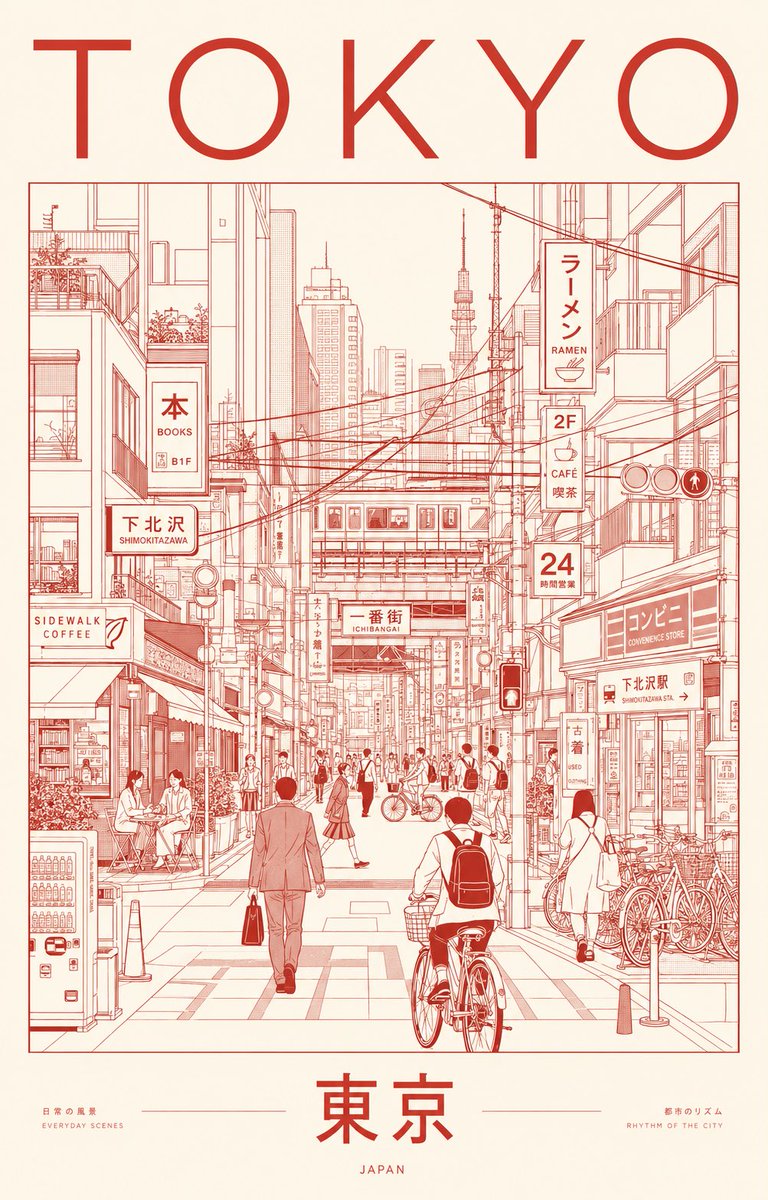
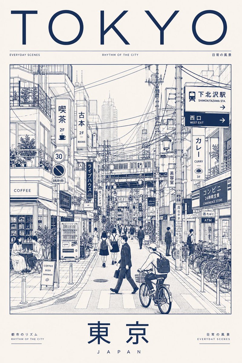
创作一幅极致高端的极简主义城市肖像海报,主题为 TOKYO,通过建筑线描插画捕捉日常都市生活中宁静的精致感与有序的混乱感。
分享链接 · https://openimages.ajiang.me/p/2066719909263143080/
color_palette · high-contrastcolor_palette · warm-tonescomposition · negative-spacequality_flags · embedded-textscene · streetsubject_type · city-street
提示词(原文,逐字保留)
Create an ultra-premium minimalist city portrait poster of TOKYO, capturing the quiet sophistication and organized chaos of everyday urban life through an architectural line-art illustration.
Instead of highlighting famous landmarks, portray a lived-in neighborhood scene where daily routines define the city’s identity. Feature a dense yet elegant streetscape inspired by areas such as Shimokitazawa, Nakameguro, Kichijoji, Koenji, or a contemporary Tokyo side street filled with local character.
SCENE
The composition centers on a bustling pedestrian corridor lined with compact cafés, ramen counters, bookstores, convenience stores, bicycle parking, vending machines, rail infrastructure, utility poles, narrow storefronts, and layered Japanese signage.
Residents naturally inhabit the scene:
Office workers commuting
Students crossing intersections
Cyclists weaving through streets
Café patrons sitting outdoors
Shoppers carrying bags
Locals waiting at crossings or transit stops
The atmosphere should feel authentically Tokyo—efficient, stylish, human-scaled, and deeply urban.
Large landmark structures may appear only as distant silhouettes integrated into the skyline, never as focal points.
VISUAL STYLE
Contemporary editorial illustration
Precision architectural drawing
Minimalist monoline artwork
Swiss International Style poster design
Japanese graphic design influence
Museum-quality city branding aesthetic
Clean vector rendering
Geometric perspective construction
Strong use of negative space
Sophisticated visual hierarchy
LINEWORK
Extremely fine monoline strokes
Technical illustration precision
No sketchiness
Dense urban detailing
Organized rhythm of windows, cables, signs, bicycles, storefronts, railings, and street furniture
Intricate composition that remains visually calm and readable
COLOR CONCEPT
Use a restrained two-color silkscreen system:
One carefully selected ink color
One contrasting paper/background color
Choose colors that evoke Tokyo’s refined urban energy and contemporary design culture.
Suggested palette:
Deep vermilion ink on warm rice-paper ivory
OR charcoal black ink on pale cream paper
OR midnight indigo ink on soft off-white stock
Avoid gradients, neon effects, multiple accent colors, or photographic lighting.
TYPOGRAPHY
Top:
TOKYO
Bottom:
東京
Typography should feel like a luxury design publication or cultural exhibition poster.
Perfect kerning
Clean editorial layout
Modern sans-serif typography
Authentic Japanese signage throughout the illustration
No distorted or unreadable text
MOOD
Not a tourist destination.
Not a postcard.
A visual celebration of Tokyo’s everyday elegance, urban rhythm, design culture, and human-scale density.
The poster should feel like it belongs in a contemporary art museum, premium travel journal, or international design exhibition.
OUTPUT
Vertical composition (4:5 or 2:3 ratio)
Ultra-high-resolution 8K
Print-ready poster design
Crisp vector-quality rendering
Exceptional detail retention
Luxury city-brand campaign aesthetic
中文译文
创作一幅极致高端的极简主义城市肖像海报,主题为 TOKYO,通过建筑线描插画捕捉日常都市生活中宁静的精致感与有序的混乱感。
不要突出著名地标,而是描绘一个充满生活气息的街区场景,让日常作息成为城市身份的象征。呈现一处密集而优雅的街景,灵感可来自下北泽、中目黑、吉祥寺、高圆寺或任何充满本地特色的当代东京小巷。
场景
构图聚焦于一条熙熙攘攘的步行走廊,两旁排列着紧凑的咖啡馆、拉面店、书店、便利店、自行车停放区、自动贩卖机、轨道交通设施、电线杆、狭窄的店面以及层层叠叠的日式招牌。
居民自然地融入场景之中:
通勤中的上班族
穿越路口的学生
在街巷中穿梭的骑行者
坐在户外的咖啡馆顾客
提着购物袋的行人
在路口或公交站等候的本地居民
整体氛围应真实地呈现东京——高效、时尚、尺度宜人且深度城市化。
大型地标建筑仅可作为融入天际线的远景剪影出现,绝不能成为视觉焦点。
视觉风格
当代编辑插画
精确的建筑绘图
极简单线艺术
瑞士国际主义风格海报设计
受日式平面设计影响
博物馆级别的城市品牌形象美学
干净的矢量渲染
几何透视构建
强烈运用负空间
精致的视觉层级
线条表现
极致纤细的单线笔触
技术插画的精准度
无草图感
密集的城市细节
窗户、电缆、招牌、自行车、店面、栏杆与街道家具形成有组织的节奏
构图繁复却保持视觉上的平静与可读性
色彩概念
使用克制的双色丝网印刷系统:
一种精心挑选的油墨色
一种对比的纸张/底色
所选色彩应能唤起东京精致的都市能量与当代设计文化。
建议配色:
深朱砂红油墨 配 温润米纸象牙白
或 炭黑色油墨 配 淡奶油纸
或 午夜靛蓝油墨 配 柔和米白纸
避免渐变、霓虹效果、多重辅助色或摄影式光影。
字体排版
顶部:
TOKYO
底部:
東京
字体风格应如同高端设计刊物或文化展览海报。
完美的字距
干净的编辑式版面
现代无衬线字体
插画中全篇使用地道且真实的日式招牌文字
文字不得扭曲或无法辨认
整体气质
不是旅游目的地。
不是明信片。
这是一场对东京日常优雅、都市节奏、设计文化与人本密度的视觉礼赞。
海报应让人感觉它属于一座当代艺术博物馆、一本高端旅行志或一场国际设计展览。
输出
竖向构图(4:5 或 2:3 比例)
超高分辨率 8K
可印刷级别的海报设计
清晰的矢量级渲染
卓越的细节保留
奢华城市品牌活动美学
来源与署名
原文由 @iamrealsnow 发布在 X:查看原推文。 本页逐字保留原文并提供机器翻译的中文解读;版权归原作者所有。
同工具的更多提示词
- [产品] — 高端产品广告,纯白无缝背景,爆炸视图揭示内部机械结构,外壳悬浮于核心之上,微型螺丝和零部件悬浮于空中,暗示精密对齐,干净柔和的阴影,超写实,微距…@iamaiistudio
- 由 Chatgpt 上的 GPT image 2 生成图像 提示词 👇 创作一幅超奢华的超现实时尚大片,主角为上传图像中的同一个人,需 100% 保留其原始面…@iamsofiaijaz
- 模糊、低分辨率、解剖结构错误、面部不对称、多余的手指、多余的四肢、主体重复、手部变形、卡通、动漫、CGI、蜡质皮肤、过度修饰的皮肤、不真实的眼睛、过度锐化、对…@mehvishs25
- 使用上传图片中的人物作为唯一人脸参考,严格保持人物的脸型、五官比例、眼睛、鼻子、嘴唇、下颌线、肤色和整体气质一致,确保人脸与参考图保持不变,不要生成人脸漂移…@lovimg_com
- 超精细的街头艺术足球海报,主角是一位可爱风格的卡通/动漫女孩,拥有鲜艳的紫色长发并扎成高马尾,自信地双臂交叉站立,一只脚踩在足球上。她身穿阿根廷国家足球队主场…@jzaib4269
- 一张高质量、逼真的自拍照:一位美丽的年轻东亚女性,留着长而分层的棕色头发,化着柔和自然的妆容,对着镜头微笑。她坐在越南一个户外街头小吃摊的一张不锈钢小桌旁,手…@AvelyrahnAI