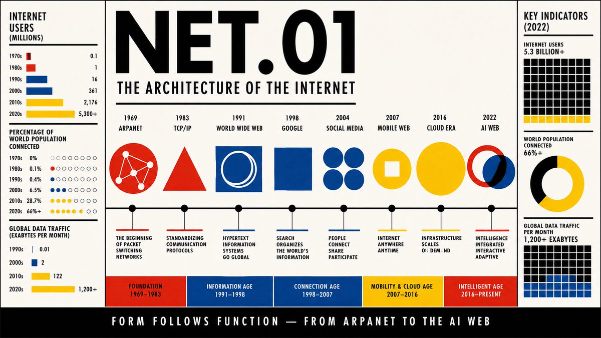
一份包豪斯设计风格的信息图海报,采用16:9横向格式,完整呈现从1969年至今互联网的演进历程,设计完全仿照1920年代德绍时期包豪斯…
分享链接 · https://openimages.ajiang.me/p/2065758159973630394/
color_palette · high-contrastcolor_palette · white-minimalcomposition · multi-panelquality_flags · typography-heavyscene · studiosubject_type · diagram-document
提示词(原文,逐字保留)
A Bauhaus design style infographic poster in 16:9 horizontal format charting the full evolution of the internet from 1969 to today, designed exactly like an original Bauhaus school publication from the 1920s Dessau period, with an absolute strict geometric aesthetic; the entire composition is built on a bold modular grid of primary colors — flat red, pure yellow, deep blue, and black — with white as the dominant background, no gradients, no shadows, no textures, no decorative elements of any kind; the layout is divided into a strong horizontal timeline running across the full width of the poster, marked with key milestones: 1969 ARPANET, 1983 TCP/IP, 1991 World Wide Web, 1998 Google, 2004 Social Media, 2007 Mobile Web, 2016 Cloud Era, 2022 AI Web, each milestone represented not by illustrations but by pure geometric symbols — circles for networks, triangles for protocols, squares for platforms, intersecting rings for connections — sized proportionally to their impact and color-coded by era; above the timeline a large bold sans-serif header reads NET.01 in massive black Futura-style lettering, with the subtitle THE ARCHITECTURE OF THE INTERNET in a smaller weight below; flanking the timeline, two vertical columns contain tightly set Bauhaus-style data panels using only geometric charts — flat bar graphs, dot matrices, circle proportions — showing metrics like number of internet users per decade, percentage of world population connected, and data traffic growth, all labeled in condensed grotesque sans-serif type with no decorative frames, just black ruled lines and colored rectangles as dividers; a small bottom strip in solid black contains the caption FORM FOLLOWS FUNCTION — FROM ARPANET TO THE AI WEB in white reversed type; the overall aesthetic must feel like a genuine 1923 Bauhaus poster: radical, rational, geometric, typographically precise, with color used only to carry meaning and structure, not decoration, high quality, aspect ratio 16:9
中文译文
一份包豪斯设计风格的信息图海报,采用16:9横向格式,完整呈现从1969年至今互联网的演进历程,设计完全仿照1920年代德绍时期包豪斯学校的原始出版物风格,拥有绝对严格的几何美学;整个构图建立在大胆的模块化网格之上,使用三原色——平涂的红色、纯黄色、深蓝色和黑色——以白色作为主导背景,无渐变、无阴影、无纹理、无任何装饰元素;版式被一条横贯海报全幅的强力水平时间线划分,标有以下关键里程碑:1969 ARPANET、1983 TCP/IP、1991 World Wide Web、1998 Google、2004 Social Media、2007 Mobile Web、2016 Cloud Era、2022 AI Web,每个里程碑不以插图表现,而是以纯粹的几何符号表示——圆形代表网络、三角形代表协议、方形代表平台、相交圆环代表连接——其尺寸按影响力大小比例缩放,并按时代进行配色编码;时间线上方是粗体无衬线大标题NET.01,采用巨大的黑色Futura风格字体,副标题THE ARCHITECTURE OF THE INTERNET以较小字重置于其下方;时间线两侧,两组垂直栏内排列着紧凑的包豪斯风格数据面板,仅使用几何图表——平涂条形图、点阵矩阵、圆形比例图——展示各项指标,如每十年互联网用户数、全球联网人口百分比以及数据流量增长,所有标签均使用压缩怪诞体无衬线字体,无装饰边框,仅以黑色规线和彩色矩形作为分隔;底部一条纯黑色窄条内含反白文字说明FORM FOLLOWS FUNCTION — FROM ARPANET TO THE AI WEB;整体美学必须呈现出真正的1923年包豪斯海报感:激进、理性、几何化、字体精确考究,色彩仅用于承载意义与结构,而非装饰,高品质,画面比例16:9
来源与署名
原文由 @92digitalartArt 发布在 X:查看原推文。 本页逐字保留原文并提供机器翻译的中文解读;版权归原作者所有。
同工具的更多提示词
- GPT 图像 2 提示 极简日本邮票电影海报,采用"Nano Banana 2" / Nippon Yūbin 展览系列风格。宽幅横版格式,置于纯黑背景之上…@AIwithAliya
- AETHER-9 // 腹侧锁定通道逃生 — 15秒 动作 分镜 变速播放(慢动作点缀) 氛围:绝望、致命、克制 — 一个如利刃般干净利落的男人,在不断闭合的…@neural_aperture
- 为 Bolt 真无线耳机设计一张 9:16 竖版产品信息图,营造高端生活方式广告的感觉。 构图与取景 年轻女性全身镜头,她的面部、肤色和发型必须与参考照片完全…@iamaiistudio
- 一个充满活力的 3×3 网格照片拼贴,包含同一个女孩九个完全独特且富有表现力的瞬间。每一帧都自然捕捉不同的情绪、姿势、表情、肢体语言和与镜头的互动,营造出在…@AiwithLariab
- 黑白时尚选角对照表照片,一位长直发部分遮住一只眼睛的女性,排列在干净的2x2网格中,共四张近距离肖像画面,背景从明亮的白色渐变至炭灰色,身穿宽松的男士衬衫,佩…@vireonixx
- 超写实肖像,一位年轻美丽的女性,长而丝滑的深棕黑色头发自然垂落,透过银色无框飞行员墨镜可见醒目的蓝色眼睛,柔软玫瑰色双唇,无瑕瓷器般肌肤搭配自然韩系妆容,身穿…@HaniaAi12