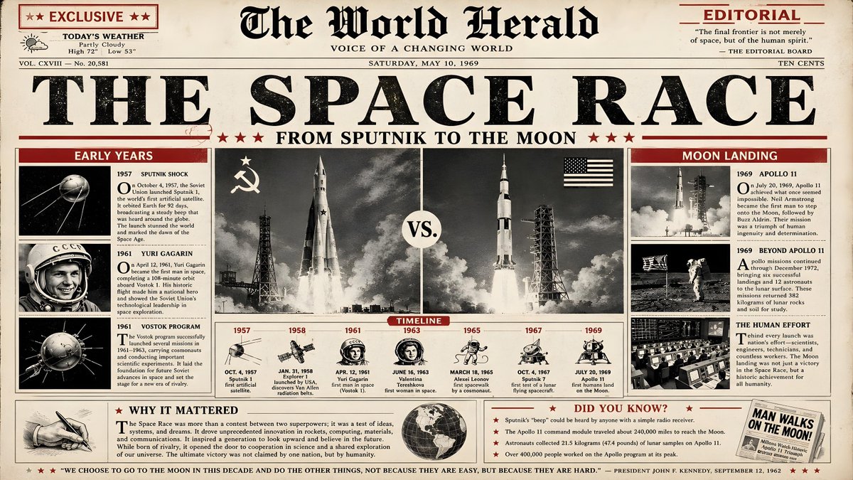
一幅报纸社论风格的历史信息图海报,16:9 横版,主题为太空竞赛,整体设计仿照20世纪中期大开本报纸的头版,采用略带做旧效果的米白色纸…
分享链接 · https://openimages.ajiang.me/p/2064678137275826630/
color_palette · high-contrastcolor_palette · warm-tonescomposition · multi-panelmood · nostalgicquality_flags · typography-heavyscene · historical-setting
提示词(原文,逐字保留)
A newspaper editorial style historical infographic poster in 16:9 horizontal format about the Space Race, designed like the front page of a mid‑20th‑century broadsheet newspaper, with a slightly aged off‑white paper background, black ink, and a single strong accent color in deep red; the layout should feature a bold main headline at the top reading THE SPACE RACE in heavy serif newsprint typography, with a subheadline below reading FROM SPUTNIK TO THE MOON in smaller capital letters; the composition is divided into clear column grids like a real newspaper: a large central black‑and‑white photo‑style illustration panel showing a stylized rocket launch and a split composition of a Soviet rocket on the left and an American Saturn V on the right, flanked by smaller boxed sections; key content blocks include a left column titled EARLY YEARS (Sputnik, Yuri Gagarin, Vostok), a center timeline strip from 1957 to 1969 with milestone dates and tiny icons, and a right column titled MOON LANDING describing Apollo missions, each section set in classic serif body copy with justified text and small drop caps; use deep red only for highlights such as section headers, lines under headlines, and small tags like EXCLUSIVE, TIMELINE, and EDITORIAL; include a small “editorial” box at the bottom titled WHY IT MATTERED summarizing the political and scientific impact, and a small DID YOU KNOW? sidebar with three or four surprising facts; overall, the poster must feel like an authentic vintage newspaper front page redesigned as a clean infographic, with clear hierarchy, strong typographic rhythm, no modern UI elements, no gradients, and a restrained, historically respectful aesthetic, 16:9 horizontal ratio
中文译文
一幅报纸社论风格的历史信息图海报,16:9 横版,主题为太空竞赛,整体设计仿照20世纪中期大开本报纸的头版,采用略带做旧效果的米白色纸张背景、黑色油墨,并以深红色作为唯一的强对比强调色;版面顶部应有一条粗体主标题,写着 THE SPACE RACE,使用厚重的衬线新闻印刷字体,其下方副标题用较小的全大写字母写着 FROM SPUTNIK TO THE MOON;版面采用真实报纸般清晰的栏目网格进行划分:中央是一幅大型黑白照片风格的插图板块,展示风格化的火箭发射场景,并以左右分屏的形式分别呈现左侧的苏联火箭和右侧的美国土星五号(Saturn V),两侧配有较小的方框小版块;关键内容板块包括左侧一栏,标题为 EARLY YEARS(Sputnik、Yuri Gagarin、Vostok),中间是一条从1957年到1969年的时间线,标注里程碑日期并配以小巧图标,右侧一栏标题为 MOON LANDING,描述阿波罗任务,每个部分均采用经典的衬线正文字体,两端对齐,并配以小型首字下沉;深红色仅用于高亮元素,例如栏目标题、标题下方的分隔线,以及 EXCLUSIVE、TIMELINE、EDITORIAL 等小标签;底部应包含一个名为 WHY IT MATTERED 的小型“editorial”方框,总结其政治与科学影响,并配有一个名为 DID YOU KNOW? 的小型侧边栏,列出三到四个令人惊讶的小知识;整体而言,海报应让人感觉像一份真正的复古报纸头版被重新设计为一幅简洁的信息图,具有清晰的层级、强烈的排版节奏,没有现代UI元素,没有渐变效果,并呈现一种克制、尊重历史的审美风格,16:9 横版比例
来源与署名
原文由 @92digitalartArt 发布在 X:查看原推文。 本页逐字保留原文并提供机器翻译的中文解读;版权归原作者所有。
同工具的更多提示词
- 一个 3x3 网格拼贴,包含同一亚洲年轻女性的九张独立照片,从上传的图片中提取,肤色较浅,风格为生活方式和社交媒体内容创作者的美学。她身穿红色紧身短款上衣、白…@HaniaAi12
- 日本奈良的超精细复古旅行海报插画,采用精致的水彩与钢笔素描风格绘制。一条迷人的奈良町传统日本街道向远方延伸,两旁林立着保存完好的木结构町家民居、手工艺商店、茶…@jzaib4269
- 参考面部:100%,不做任何替换或修改面部特征,保持完全一致),生成一张超写真、超精细、8K 分辨率、真实生活的年轻女性(20 多岁)肖像。8 服装穿着:合身…@saniaspeaks_
- 年轻女性,丰盈的深棕色头发带有蜂蜜金色挑染,呈现松散的华丽波浪卷,面部轮廓柔和,嘴唇饱满,目光望向画面右侧。肌肤光滑呈阳光亲吻的暖调,质感真实,带有细腻光泽…@iamaiistudio
- 一对时尚的年轻情侣在专业摄影棚内合影,他们站得很近,相互拥抱,表情自信,直视镜头。女士留着长长波浪状的棕色头发,妆容自然精致,身穿一件修身的青蓝色纽扣衬衫,搭…@DilshadAI1
- (需要更换概念) 创建一个单一的纵向 9:16 前期制作开发板,结合角色设定图 + 电影分镜,用于一段 15 秒的真人奇幻竞技场战斗。 这是一块专业的特技团队…@HeyAbhishek