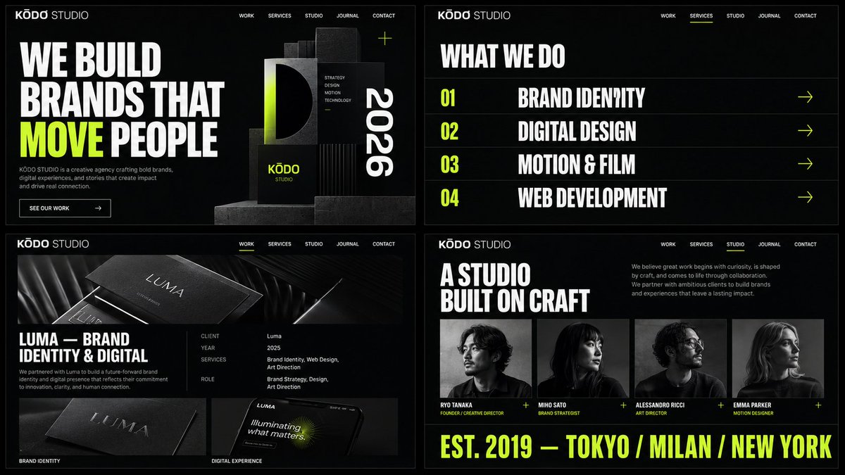
为一个名为"KŌDO STUDIO"的大胆高端创意机构,以16:9横向格式创建4张连贯的网站样机图像。全部4张图像必须属于同一个网站…
分享链接 · https://openimages.ajiang.me/p/2058795175867027934/
color_palette · high-contrastcomposition · multi-panelquality_flags · embedded-textquality_flags · multi-panel-layoutquality_flags · typography-heavysubject_type · graphic-design
提示词(原文,逐字保留)
Create 4 coherent website mockup images in 16:9 horizontal format for a bold premium creative agency called "KŌDO STUDIO". All 4 images must belong to the same website and share the exact same branding system: same logo style, same sharp oversized editorial sans-serif typography, same dark charcoal near-black background palette with electric lime green as the only accent color and white for primary text, same confident architectural layout style, same spacing rhythm, same bold premium 2026 creative agency web design quality. The images should feel like four different pages of one single polished creative studio website. IMAGE 1 – Homepage Hero: A bold modern creative agency homepage mockup in 16:9 horizontal format for "KŌDO STUDIO", featuring a dark charcoal background, clean minimal navigation bar at top with KODO STUDIO logo on the left and menu items Work, Services, Studio, Journal, Contact in white on the right, a massive oversized display headline "WE BUILD BRANDS THAT MOVE PEOPLE" in large bold editorial white sans-serif with a single word highlighted in vivid electric lime green, a short agency descriptor line below in muted gray, a ghost-style white outlined CTA button labeled "See Our Work", and on the right side a large dramatic abstract brand composition with geometric forms and typographic elements in dark tones with lime green and white highlights, asymmetric layout, bold editorial agency atmosphere. IMAGE 2 – Services Page: A bold modern creative agency services page mockup in 16:9 horizontal format for the same "KŌDO STUDIO", same dark background, same navigation and logo, same lime green accent, featuring a left-aligned section title "What We Do" in large white display font, below it four services displayed as large interactive horizontal rows spanning full content width, each row showing service number and service name "Brand Identity", "Digital Design", "Motion & Film", "Web Development" in oversized bold white type with lime green arrow indicators on the right, each row separated by a thin subtle divider line, editorial typographic-forward layout, confident and architectural premium agency aesthetic. IMAGE 3 – Case Study Page: A bold modern creative agency case study page mockup in 16:9 horizontal format for the same "KŌDO STUDIO", same dark background, same navigation, logo, typography and lime green accent, featuring a full-width project hero image at the top showing a premium brand identity project, below it a two-column layout with project title "Luma — Brand Identity & Digital" in large white bold display font on the left, and on the right a structured project metadata panel showing Client, Year, Services, Role in small muted gray labels with white values, a brief project description paragraph, then two large project deliverable images side by side with subtle captions, editorial case study layout, architectural and confident. IMAGE 4 – About / Team Page: A bold modern creative agency about page mockup in 16:9 horizontal format for the same "KŌDO STUDIO", same dark background, navigation, logo, typography and lime green accent, featuring a strong section headline "A Studio Built On Craft" in large white bold display type, a short agency manifesto paragraph in muted gray body text, then a team grid showing four team member cards horizontally with black and white editorial portrait photos, team member names in white, role titles in lime green small caps, and at the bottom a large full-width typographic banner showing lime green text "EST. 2019 — TOKYO / MILAN / NEW YORK" in tracked uppercase display font, dramatic editorial agency mood. All 4 images must look cohesive, dark, bold, editorial, architectural, and clearly part of one single complete creative agency website. Keep everything in 16:9 horizontal format.
中文译文
为一个名为"KŌDO STUDIO"的大胆高端创意机构,以16:9横向格式创建4张连贯的网站样机图像。全部4张图像必须属于同一个网站,并共享完全相同的品牌系统:相同的标志风格、相同的锐利超大版式编辑无衬线字体、相同的深炭黑近黑色背景配色(以电光酸橙绿作为唯一的强调色,白色作为主要文字)、相同的自信建筑式布局风格、相同的间距节奏、相同的大胆高端2026创意机构网页设计品质。这些图像应该让人感觉像是一个完整的精致创意工作室网站的四个不同页面。图像1——主页英雄区:为"KŌDO STUDIO"设计的16:9横向格式的大胆现代创意机构主页样机,采用深炭黑背景,顶部为简洁的极简导航栏,左侧为KODO STUDIO标志,右侧为白色菜单项Work、Services、Studio、Journal、Contact,巨大的超大展示标题"WE BUILD BRANDS THAT MOVE PEOPLE"采用大胆的编辑风格白色无衬线超大字体,其中一个单词以鲜艳的电光酸橙绿高亮,下方为一条短小的灰色机构描述文字,一个白色描边的幽灵风格CTA按钮,标签为"See Our Work",右侧为一个大型戏剧性的抽象品牌构图,带有几何形态和版式元素,采用深色调并点缀酸橙绿和白色高光,非对称布局,大胆的编辑风格机构氛围。图像2——服务页面:为同一个"KŌDO STUDIO"设计的16:9横向格式的大胆现代创意机构服务页面样机,相同的深色背景、相同的导航和标志、相同的酸橙绿强调色,采用左对齐的区块标题"What We Do"使用大型白色展示字体,下方四个服务以跨越整个内容宽度的大型可交互水平行展示,每行显示服务编号和服务名称"Brand Identity"、"Digital Design"、"Motion & Film"、"Web Development",采用超大大胆白色字体,右侧带酸橙绿色箭头指示器,每行以细而微妙的分隔线分隔,编辑风格的前瞻性版式布局,自信且建筑式的高端机构美学。图像3——案例研究页面:为同一个"KŌDO STUDIO"设计的16:9横向格式的大胆现代创意机构案例研究页面样机,相同的深色背景、相同的导航、标志、字体和酸橙绿强调色,顶部为全宽项目英雄图像,展示一个高端品牌识别项目,下方为两栏布局,左侧为大型白色大胆展示字体的项目标题"Luma — Brand Identity & Digital",右侧为结构化的项目元数据面板,显示Client、Year、Services、Role等小型柔和灰色标签和白色数值,一段简短的项目描述段落,然后并排显示两张大型项目交付图像,带有微妙的说明文字,编辑风格的案例研究布局,建筑式且自信。图像4——关于/团队页面:为同一个"KŌDO STUDIO"设计的16:9横向格式的大胆现代创意机构关于页面样机,相同的深色背景、导航、标志、字体和酸橙绿强调色,采用大型白色大胆展示字体的强势区块标题"A Studio Built On Craft",一段简短柔和灰色正文的机构宣言段落,然后是一个团队网格,水平展示四张团队成员卡片,配有黑白编辑风格肖像照片,团队成员姓名为白色,职位头衔为酸橙绿色小型大写字母,底部为大型全宽版式横幅,显示酸橙绿色文字"EST. 2019 — TOKYO / MILAN / NEW YORK",采用宽字距大写展示字体,戏剧性的编辑风格机构氛围。全部4张图像必须看起来连贯、深色、大胆、编辑风格、建筑式,并清楚地属于同一个完整的创意机构网站。所有内容保持16:9横向格式。
来源与署名
原文由 @92digitalartArt 发布在 X:查看原推文。 本页逐字保留原文并提供机器翻译的中文解读;版权归原作者所有。
同工具的更多提示词
- 视觉炼金术 将任何产品打造成由顶级创意代理公司制作的精品广告。一款主角产品、超现实奢华风格、极简构图、大胆的品牌呈现,以及一个足以让人停下滚动的强力视觉钩子…@aziz4ai
- 仅使用上传的参考图像来确保女性的身份、面部结构、发型、肤色、面部柔和度、妆容风格以及整体外观的一致性。以超写实的自然摄影效果,精确还原附件图像中相同的电影复古…@itsphotogptai
- 超写实电影感iPhone街拍人像:一位惊艳年轻女子深夜站在奢华欧洲城市中,正面姿势、眼神直视镜头,自然柔笑,乌黑丝滑长发,优雅黑色大衣与围巾,湿润路面上反射着…@AiwithSaad
- 高端超现实汽车广告海报,[BRAND](品牌)[CAR MODEL](车型),标志性复古车以干净的侧面视角展示,一位时尚的[CHARACTER](角色)自信地…@Goodmanprotocol
- 👇 https://t.co/MkVE2mXGGZ@heyfionaai
- 将此源提示词翻译供阅读和搜索。严格调用一次translate_prompt。按原样保留URL、JSON键、命令标志、括号、占位符、代码和参数值。不要总结或添加…@Shinning1010