GPT Image 2 x 电商横幅
分享链接 · https://openimages.ajiang.me/p/2054537036531741104/
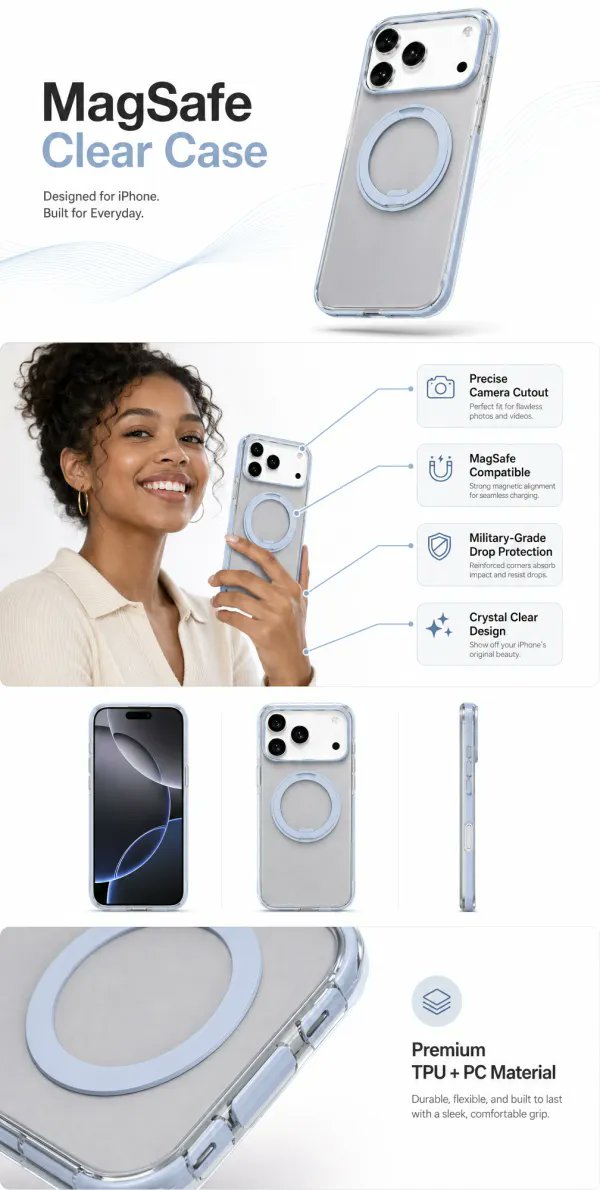
color_palette · white-minimalcomposition · close-upcomposition · multi-panellighting · studio-lightquality_flags · embedded-textsubject_type · product
提示词(原文,逐字保留)
GPT Image 2 x ecommerce banners
Here is the prompt structure I would use before asking a designer for 20 ad variations.
The trick is not “make it premium.”
The trick is telling the model what job the image has:
- stop the scroll
- keep the product recognizable
- make one buying reason obvious
- leave space for readable copy
- feel like a real ecommerce asset, not a random AI poster
Prompt pack:
“Act as a senior ecommerce art director and conversion-focused ad designer.
Create one finished horizontal ecommerce banner for:
Product: [PRODUCT]
Audience: [AUDIENCE]
Main buying reason: [ONE REASON]
Offer or CTA: [CTA]
Brand mood: [MOOD]
Aspect ratio: [RATIO]
Use the uploaded product image as the source of truth. Keep the product shape, color, logo, packaging, material, and key details consistent.
Improve the image like a commercial shoot: cleaner lighting, stronger composition, better product presence, realistic shadows, and a background that matches the buyer’s context.
The banner should have:
1. one clear headline
2. one supporting benefit line
3. one CTA area
4. enough negative space for copy
5. no fake reviews
6. no fake badges
7. no unreadable tiny text
8. no unnecessary decorative clutter
Style direction:
[choose one]
- Amazon A+ product infographic
- Shopify hero banner
- TikTok Shop first-frame ad
- Instagram product launch card
- premium brand campaign poster
- clean product detail visual
Make it look ready for a real product page or paid ad.”
Why this works:
Most AI image prompts describe style.
This one describes responsibility.
A banner is not just an image. It has to carry product truth, sales context, hierarchy, and copy placement at the same time.
For UGCgo, I’d turn this into a reusable template:
1. upload product photo
2. choose banner / A+ / first-frame / product detail
3. fill product + buyer + one reason
4. generate 4 visual directions
5. keep the version that makes the product easiest to understand
My favorite test:
If you remove the logo and CTA, can the image still tell what the product is and why someone should care?
If not, the banner is probably just pretty.
Useful assets to test this with:
- Amazon A+ content template
- product detail template
- launch poster template
- UGC ad template
- brand kit template
Tools are raw material.
The prompt is the creative brief.
The template is how you make it repeatable.
#GPTImage2 #AIProductPhotos #AdCreative #EcommerceMarketing #ugcgo.app
中文译文
GPT Image 2 x 电商横幅
这是在向设计师提出 20 个广告变体需求之前,我会使用的提示词结构。
关键不在于“让它显得高端”。
关键在于告诉模型这张图要承担什么任务:
- 让人停下滑动
- 保持产品可识别
- 让一个购买理由显而易见
- 为文案留出可读的空间
- 看起来像真实的电商素材,而不是随机的 AI 海报
提示词包:
“扮演一位资深的电商美术指导和以转化为导向的广告设计师。
为以下内容制作一张完成的横版电商横幅:
产品:[PRODUCT]
受众:[AUDIENCE]
核心购买理由:[ONE REASON]
优惠或行动号召(CTA):[CTA]
品牌调性:[MOOD]
宽高比:[RATIO]
以上传的产品图片作为唯一事实来源。保持产品的形状、颜色、Logo、包装、材质和关键细节一致。
像商业拍摄一样优化图像:更干净的打光、更强的构图、更好的产品存在感、真实的阴影,以及符合买家使用场景的背景。
横幅应具备:
1. 一句清晰的主标题
2. 一句辅助利益点文案
3. 一个 CTA 区域
4. 足够的负空间用于排版
5. 不要伪造的评价
6. 不要伪造的徽章
7. 不要看不清的小字
8. 不要多余的装饰性元素
风格方向:
[选择其一]
- Amazon A+ 产品信息图
- Shopify 首屏横幅
- TikTok Shop 首帧广告
- Instagram 产品发布卡片
- 高端品牌活动海报
- 简洁的产品详情视觉
让它看起来已准备好用于真实的产品页面或付费广告。”
为什么这样有效:
大多数 AI 图像提示词描述的是风格。
这一个描述的是职责。
横幅不仅仅是一张图。它必须同时承载产品事实、销售场景、信息层级和文案位置。
在 UGCgo 中,我会把它变成一个可重复使用的模板:
1. 上传产品照片
2. 选择 banner / A+ / 首帧 / 产品详情
3. 填写产品 + 买家 + 一个理由
4. 生成 4 个视觉方向
5. 保留让产品最容易理解的那一版
我最喜欢的测试方法:
如果你去掉 Logo 和 CTA,图像是否仍然能让人看出产品是什么以及为什么值得关注?
如果不能,那这张横幅大概只是“好看”。
适合用来测试的素材:
- Amazon A+ 内容模板
- 产品详情模板
- 发布海报模板
- UGC 广告模板
- 品牌套件模板
工具只是原材料。
提示词才是创意简报。
模板则是让它可重复的方法。
#GPTImage2 #AIProductPhotos #AdCreative #EcommerceMarketing #ugcgo.app
来源与署名
原文由 @qianqiongge 发布在 X:查看原推文。 本页逐字保留原文并提供机器翻译的中文解读;版权归原作者所有。
同工具的更多提示词
- 超精细电影级赛博垃圾风时尚海报:一位年轻男子自信地朝镜头走来,居于画面中央,全身构图,眼神锐利,面部轮廓柔和且具男性气质,深棕色凌乱被风吹起的头发,淡淡的胡茬…@harboriis
- GPT image 2 on ChatGPT 提示词 超现实电影感人像,年轻男性奇幻战士,灵感来自经典 JRPG 美学,超精细的皮肤纹理,锋利的下颌线,柔软自…@kingofdairyque
- 移除这张 Stuttering John 播客视频截图中柔化滤镜的效果,并根据他近期的无滤镜照片,渲染一张具有清晰细节的图像。https://t.co/tVV…@DabblingJohn
- 一幅高度精细的超现实风格3D角色肖像,描绘了一位古怪的年轻男子:他有一头卷曲的黑发、一撇细长的八字胡,戴着一副圆形的琥珀色镜片眼镜。他头戴一顶黑白相间的棒球帽…@Shorelyn_
- 步骤 4: 使用 GPT-Image-2 生成一个起始帧。 我的提示词和参考图像: 一张来自天空体育(Sky Sports)直播的英超足球比赛的电视转播截图…@Dipanshu_AI
- 一张高分辨率的特写肖像照片,画面中是一位女性,她绽放出真挚灿烂的笑容,目光略微偏离镜头。她拥有波浪状的深褐色头发、柔和的棕色双眸,以及散发自然光泽的肌肤。她佩…@Minahil42298354