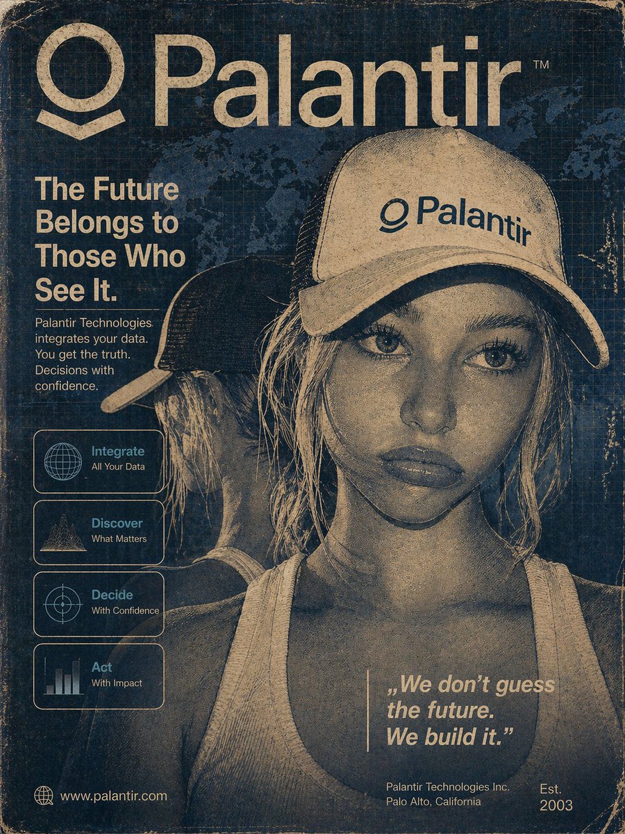
90年代至2000年代初的复古科技广告海报,主题为Palantir,电影感且怀旧。画面中央放置一位戴着Palantir卡车司机帽的女孩…
分享链接 · https://openimages.ajiang.me/p/2047516702527885733/
color_palette · mutedcomposition · centeredcomposition · close-uphuman_attributes · headwearmood · nostalgicquality_flags · embedded-text
提示词(原文,逐字保留)
90s–early 2000s retro tech advertisement poster for Palantir, cinematic and nostalgic. Feature a centered portrait of a girl wearing a Palantir trucker hat, but fully integrated into the design — not just pasted on. Apply a matte, desaturated colorway (muted navy, beige, grayscale tones) with heavy film grain, paper texture, and subtle halftone/dithering to make her look partially illustrated, almost like a hand-drawn print while still preserving realistic facial detail and beauty.
Blend her into the background using layered textures, soft contrast, and slight edge fading. Add vintage UI overlays: faint gridlines, world map, data panels, and early-2000s interface elements. Include distressed wear (scratches, folds, faded ink) across the entire poster.
Typography: bold, clean sans-serif headline in classic corporate style:
“The Future Belongs to Those Who See It.”
Add smaller subtext blocks and icon panels (Integrate / Discover / Decide / Act) with minimalistic line icons. Include a subtle quote in the lower section:
“We don’t guess the future. We build it.”
Overall feel: retro-futuristic, corporate propaganda aesthetic, polished but worn, like an old magazine ad or printed tech poster from 1998–2005. Balance between realism and stylized illustration, with the subject feeling embedded into the design rather than separate.
中文译文
90年代至2000年代初的复古科技广告海报,主题为Palantir,电影感且怀旧。画面中央放置一位戴着Palantir卡车司机帽的女孩肖像,但需完全融入整体设计之中——不能仅仅是简单贴上去的感觉。采用哑光、低饱和度的配色方案(柔和的深蓝、米色、灰度色调),叠加浓重的胶片颗粒、纸质纹理以及细微的半色调/抖动效果,使她看起来既像是部分手绘插画,又能保留真实的面部细节与美感。
通过多层纹理、柔和的对比度以及轻微的边缘渐隐,让她与背景自然融合。添加复古界面叠加层:淡雅的网格线、世界地图、数据面板以及2000年代初的界面元素。在整张海报中加入做旧磨损效果(划痕、折痕、油墨褪色)。
字体排版:采用经典企业风格的粗体、简洁无衬线大标题:
“The Future Belongs to Those Who See It.”
添加较小的副文本区块和图标面板(Integrate / Discover / Decide / Act),配有极简风格的线条图标。在下方区域加入一行淡化的引言:
“We don’t guess the future. We build it.”
整体感觉:复古未来主义、企业宣传美学,精良却又带有磨损痕迹,仿佛是1998–2005年间的旧杂志广告或印刷科技海报。在写实与风格化插画之间取得平衡,让主体感觉深嵌于设计之中,而非独立于其外。
来源与署名
原文由 @ctrlvolk 发布在 X:查看原推文。 本页逐字保留原文并提供机器翻译的中文解读;版权归原作者所有。
同工具的更多提示词
- 超电影感无缝单镜头拍摄,总时长15秒。开场为雨夜城市中缓慢下降的航拍镜头。霓虹灯光穿透薄雾。潮湿街道反射蓝色与紫色调。相机在雨水中缓缓向下滑行,镜头上可见柔和…@saniaspeaks_
- 微软的360度等距柱状投影图像。 预览工具: https://t.co/nwtNJKKeUy https://t.co/ZHH1SF0KW2@laughing_code
- "一幅现实主义风格的赛博女性形象,她坐在宇宙的边缘,思考着存在的意义" 描述中包含模型细节@CrodleMon
- 魔法学院禁书馆深夜,成熟女巫学者穿黑色丝绸长裙与半透明披肩,在漂浮烛火和发光咒文中翻阅禁忌古书,侧身回望镜头,锁骨和手臂肌肤在暖冷对比光里格外迷人,空气里漂浮…@block0_eth
- { "title": "脑肿瘤的因果链", "style": "电影感医学信息图,照片级真实解剖 + 图形 UI 叠加,纯白背景,编辑海报风格", "aspe…@Ankit_patel211
- “给我一些内容创意” 更好的提示:“我正在围绕 AI + 内容创作建立我的受众群。我的目标是增长和互动。” 上下文 = 更好的输出。https://t.co/…@DoskyArt