(可用于 gemini、gpt 或任何其他 AI 模型):
分享链接 · https://openimages.ajiang.me/p/2047197102560985201/
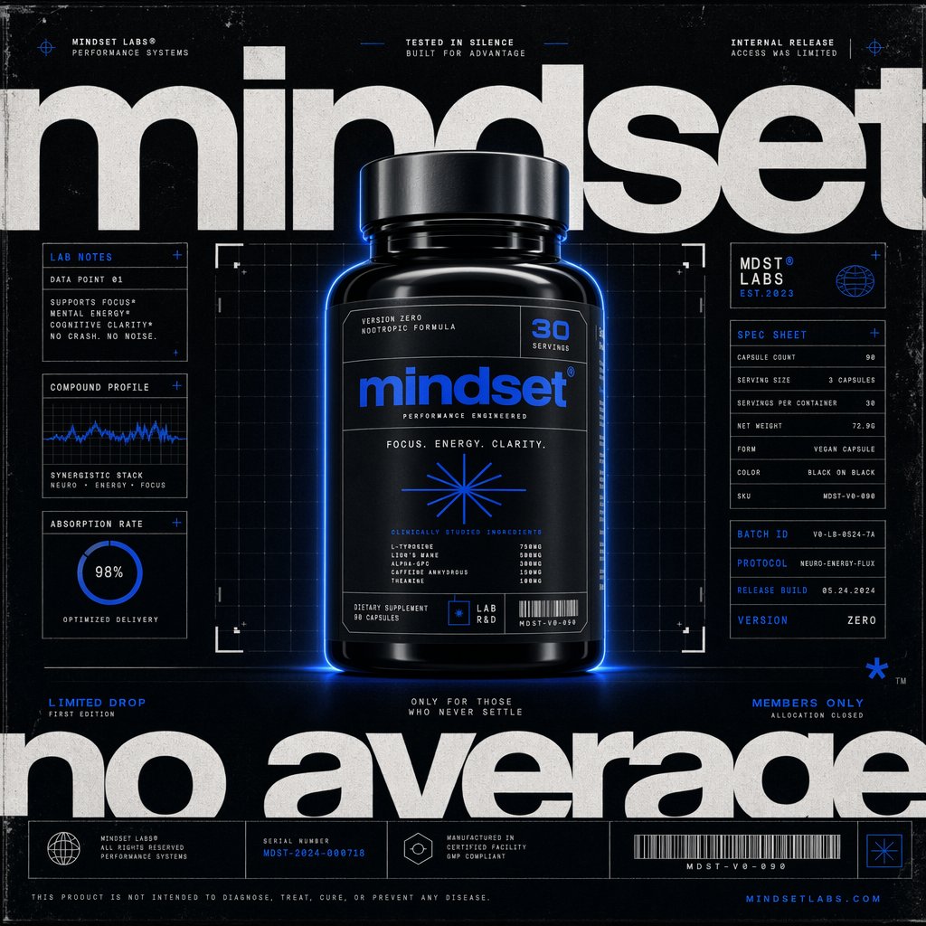
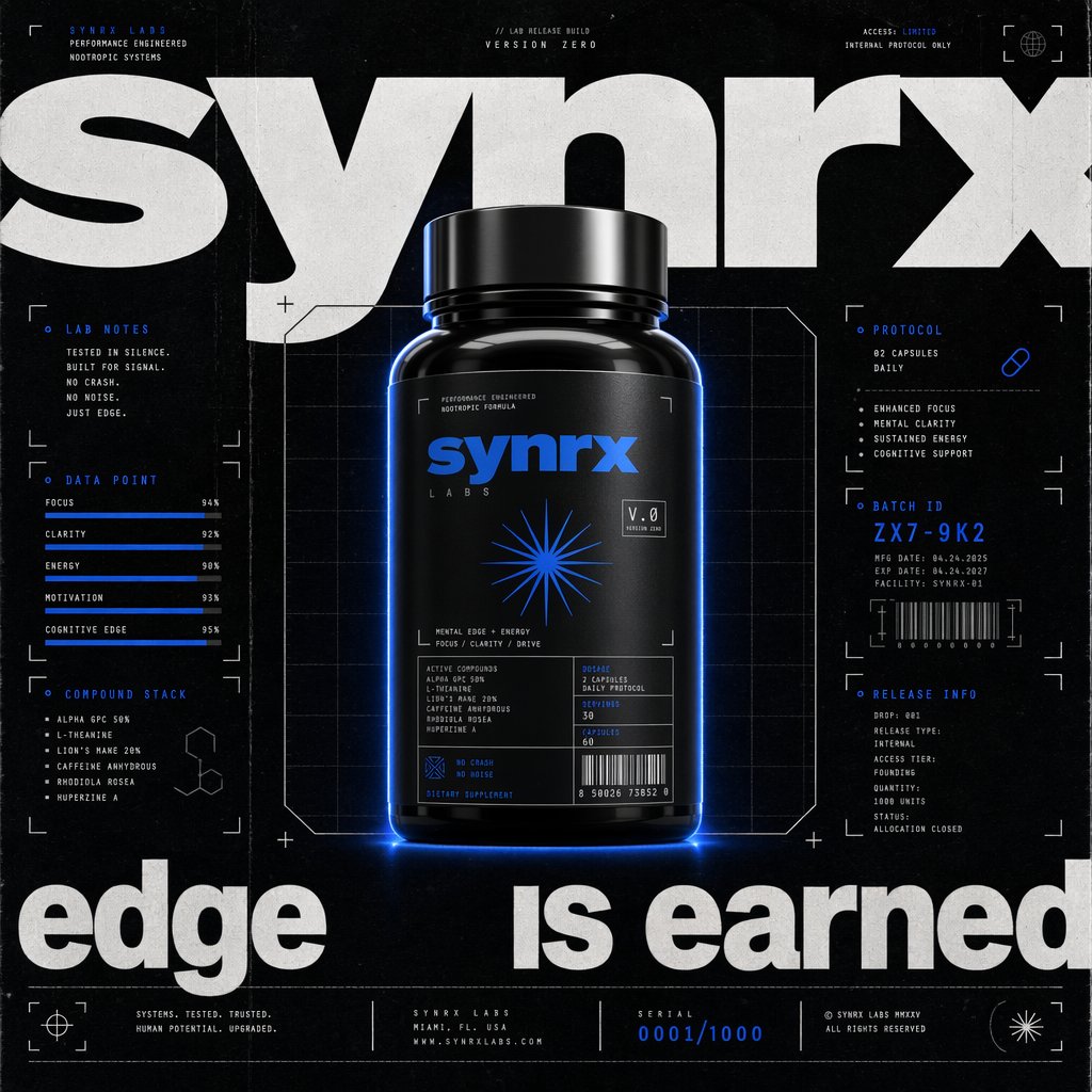
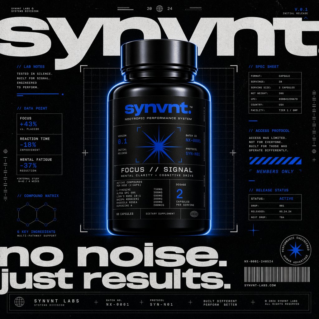
color_palette · high-contrastcomposition · centeredlighting · low-keylighting · rim-lightmood · futuristicquality_flags · embedded-text
提示词(原文,逐字保留)
Prompt
(can be used with gemini, gpt or any other AI model):
https://t.co/OQMYT3X5hA
1. 🎯 ROLE + STYLE DNA
• Purpose: Defines the image-maker mindset and the aesthetic operating system
• Core Pattern:
- Act as a futuristic brand campaign designer, CGI product photographer, and supplement packaging art director creating a front-facing hero poster for a high-performance wellness brand.
- References: Nike ACG editorial systems, Nothing minimal tech branding, cyberpunk lab interface graphics, Swiss grid posters, underground performance supplement campaigns, sci-fi UI diagnostics
• Reusable Concepts:
- Role: CGI Product Photographer + Brand Systems Designer + Experimental Typographic Art Director
- Shot: Centered hero packshot integrated into a poster system
- Category: Premium nootropic / energy supplement bottle
- Style refs: brutalist typography, blueprint UI overlays, lab-spec packaging, high-contrast e-commerce editorial, limited-drop product launch graphics
• Editable knobs:
- Replace references to shift from cyber-lab to luxury, fashion, biotech, gaming, or sports
- Replace category to adapt for fragrance, skincare, hardware, beverage, or apparel
2. 🧩 BRAND IDENTITY TRANSLATION
• Purpose: Converts brand personality into graphic and physical language
• Core Identity in This Reference:
- Brand reads as engineered, exclusive, clinical, performance-focused, futuristic, and culturally sharp
- The wordmark is the hero, not just the product
- Identity is built from contrast between silence and intensity: black void, white type, electric blue signal accents
• Logic Template:
- IF brand has a wordmark:
- Make the wordmark oversized and partially cropped by the canvas edges
- Use it as environmental typography behind and around the product
- IF brand has a symbol:
- Repeat the symbol as interface marker, label emblem, and accent motif
- Translate identity into 3 systems:
- Typography = dominance and authority
- Product = proof object
- UI micrographics = scientific credibility
• Key Abstraction:
- You are not merely showing packaging
- You are staging a brand signal inside a technical poster interface
• Editable knobs:
- Interpretation style:
- literal = use exact wordmark/symbol
- abstract = create a geometric motif inspired by the brand essence
- Tone:
- clinical
- athletic
- cult premium
- hacker-tech
3. 📏 SCALE & COMPOSITION SYSTEM
• Purpose: Controls premium poster tension and discovery
• Hard Rules:
- Product centered vertically and horizontally
- Bottle occupies about 30–38% of canvas width
- Oversized wordmark occupies 70–90% of total canvas width and sits behind product
- Main product isolated in a technical framing box or grid field
- Surrounding negative space filled with structured annotations, never empty emptiness
- Top and bottom typography should feel cropped by the frame for editorial force
• Composition Logic:
- Center = product proof
- Background = brand authority
- Side columns = lab notes / claims / spec sheet / drop language
- Bottom strip = metadata, codes, protocol language, footer system
• Cinematic Concept:
- The object feels archived, tested, and released under controlled conditions
• Editable knobs:
- More luxury: reduce side-note density
- More tech: increase UI overlays and grid visibility
- More commercial: enlarge bottle to 42–48%
- More editorial: increase type cropping and asymmetry
4. 🧱 OBJECT GEOMETRY
• Purpose: Defines the physical artifact precisely
• Base Form:
- Glossy black supplement bottle
- Cylindrical body with soft shoulder transitions
- Slightly wider cylindrical cap with shallow rounded edge
- Tall label rectangle with tight margins and technical panel segmentation
• Camera Angle:
- Straight-on frontal view with very slight low-to-neutral perspective
- Minimal rotation, almost perfectly symmetrical
- Keeps label legible and iconic
• Edge Detail:
- Strong rim light outlining silhouette
- Soft blue halo glow around bottle contour
- Reflective cap catches brighter metallic highlights than body
• Editable knobs:
- Bottle type: capsule jar, canister, serum bottle, can, fragrance flacon
- Cap finish: matte black, gunmetal, brushed aluminum
- Perspective: perfectly orthographic for cleaner UI feel, or 5–10° perspective for more realism
5. 🎨 COLOR SYSTEM
• Purpose: Creates instant brand recognition through disciplined contrast
• Core Palette:
- Background: deep textured black / charcoal
- Typography: stark white
- Accent: electric cobalt blue
- Product: black-on-black with blue highlights
• Contrast Logic:
- Use only 3 dominant values:
- black field
- white macro typography
- blue signal accents
- Blue should appear as energy activation, not flood fill
- White carries hierarchy, blue carries precision and pulse
• Color Placement Rules:
- Main wordmark and large slogan in white
- Label logo and key iconography in blue
- Technical annotations mostly white, with selective blue highlights for numbers, dividers, and emphasis
- Glow around product should be subtle electric blue
• Editable knobs:
- Accent hue: cobalt, neon cyan, acid green, infrared red
- Background depth: pure black for cleaner output, dusty black for more analog grit
- Contrast intensity: soft premium vs hyper-electric launch poster
6. 🧪 MATERIAL SYSTEM
• Purpose: Defines tactile realism and poster finish
• Product Materials:
- Bottle body: glossy black plastic or lacquered composite
- Cap: satin metal or polished dark anodized finish
- Label: matte black stock with subtle sheen difference from bottle
• Poster Surface Language:
- Slight distressed print texture
- Faint dust, scan noise, paper wear, and light scratches
- Grid and UI lines should feel screenprinted or plotted
• Lighting Interaction:
- Front lighting is controlled and low-key
- Side/rim lights separate black bottle from black background
- Blue underglow or contour glow adds sci-fi energy
- Highlights must be crisp but not luxury-glossy to the point of beauty ad softness
• Editable knobs:
- Cleaner output: remove distress and noise
- More underground: add xerox grain, toner texture, misregistration, subtle print wear
- More futuristic: strengthen emissive glow and interface luminosity
7. ✂️ GRAPHIC SYSTEM
• Purpose: Defines the poster intelligence layer around the object
• Core Elements:
- Oversized cropped headline wordmark at top
- Oversized cropped slogan at bottom
- Central technical grid behind product
- Corner crop marks and framing brackets
- Side modules labeled like lab notes, data point, spec sheet, batch ID, protocol, versioning
- Tiny metadata footer with codes, release labels, URLs, serial language
- Barcode and abstract symbol marks
• Rules:
- Use monospaced or engineered microtype for annotation text
- Use bold neo-grotesk sans serif for giant headlines
- Keep all small text aligned to a rigid grid
- Use short, punchy copy fragments instead of long paragraphs
- Every element should imply testing, scarcity, or system logic
• Tone of Copy:
- controlled
- quiet confidence
- exclusive
- high-performance
- anti-hype but still aspirational
• Editable knobs:
- Increase scarcity language for drop culture
- Increase scientific claims language for biotech feel
- Increase athletic copy for sports-performance positioning
8. 🔤 TYPOGRAPHY SYSTEM
• Purpose: Recreates the identity backbone
• Headline Style:
- Massive lowercase sans serif wordmark
- Heavy to extra-bold weight
- Tight spacing
- Cropped aggressively by frame edges
• Secondary Type:
- Condensed or monospaced utility text
- Small uppercase labels
- Modular placement in boxes and columns
• Hierarchy Rules:
- Level 1: giant white brand and slogan text
- Level 2: blue product logo and symbol
- Level 3: white utility annotations and spec labels
- Level 4: tiny metadata and footer strings
• Editable knobs:
- More fashion: use cleaner editorial grotesk
- More industrial: increase monospace density
- More luxury-tech: reduce microcopy, enlarge spacing
9. 💡 LIGHTING SYSTEM
• Purpose: Controls realism and mood
• Setup:
- Low-key studio lighting
- Soft frontal fill for label readability
- Strong rim lights on left and right edges
- Narrow top highlight on cap
- Faint electric blue glow around bottle base and contour
• Result:
- Bottle emerges from black like a precision object in a test chamber
- Black-on-black remains readable because of edge separation
• Editable knobs:
- More premium: soften blue glow
- More sci-fi: intensify underglow and blue edge bloom
- More raw: reduce glow, rely on silver speculars only
10. 🧾 COPY + BRAND VOICE EXTRACTION
• Purpose: Makes the design feel like the same brand world
• Voice Traits:
- sparse
- technical
- elite but restrained
- confident, never loud
- product-as-advantage language
• Sample Copy Logic:
- Use fragments like:
- tested in silence
- no crash, no noise
- access was limited
- version zero
- performance engineered
- batch ID / protocol / release build
- Claims should feel systemized, not salesy
• Editable knobs:
- More exclusive: members-only, internal release, allocation closed
- More clinical: absorption rate, compound profile, dosage grid
- More cultural: first drop, selected only, early access protocol
11. 🔁 REBUILD FORMULA
• Use this structure:
- PHASE A: Define role and aesthetic DNA
- PHASE B: Translate brand into oversized typography + signal motif
- PHASE C: Build centered product composition within a technical grid
- PHASE D: Use black / white / electric blue contrast logic
- PHASE E: Define glossy black bottle materials and low-key lighting
- PHASE F: Add lab-interface annotations, metadata, barcode, and release language
- PHASE G: Finish with subtle print distress and campaign-poster tension
中文译文
(可用于 gemini、gpt 或任何其他 AI 模型):
https://t.co/OQMYT3X5hA
1. 🎯 角色 + 风格 DNA
• 目的:定义图像创作者的思维方式与美学操作系统
• 核心模式:
- 作为面向未来的品牌活动设计师、CGI 产品摄影师与保健品包装美术指导,为一个高性能健康品牌创作正面主视觉海报。
- 参考:Nike ACG 编辑系统、Nothing 极简科技品牌、赛博朋克实验室界面图形、瑞士网格海报、地下性能补剂活动、科幻 UI 诊断
• 可复用概念:
- 角色:CGI 产品摄影师 + 品牌系统设计师 + 实验性字体美术指导
- 镜头:居中英雄级产品图,融入海报系统
- 类别:高端益智 / 能量补剂瓶
- 风格参考:粗野主义字体、蓝图式 UI 叠加、实验室规格包装、高对比电商编辑、限量发售产品发布图形
• 可编辑旋钮:
- 替换参考以从赛博实验室转向奢侈品、时尚、生物科技、游戏或运动
- 替换类别以适配香水、护肤、硬件、饮料或服装
2. 🧩 品牌识别转化
• 目的:将品牌个性转化为图形与物理语言
• 本参考中的核心识别:
- 品牌气质为:工程化、独家、临床、性能导向、未来感、文化锋利
- 字标是主角,而非产品本身
- 识别建立在静默与强度之间的对比之上:黑色虚空、白色字体、电光蓝信号点缀
• 逻辑模板:
- 若品牌有字标:
- 将字标做得超大,并部分被画布边缘裁切
- 将其作为产品背后与周围的环境式字体
- 若品牌有符号:
- 重复该符号作为界面标识、标签徽章与点缀母题
- 将识别转化为 3 个系统:
- 字体 = 支配与权威
- 产品 = 证明物
- UI 微观图形 = 科学可信度
• 关键抽象:
- 你并不仅仅在展示包装
- 你正在技术海报界面中编排一个品牌信号
• 可编辑旋钮:
- 解读风格:
- 字面 = 使用精确的字标 / 符号
- 抽象 = 创造受品牌精髓启发的几何母题
- 语气:
- 临床
- 运动
- 邪典高端
- 黑客科技
3. 📏 比例与构图系统
• 目的:控制高端海报的张力与发现感
• 硬性规则:
- 产品在垂直与水平方向居中
- 瓶身宽度约占画布宽度的 30–38%
- 超大字标宽度占总画布宽度的 70–90%,位于产品之后
- 主体产品隔离在技术框线或网格场中
- 周围负空间以结构化注释填充,绝不空置
- 顶部与底部字体应有被画框裁切的编辑感力度
• 构图逻辑:
- 中心 = 产品证明
- 背景 = 品牌权威
- 侧栏 = 实验笔记 / 卖点 / 规格表 / 限定发售语言
- 底部条带 = 元数据、代码、协议语言、页脚系统
• 电影感概念:
- 物体仿佛在受控条件下被归档、测试与发布
• 可编辑旋钮:
- 更奢华:减少侧注密度
- 更技术:增加 UI 叠加与网格可见度
- 更商业:将瓶身放大至 42–48%
- 更编辑:增加字体裁切与不对称感
4. 🧱 物体几何
• 目的:精确定义物理产物
• 基础形态:
- 黑色亮面补剂瓶
- 圆柱形瓶身,肩部过渡柔和
- 略宽的圆柱形瓶盖,带浅圆边
- 高挑标签矩形,边缘紧凑,并做技术化面板分区
• 摄影角度:
- 正面直视,仅带极轻微的偏低到中性透视
- 极小旋转,几乎完全对称
- 保持标签清晰可读且具标志性
• 边缘细节:
- 强烈轮廓光勾勒剪影
- 瓶身轮廓周围柔和蓝色光晕
- 反射性瓶盖的高光比瓶身更亮且更具金属感
• 可编辑旋钮:
- 瓶型:胶囊罐、密封罐、精华液瓶、罐装、香水瓶
- 瓶盖饰面:哑光黑、枪灰、拉丝铝
- 透视:完全正交以获得更清晰的 UI 感;或 5–10° 透视以增强真实感
5. 🎨 色彩系统
• 目的:通过克制的对比创造即时的品牌识别
• 核心色板:
- 背景:深纹理黑 / 炭灰
- 字体:纯白
- 点缀色:电光钴蓝
- 产品:黑色叠黑色,搭配蓝色高光
• 对比逻辑:
- 仅使用 3 种主导值:
- 黑色场域
- 白色宏大字体
- 蓝色信号点缀
- 蓝色应作为能量激活出现,而非铺满填充
- 白色承载层级,蓝色承载精度与脉动
• 色彩放置规则:
- 主字标与大标语使用白色
- 标签 logo 与关键图标使用蓝色
- 技术注释主要为白色,选择性地使用蓝色突出数字、分隔线与重点
- 产品周围光晕应为微妙电光蓝
• 可编辑旋钮:
- 点缀色相:钴蓝、霓虹青、酸绿、红外红
- 背景深度:纯黑以获得更干净的输出;灰黑以获得更多模拟质感
- 对比强度:柔和高端 vs 超电感发布海报
6. 🧪 材质系统
• 目的:定义触觉真实感与海报成品
• 产品材质:
- 瓶身:黑色亮面塑料或漆面复合材料
- 瓶盖:缎面金属或抛光深色阳极氧化饰面
- 标签:哑光黑纸基,与瓶身有微妙光泽差异
• 海报表面语言:
- 轻微做旧印刷纹理
- 隐约的灰尘、扫描噪点、纸张磨损与浅划痕
- 网格与 UI 线条应有丝网印刷或绘图仪绘制感
• 光线交互:
- 正面光线受控且低调
- 侧 / 轮廓光将黑色瓶身与黑色背景分离
- 蓝色底光或轮廓光增加科幻能量
- 高光必须锐利,但不应柔滑到奢侈品美妆广告的程度
• 可编辑旋钮:
- 更干净的输出:去除做旧与噪点
- 更地下:加入施乐颗粒、碳粉纹理、错位套印、细微印刷磨损
- 更未来:加强自发光与界面亮度
7. ✂️ 图形系统
• 目的:定义围绕物体的海报智能层
• 核心元素:
- 顶部超大裁切标题字标
- 底部超大裁切标语
- 产品之后的中央技术网格
- 角部裁切标记与画框括号
- 侧栏模块,标签如实验笔记、数据点、规格表、批次 ID、协议、版本号
- 底部细小元数据页脚,包含代码、发布标签、URL、序列号语言
- 条形码与抽象符号标记
• 规则:
- 注释文本使用等宽或工程化微型字体
- 巨型标题使用粗体新怪诞无衬线
- 所有小字沿严格网格对齐
- 使用短促有力的文案片段,而非长段落
- 每个元素都应暗示测试、稀缺性或系统逻辑
• 文案语气:
- 受控
- 静默自信
- 独家
- 高性能
- 反炒作但仍具抱负
• 可编辑旋钮:
- 增加稀缺性语言以适配限量发售文化
- 增加科学宣称语言以适配生物科技感
- 增加运动文案以适配运动性能定位
8. 🔤 字体系统
• 目的:重建识别主轴
• 标题风格:
- 巨大小写无衬线字标
- 重至极粗字重
- 紧凑字距
- 被画框边缘激进裁切
• 次级字体:
- 压缩或等宽实用字体
- 小号大写标签
- 在方框与栏中模块化排布
• 层级规则:
- 第一层:巨型白色品牌与标语文字
- 第二层:蓝色产品 logo 与符号
- 第三层:白色实用注释与规格标签
- 第四层:细小元数据与页脚字符串
• 可编辑旋钮:
- 更时尚:使用更干净的编辑级怪诞体
- 更工业:增加等宽字体密度
- 更奢华科技:减少微文案,增大间距
9. 💡 灯光系统
• 目的:控制真实感与氛围
• 设置:
- 低调摄影棚灯光
- 柔和正面补光,保证标签可读
- 左右两侧强烈轮廓光
- 瓶盖顶部狭窄高光
- 瓶底与轮廓周围隐约电光蓝光晕
• 效果:
- 瓶身如同测试舱中的精密物体,从黑色中浮现
- 黑底黑物仍因边缘分离而保持可读
• 可编辑旋钮:
- 更高端:柔化蓝色光晕
- 更科幻:强化底光与蓝色边缘光晕
- 更生猛:减少光晕,仅依赖银色高光
10. 🧾 文案 + 品牌声音提炼
• 目的:让设计感觉处于同一品牌世界
• 声音特质:
- 稀疏
- 技术化
- 精英但克制
- 自信,从不高调
- 产品即优势的语言
• 文案示例逻辑:
- 使用以下片段:
- tested in silence
- no crash, no noise
- access was limited
- version zero
- performance engineered
- batch ID / protocol / release build
- 宣称应系统化,而非推销化
• 可编辑旋钮:
- 更独家:仅限会员、内部发布、份额已关闭
- 更临床:吸收率、化合物构成、剂量网格
- 更文化:首发、仅受邀者、提前访问协议
11. 🔁 重建公式
• 使用此结构:
- 阶段 A:定义角色与美学 DNA
- 阶段 B:将品牌转化为超大字体 + 信号母题
- 阶段 C:在技术网格内构建居中产品构图
- 阶段 D:使用黑 / 白 / 电光蓝对比逻辑
- 阶段 E:定义黑色亮面瓶身材质与低调灯光
- 阶段 F:添加实验室界面注释、元数据、条形码与发布语言
- 阶段 G:以微妙印刷做旧与活动海报张力收尾
来源与署名
原文由 @Motion_Viz 发布在 X:查看原推文。 本页逐字保留原文并提供机器翻译的中文解读;版权归原作者所有。
同工具的更多提示词
- CALMING GREEN TEA 面膜套装 正面展示,打开的盒子呈现柔和的鼠尾草绿色面膜袋和带哑光银色瓶盖的半透明安瓶,产品居中放置,清晰品牌标识 "CAL…@ZaraIrahh
- 海报品牌 提示词 📌 https://t.co/7VEpnbk71b@AdityaMotionV
- 超写实产品摄影:一个装在酥脆华夫筒里的浓郁草莓圣代冰淇淋,造型采用简洁、现代的高级美学风格。圣代为鲜艳的天然粉色,质地浓稠顺滑,塑形成光滑的旋涡状,顶端呈柔和…@ZaraIrahh
- GPT Image 2 商业广告分镜提示词: 创建一张电影感商业广告分镜表。 布局: - 固定的 6 格网格(2x3),均匀分布 - 干净的白色或中性背景 -…@aimikoda
- 一个超写实的 UI/UX 模型,展示在一台纤薄现代的笔记本电脑上,置于极简木质桌面,配以柔和的自然日光。屏幕上呈现一个简洁的 SaaS 仪表盘,拥有优雅的排版…@ZaraIrahh
- 这幅画中只有一张面孔:一位优雅的年轻女模特,带着淡淡的笑容。一道线条从她的发际线处开始,将她的脸一分为二,设计成仿佛被猛烈撕裂的纸张。整幅画被一条流畅的、类似…@dotey