为名为 PulseFit 的品牌设计一个现代、高端的健身应用着陆页和产品 UI。
分享链接 · https://openimages.ajiang.me/p/2046609300605260193/
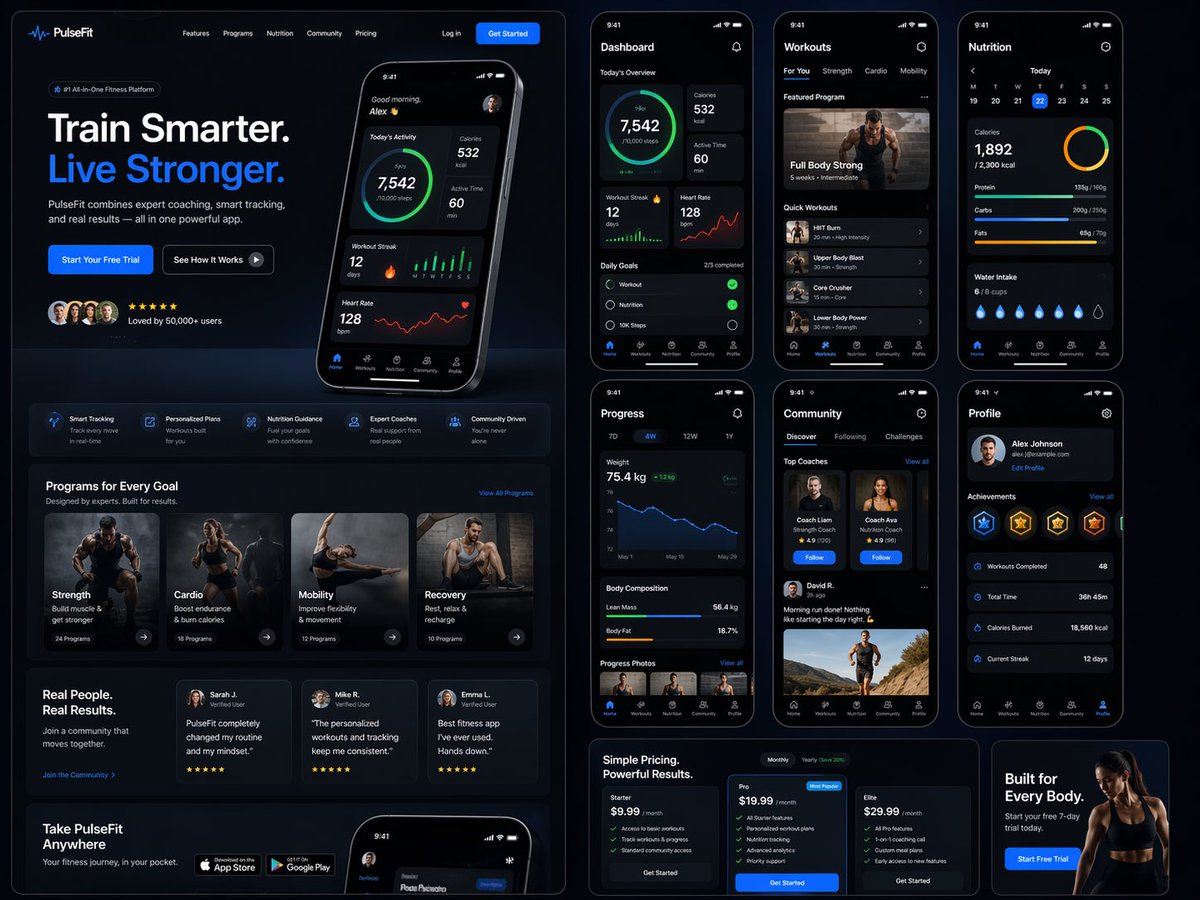
color_palette · dark-moodycolor_palette · neoncomposition · multi-panellighting · low-keyquality_flags · typography-heavysubject_type · ui-screen
提示词(原文,逐字保留)
Design a modern, high-end fitness app landing page and product UI for a brand called PulseFit.
Create a clean web design mockup that looks like a real SaaS fitness platform and mobile companion app. The design should feel premium, motivating, and easy to use, with a polished UI/UX style similar to top-tier health and wellness apps.
Include:
- A hero section with bold headline, short subheadline, strong call-to-action button, and app preview
- Dashboard UI showing daily activity, calories burned, workout streak, heart rate, step count, and progress rings
- Workout program cards for strength, cardio, mobility, and recovery
- Nutrition tracking section with macro breakdown and water intake
- Progress charts and analytics widgets
- Trainer/community section with profile cards and testimonials
- Pricing section and download/app store callout
- Mobile app screens shown alongside the web design for a cohesive product ecosystem
Style direction:
- Sleek, minimal, modern interface
- Premium fitness brand aesthetic
- Smooth spacing, strong hierarchy, rounded cards, soft shadows
- Dark mode UI with energetic accent colors like electric blue, neon green, or vibrant orange
- Crisp typography, realistic charts, polished buttons, beautiful onboarding feel
- Highly detailed, dribbble-worthy, startup-quality product design
- Realistic UX case study presentation, not a cartoon or illustration
Composition:
- Full website homepage mockup
- Multiple UI sections visible in one polished presentation
- Slight perspective or straight-on product showcase
- Clean background with subtle gradients and professional lighting
- Ultra-detailed, sharp text rendering, visually balanced layout
Output:
A stunning, realistic UI/UX design concept for a fitness app website and dashboard that looks ready for development.
Make it look like a real Figma product design presentation for a premium startup.
中文译文
为名为 PulseFit 的品牌设计一个现代、高端的健身应用着陆页和产品 UI。
创建一个干净的网络设计模型,看起来像一个真实的 SaaS 健身平台和移动配套应用。该设计应感觉高端、激励人心且易于使用,具有类似于顶级健康和健康应用的精致 UI/UX 风格。
包含:
- 一个英雄区域,包含大胆的标题、简短的副标题、强烈的行动号召按钮和应用预览
- 仪表板 UI,显示每日活动、燃烧的卡路里、锻炼连续打卡、心率、步数和进度环
- 针对力量、有氧、灵活性(mobility)和恢复的锻炼课程卡片
- 营养追踪部分,包含宏量营养素分解(macro breakdown)和水分摄入
- 进度图表和分析小部件
- 教练/社区部分,包含个人资料卡片和推荐语
- 定价部分以及下载/应用商店的推广
- 与网页设计并排显示的移动应用屏幕,以打造统一的产品生态系统
风格方向:
- 时尚、极简、现代的界面
- 高端健身品牌美学
- 流畅的间距、强烈的层次结构、圆角卡片、柔和的阴影
- 深色模式 UI,搭配充满活力的强调色,如电光蓝(electric blue)、霓虹绿(neon green)或鲜艳的橙色(vibrant orange)
- 清晰的排版、逼真的图表、精致的按钮、美观的引导(onboarding)体验
- 高度精细、值得放在 Dribbble 上的、初创公司品质的产品设计
- 逼真的 UX 案例研究展示,而非卡通或插画
构图:
- 完整的网站主页模型
- 在一个精致的展示中可见多个 UI 部分
- 轻微透视或正面的产品展示
- 干净的背景,带有微妙的渐变和专业的照明
- 超精细、清晰的文本渲染、视觉平衡的布局
输出:
一个令人惊叹的、逼真的 UI/UX 设计概念,用于健身应用网站和仪表板,看起来已准备好进行开发。
让它看起来像一个真实的、面向高端初创公司的 Figma 产品设计展示。
来源与署名
原文由 @pwealthydad 发布在 X:查看原推文。 本页逐字保留原文并提供机器翻译的中文解读;版权归原作者所有。
同工具的更多提示词
- { "image_metadata": { "image_type": "休闲日光浴肖像", "framing": "自上而下的近距离全身镜头,略带俯视透视"…@Ankit_patel211
- 由 GPT Image 2 拍摄的人像 ---prompt--- 9:16 竖版——日系富士胶片风格人像,单一主体 富士胶片模拟美学(Pro 400H / S…@BubbleBrain
- 学习资料测评005 「2026 AI廣告製作從0到成片|腳本+角色+生成+剪輯,全流程教學」 一、提示词 1.帮Liquid Death(美国一个以极端叛逆、…@imazhiyu
- “生成一张 Adobe Premiere 的真实桌面截图” https://t.co/xOZd6BYsUz@katedeyneka
- 一只圆滚滚的小猫蜷缩着睡在一个巨大的茶杯里,周围漂浮着肥皂泡和微微发光的星星,柔和的粉彩色调,粉色与淡紫色交织,温暖的烛光,梦幻水彩风格,松散而富有表现力的晕…@conley_presnell
- 'City of Mumbai on 26th November, 2008 at 10 AM, 6 PM, and 9 PM.' 我没有提供任何关于具体事件…@drashyakuruwa